Regardless of the final result, logo design is hardly ever easy and there’s always a lot more that’s gone into a design than one would expect.
But, I’m a true believer in results speaking louder than words—and when it comes to logo designs, here are some prominent, big name logos that simply come across as lazy. In reality, I’m guessing a lot of effort went into these, but the results tell a different story:
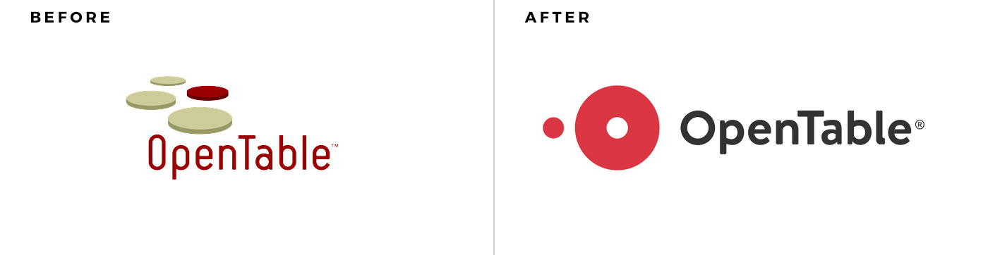
Sorry, but a round sperm about to ovulate an egg simply doesn’t say anything about the brand’s offering, story or anything else. The old logo, while dated, at least had some meaning and was a little bit interesting. While simple shapes make for great logos, they can’t be so simple that they don’t look like a logo.
I cringed when I saw this. The prior logo was at least memorable and interesting. But no, apparently typing a word in Helvetica and getting rid of all letter-spacing is someone’s idea of a logo.
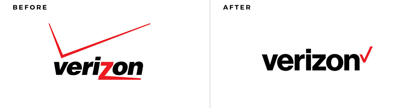
And speaking of words typed in Helvetica and called a logo… I’m guessing the story behind this is that an executive at Verizon was tired of seeing their logo in every blog post about terrible logos and ordered a redesign. After not getting a new logo later that afternoon, the executive decided to do it himself and all his “yes-people” praised him on his keen design sense and abilities.
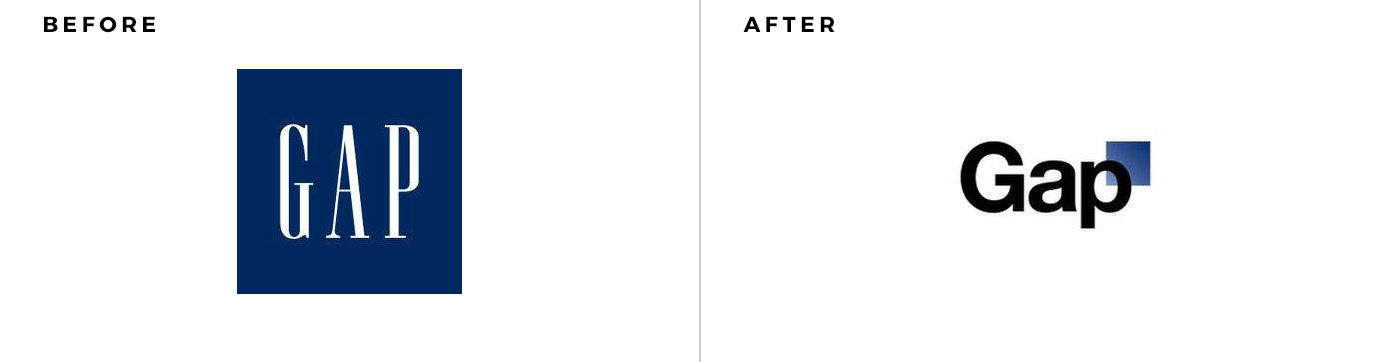
The infamous Gap logo redesign falls into the same category. Note the pattern here… after the Helvetica documentary came out, graphic designers apparently had a collective brain fart that required they create their logos only using Helvetica. I love Helvetica as much as the next guy, but it isn’t a font that will set your brand apart.
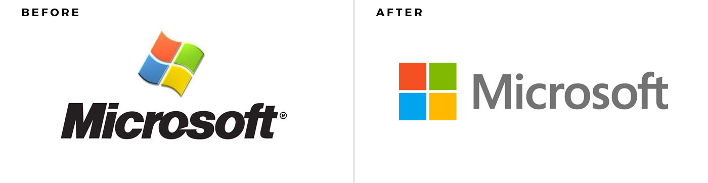
It isn’t Helvetica, but this logo redesign was definitely lazy. I imagine the design brief was: Get rid of any character the logo has but not so much that people won’t recognize it’s Microsoft. If you gave this brief to any designer, the logo redesign is what they would come up with in about 3 minutes (maybe 5 minutes, because they didn’t use Helvetica).


Fun-to-read reviews! Great! but Slightly disagree with the Microsoft one.