I was recently asked on Quora what designers outside of Google thought of their new logo. Here’s my answer.
I personally am not very keen on the new logo. The new logo does several things well:
- It looks like Google, because of the colors.
- It’s clean and well executed
- It’s target audience seems to like it (based on the few surveys I’ve seen).
The problem I have with the logo is two-fold:
a) It didn’t solve any of the problems of the previous logo.
b) It took the “safe” approach, making a more generic logo that looks aesthetically juvenile in comparison to the previous logo.
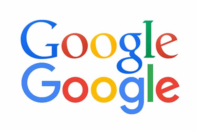
Let’s start with the problems of the previous logo. The logo was text-only and derived much of it’s character from the colors of the letters. Thus if you executed the logo without the colors (such as a foil, a metal plate, a deboss, an engraving, etc.) you would effectively lose the logo. Moreover, because the logo was text only, it didn’t have an icon. This is something it obviously struggled with. While twitter used the bird, Yelp it’s asterisk, Apple it’s apple—Google never settled on an icon that was clear in people’s minds. The most common was the lowercase g against a blue background (more on that later).
The new logo solved neither of these problems—or at least didn’t solve them very well. The color-dependent logo was replaced with a new, color-dependent logo. And rather than create a unique element in the logo that would translate into an icon, they created a separate icon, independent of the logo, which itself only works in color.
Imagine for a moment a laptop created by Google in the same style as the MacBook. Rather than a lit apple on the back, what would appear in its place? The fact that the answer isn’t obvious is a problem in logo and branding design. Would you put the G on there in color? It would look like a throwback to the RGB inspired designs of the 90’s. Or would you put just the G in white? The problem is that a generic, geometric sans serif G simply doesn’t have the same recognition as an apple or a bird.
With the previous logo, the lower-case “g” had some character. The new uppercase G only has character when the color rainbow is applied to it. Could it have instead been made to look like a power symbol on its side? Sure, not that this would be the right message, but at least it would have some character and would translate into an icon.
This leads me to the second issue I have with the logo—it’s a dumbing down of their existing branding. The new logotype looks like a cleaned up version of comic sans. And in that regard, it looks like it’s aimed at children. From the circular “o”s to the single-deck lowercase “g” that replaced the previous double-decker “g” to the overly bold face.
I felt the previous logo had a nice contrast of visual language—using a traditional, yet modernized serif face with overtly childish colors. The two worked well in providing a brand message of playfulness while still being authoritative. The new logo uses the same overtly childish colors but now also uses an overtly childish font—one that reminds me of the letter art hanging in my daughter’s transitional kindergarten classroom.
We’ve seen this same trend of redesigning a logo by making it sans serif and ridding it of any character. eBay immediately comes to mind as does Microsoft. This is the safe approach. Nothing new or interesting is created and so there is nothing for people to “hate” about it.
It’s a rare case where a rebranding dares to create a new symbol and stick to their guns, despite all the internet hate thrown at it (AirBnB).
With all that said, redesigning the branding for Google is an extremely daunting task. No matter what you do, there will be thousands of designers and critics bashing you for your decisions, all with far less information at their disposal.
And so my final statement is that the new logo is well executed and will probably serve the company well.
But do I like it—no, not really.


