One of the most important tasks of a designer is to create a hierarchy—to create an order of importance to the elements of a design so as to direct attention and make information more easily assimilated.
Hierarchy is defined as: A logical way to express the relative importance of different elements by providing a visual guide to their organization.
A text hierarchy helps make a layout clear, unambiguous and easier to digest. A text hierarchy can be established in numerous ways by employing different weights, sizes and styles of a font. Alternatively, a simple hierarchy can be achieved by using different colors of the same font.
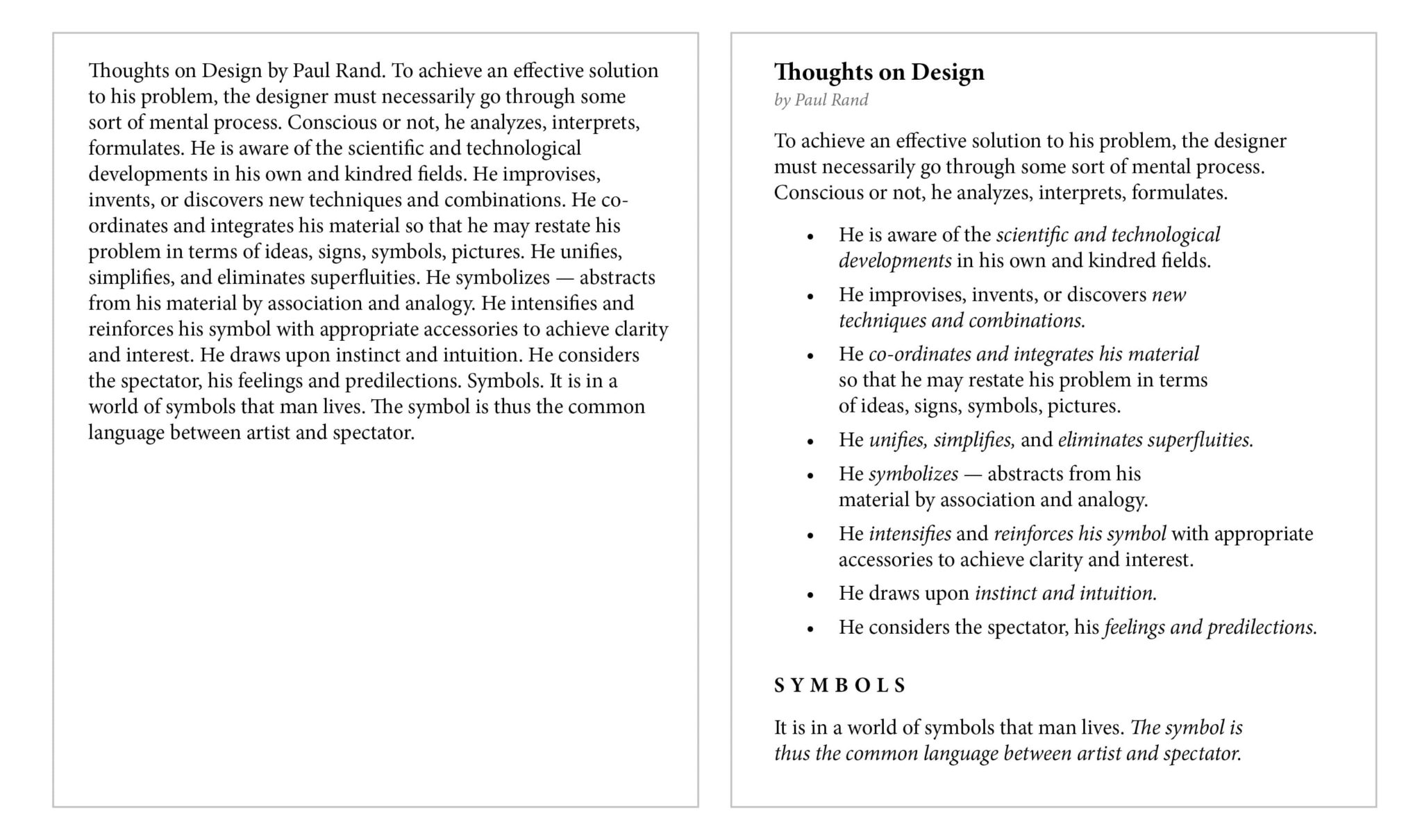
Hierarchy has been built into the very core of the HTML language—H1, H2, H3, blockquote, strong, em. All of these tags exist to create hierarchy. Below you can see two small blocks of text. The first is the text by itself, with no formatting except the standard use of punctuation. The second has been designed with a visual hierarchy.
Note how the one that properly uses hierarchy is easier to understand and look at. You know what information is more important than other information. You know what you should read first. You know what you should give added attention to. While both have exactly the same text, one has been given hierarchy through design and the other hasn’t.
Hierarchy in design is not limited to text. Look at any well-designed website and you will see that visual hierarchy is used in structuring the page—from the size of the navigation banner to the hero image, buttons, blurbs and icons. All of these, their size, their color, their placement—affect the visual hierarchy of elements.
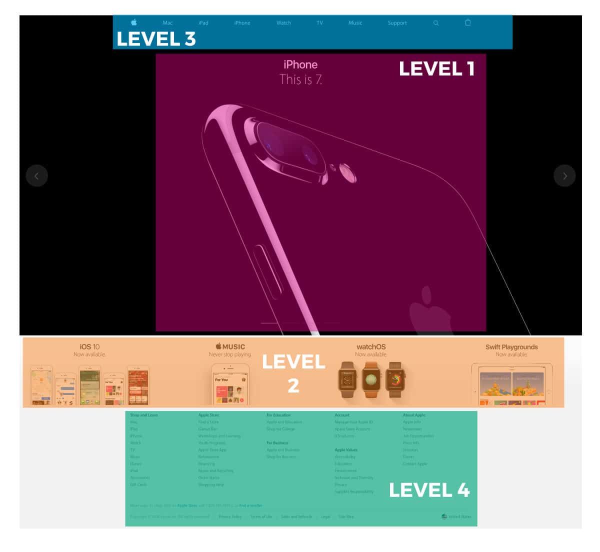
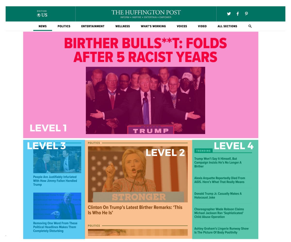
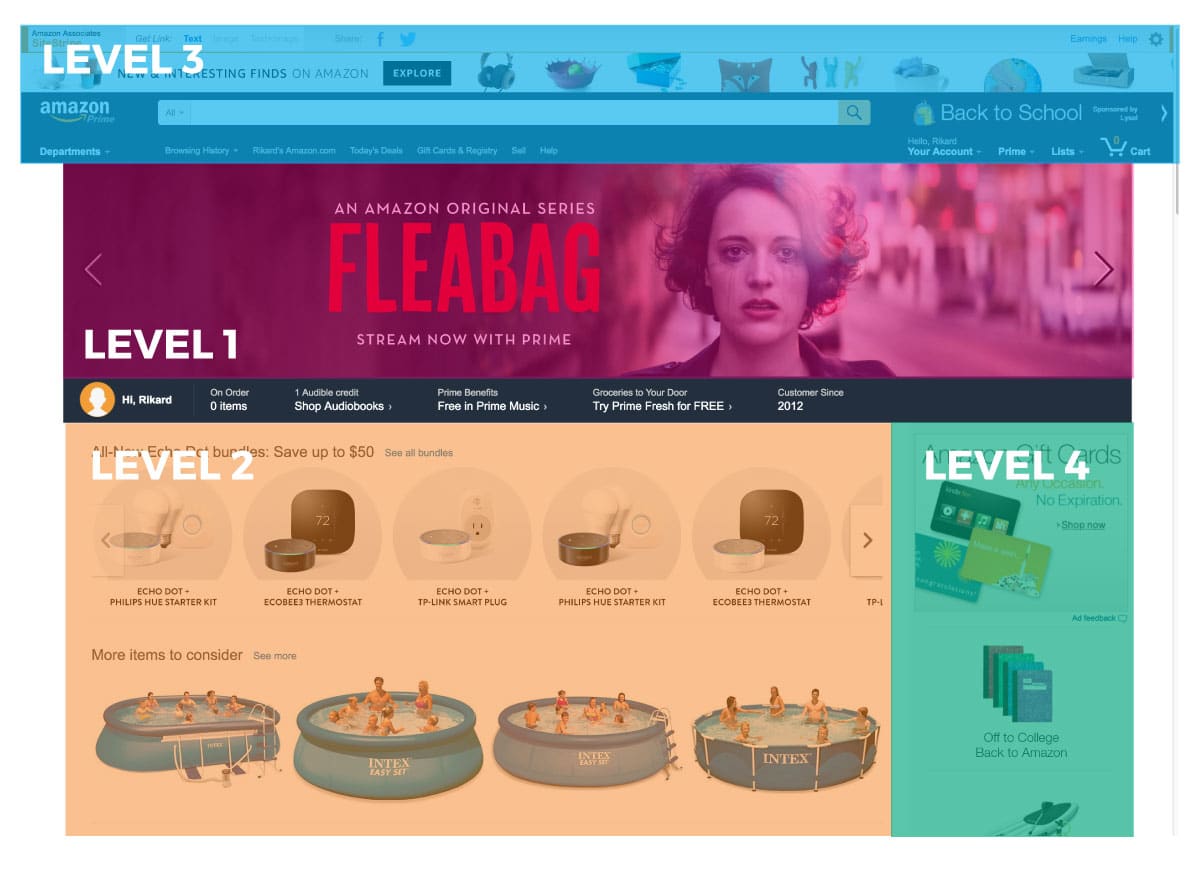
Here are the home pages of three popular websites. I’ve overlaid 4 levels of hierarchy on each taken objectively from the design of the page.
Apple has the clearest hierarchy, Amazon the least clear. While more information naturally creates a larger challenge in visual hierarchy, it appears that Amazon has taken the “catalog approach” where one item per page is given high importance and everything else is given equal importance. This approach works in a shopping site or news site—where you’re simply looking to present a lot of items hoping that one creates interest, but doesn’t work when you’re attempting to deliver a specific message or sell a specific item.
Designing Visual Hierarchy
There are many tools at a designer’s disposal to create hierarchy in design and the above examples shed some light on what they are. Here is a breakdown of the most common tools, in their approximate order of importance.
1) Size. The larger something is, the more important it is. It is the first thing the eye will see and thus, by implication, the most important thing to look at.
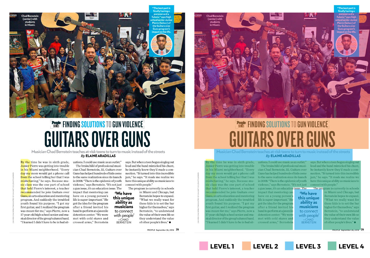
Here the hero or feature image is given most importance, taking up nearly half of the entire page. The headline, with a font size 5 to 7 times larger than the body text, is given secondary importance, the subhead and pull quotes come after this followed at last by the body copy.
2) Position. As we read things from top to bottom and left to right, placement of items first at the top and then on the left give them more importance. This is the reason logos on websites are placed in the top left corner. We naturally look first at the top and move our eye down. And if there are multiple items in one row, we will naturally start on the left and more our way to the right.
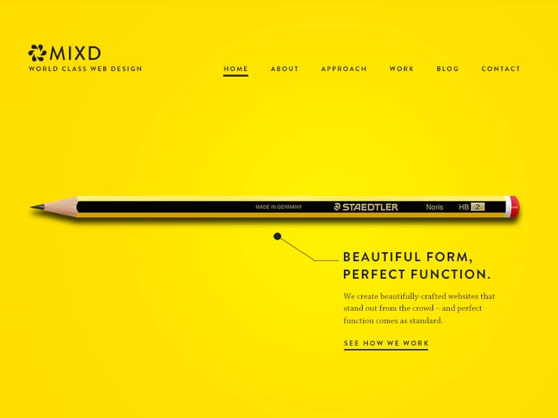
Note the logo at the top left as well as the menu. What you want people to see first on a menu is placed on the left.
There’s a lot of effort and study that has gone into the sequence and pattern of human interaction and interest. For example, the back pages of a magazine are extremely important real estate for advertising as many people will flip through a magazine backwards.
Proximity also plays a part in positioning. By grouping elements, they are given visual hierarchy. A subhead to your primary heading is given more importance to a subhead further down the page, even if they share the same visual language.
3) Negative space. Negative space (or whitespace) can be used to increase or decrease the importance of items. Generally, the more negative space you give an item, the more important that item is. Negative space allows your eye to better isolate and see an item. This is the reason we have space above and below a heading. It is also a key to Apple’s design philosophy—a lot of white space creates importance to the item within that space. Conversely, however, white space can give an item a sense of smaller scale and in this fashion can be used to reduce importance.

A key part of Apple’s design philosophy is the use of white space to give importance to items. Rather than trying to pack a lot of information on a page, Apple breaks that information into small tidbits with a lot of space to breathe.
4) Color. There are three primary components to color and each of these can be used to create hierarchy—saturation, hue and lightness/darkness.
Saturation: In any design that is primarily black and white, the item with color is being given higher importance. This can be used in its most primitive fashion where everything is in greyscale except the item you are drawing attention to. The red dress in Schindler’s List is a great example of this. And it’s use in graphic design is very common.

By keeping only the bourbon bottle in color, our attention is drawn to it and it’s given higher importance than the other images on the page, even though some are the same size or larger than the bottle.
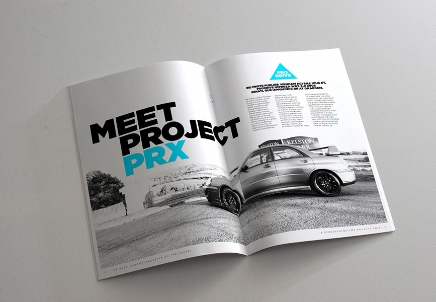
Here, the name of the project “PRX” is brought to the forefront through a bright color, where the rest of the page is in black and white. Here color supersedes the size of elements in creating a visual hierarchy.
A more subtle use of this is having a neutral color palette with only one element of color being more saturated than the rest.

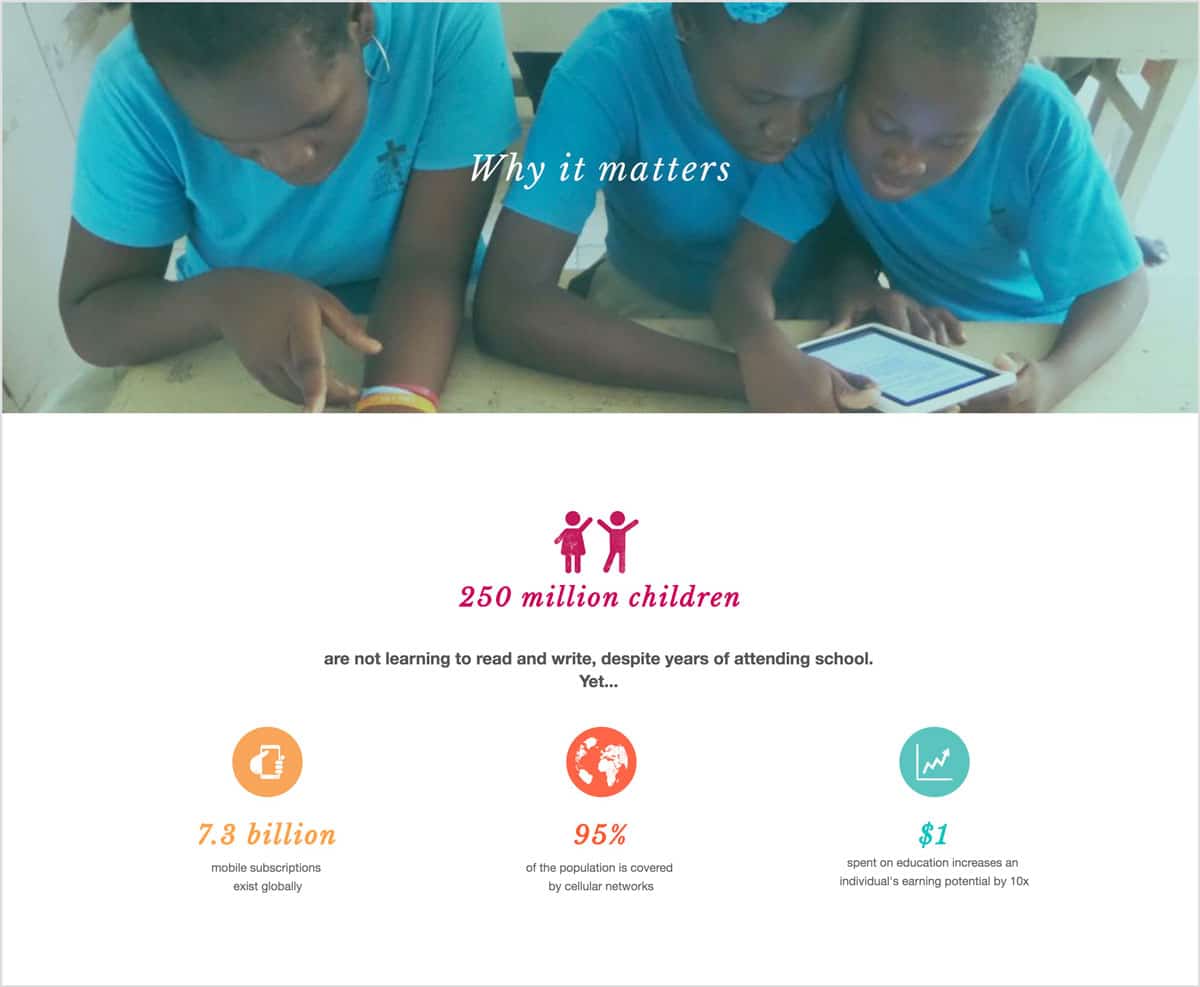
By using a neutral (desaturated) color palette, our attention is drawn the touches of blue in the image and the tagline.
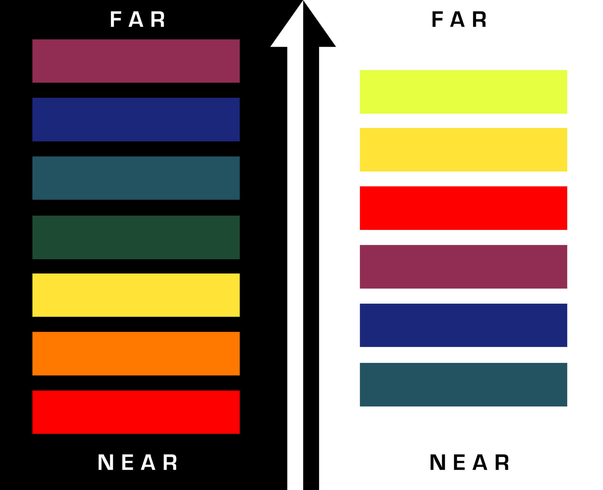
Hue: Certain colors stand out above others. If you look at a color depth chart, you will note that warm colors are the most front colors, while cool colors recede backwards. Red is color at the front and thus one of the first colors your eye goes to. This is the reason for notifications and alerts often using red in interface design. It is also the reason for “On Sale” banners being red. Red is a color that draws your eye.
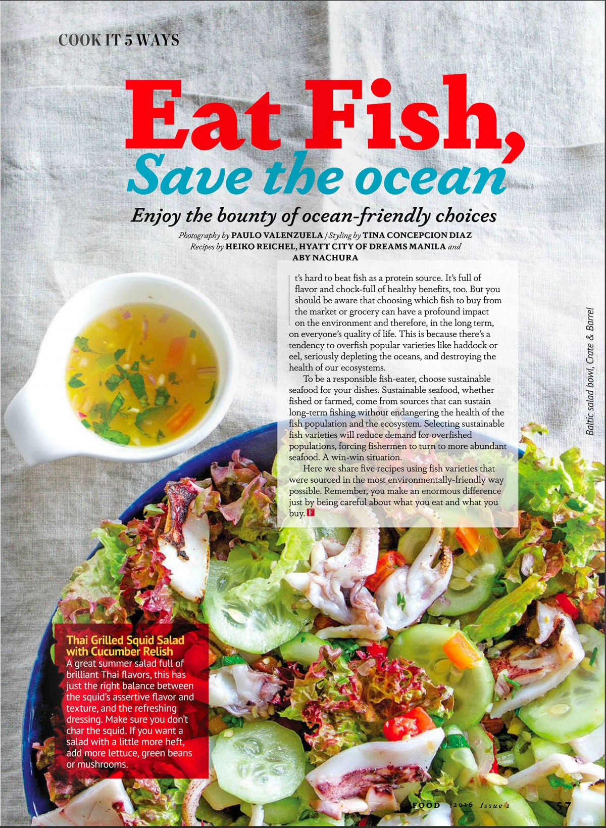
“Eat Fish” is being given great importance than “Save the ocean” through the use of color, position and size.
Lightness/Darkness: In a mostly dark design, bright elements will come forward and appear more important. Conversely, in a primarily light design, a dark element will draw attention. This leads us to contrast.
5) Contrast. Many of the above depend on contrast to work—saturation of color, size and so forth. But contrast can be used in other ways as well. A contrast in pattern, of mood lines, of color—all of these can help you in creating hierarchy in your design. In lowering the importance of an element within your design hierarchy, reducing contrast is an extremely effective tool.
6) Repetition: Repetition provides meaning to visual elements and allows one to more easily and quickly assimilate information. When you see items in a list, you can easily predict the context of the proceeding items in the same list. When you see and understand one icon’s information, the rest can be understood far more quickly.
7) Alignment: Alignment creates order and visual coherence to a design. It allows for your audience to place relative importance to elements on a page, establish beginning and end points and associate items together or apart depending on their alignment or misalignment.
The Purpose of Hierarchy (and Graphic Design)
When it comes to graphic design—and more specifically the PURPOSE of graphic design—you can divide it into two broad categories:
- Marketing.
- Information.
In the first category comes all design intended to sell a product, a service, a brand or an idea. Posters, fliers, most websites, brochures, corporate identity.
The second category encompasses all design that facilities the relay of, or assimilation of, information. Here you have interior book design, user interface design, magazine design.
Both of these are not mutually exclusive. In fact, there is usually always some kind of cross over between the two. Packaging falls somewhere in-between—being important for both selling the product and, after purchase, relaying information on its proper use. Magazines jump between the two, with articles intended to relay information and ads intended to sell products. Corporate identity design relays contact information but also tries to sell a brand.
In a broad sense, graphic design exists to facilitate and raise the quality of a communication; whether that communication is an explanation of quantum physics or simply the idea of longing and nostalgia.
Marketing Hierarchy
When it comes to creating hierarchy for a marketing design, a great template to use is the tried and true AIDA model.
- A – attention (awareness): attract the attention of the customer.
- I – interest of the customer.
- D – desire: convince customers that they want and desire the product or service and that it will satisfy their needs.
- A – action: lead customers towards taking action and/or purchasing.
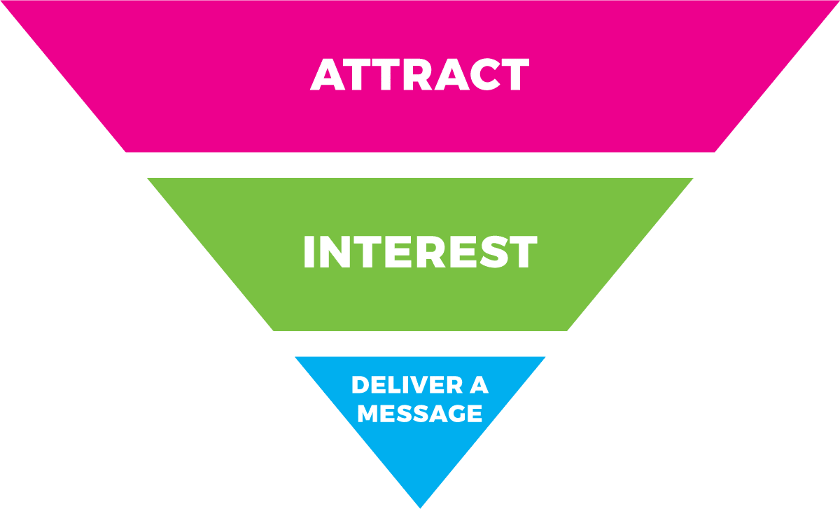
There are other versions of this model, with many marketing companies and advertising agencies creating their own, slightly different version to encompass sharing, satisfaction and the like. The reality is that they all don’t deviate far from he above model, which is tried and proven. My preferred, simplified model is: Attract, Interest, Deliver a Message. Primarily because it is easier to remember and distinguishes more clearly between attract and interest.
As people start on this cycle there will be a natural fall off, but the people staying will also require less stimuli to get to the end. As such, the cycle can be seen as an inverse pyramid when it comes to hierarchy and the importance of elements in a design. Place the most importance on elements intended to attract, a bit less on the elements designed to interest and less on those intended to deliver the message (convince of a want and lead to action).
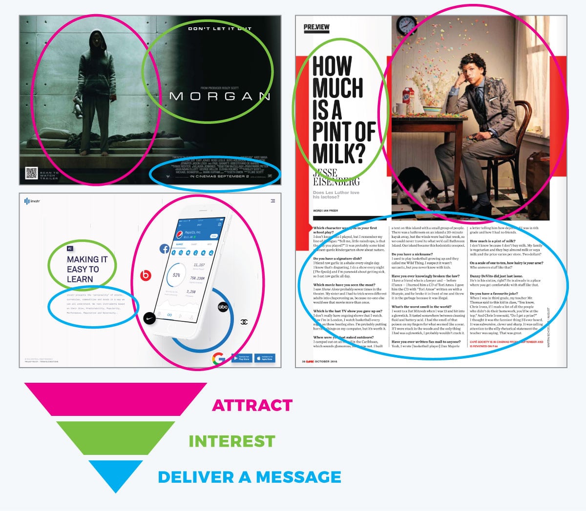
This pattern is quite obvious when you look at almost any graphic design.
The image attracts your attention. The headline interests you. And the copy delivers a message, prompting some kind of action.
This same pattern can be seen in web layouts as well. You will often see a large photo or graphic to attract, then headlines to interest and copy with a button to convince and prompt action.
Information Hierarchy
Information hierarchy often follows a similar pattern. You must first attract, then interest and then deliver your message. This pattern, as a microcosm, can be seen in virtually any article design. There is an image and headline to attract you, then either a subhead summary or pull quote to pull your interest and then the text itself to deliver the message.
But designing information hierarchy has a lot more to do with delivering the message, and here hierarchy design plays a large part in separating the information into more easily assimilated pieces and assigning those pieces or segments relative importance. Pull quotes, subheads, illustrations, infographics—all of these are tools used to establish hierarchy within information design. If you want a master class in information hierarchy design, look at cookbook designs. A well-designed cookbook has to impart a lot of information and separate that information well.
In user interface design, directing attention and action is paramount. Users should never be confused as to their next action. The design should be self explanatory and hidden, so that the information is easily and almost seamlessly digestible.
Fractal Hierarchy
In many ways, visual hierarchy design is “fractal.” Take a magazine, for example:
- There is a hierarchy designed into the magazine as a whole—the front cover being the most important (serving to attract an audience), the first few pages in the front and back being second in importance (and serving to interest through table of contents and easily digestible information tidbits) and the rest of the magazine being of tertiary importance (delivering the information of the magazine).
- The front cover has its own hierarchy, with an image, headlines, secondary headlines and so forth.
- The table of contents has its own hierarchy.
- Each article has a hierarchy, with an image, headline, first paragraph, pull quotes, subheads and the like.
- And within articles, images have a hierarchy, with a primary subject, secondary items and so forth.
Even in as small an item as a logo, hierarchy design comes into play in balancing the logo symbol, logo type and tagline.
Visual hierarchy is intrinsic to design. It is how a designer makes information accessible and interesting to an audience; how a designer tells a story.
References & Further Study:
-
Communicating with Visual Hierarchy by Luke Wroblewski
-
Visual Hierarchy article on Wikipedia








Thanks a lot, it really help me in my designs
This is a great overview! Thank you very much for sharing.
Thank you Rikard.
Very useful guidelines.
Regards