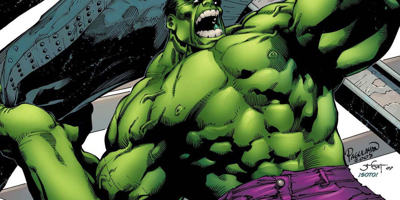
Color harmony is the theory of combining colors in a fashion that is harmonious to the eye. In other words, what colors work well together. It is the reason the Hulk wears purple pants. It is the reason the original X-Men had yellow and blue uniforms. It is the reason behind almost all color design decisions.
Color Wheel
Color harmony is based on the concept of a color wheel. You can study up on the history of it here. Essentially, it is a wheel with all the colors formed in a circle. Primary colors are on three equally distanced points of the wheel. Typically these are Red, Blue and Yellow. In the field of painting, where the color wheel originated, these three primary colors were used to mix almost all other colors. In modern printing these are replaced with Magenta, Cyan and Yellow. Black is thrown in to create darker colors, thus C, M, Y, K.
Between the three primary colors on the wheel are their mixed colors—purple between red and blue, orange between red and yellow, green between yellow and blue. Theoretically, all colors feels somewhere on the wheel.
The wheel represents color in a circle. Closer to the middle of the circle, colors are less pure. At the outer edge of the circle, they are more pure and more saturated. In 3D representations of the color wheel, one might add darkness and lightness separate from saturation. The thing that is important to know in color harmony is that how dark or light or how saturated colors are does not affect their position on the wheel. Orange can range from a dark brown, to a bright orange to a pale skin tone. All of these are ORANGE when it comes to the color wheel.
(As a side note, this is a great color wheel for designers to have.)
Key Color
After the color wheel itself, the next important thing to understand is the key color. The key color is the most important color of your design. It is the color you can’t change or the color of the element you want to draw attention to. If you are doing a painting of the Hulk, your key color is green as it is the color you can’t change. If you are doing a photograph of a person, then their skin tone is your key color. If you are doing product photography, then the color of your product is the key color.
When determining your color harmony, you need to first determine your key color. From there, you can look at the various types of harmony and see which one you like best or which best suits your design.
Types of Harmony
There are 5 types of color harmony:
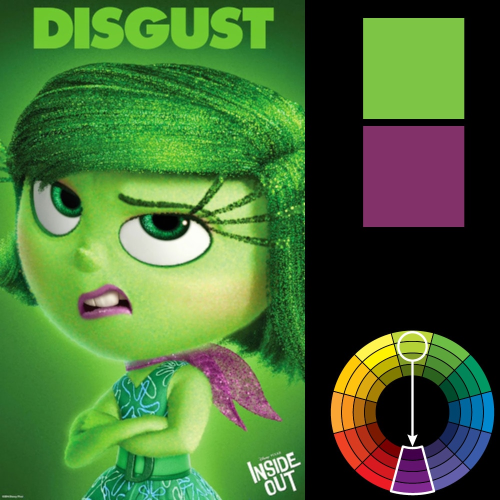
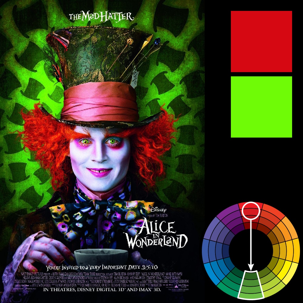
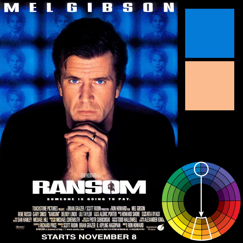
1) Direct Harmony: This is the most basic harmony. It is a point opposite to the key color on the wheel. This “opposite” color is referred to as the complementary color and thus the direct harmony can also be called the complementary harmony. Virtually all color harmonies (except Analogous) are a variation of the direct harmony. It is the reason the wheel exists as opposed to a different kind of chart.
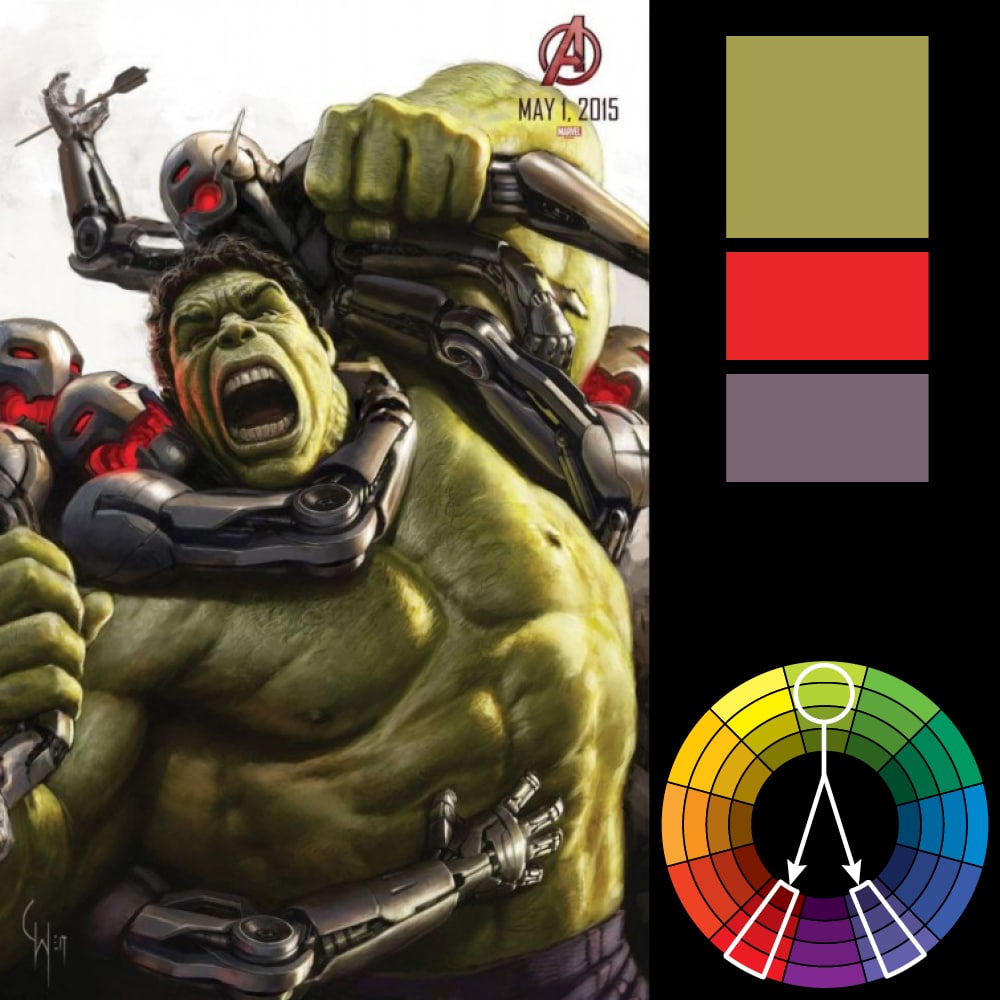
The high contrast of complementary colors creates a vibrant look especially when used at full saturation but can be jarring if not managed properly. This is the most common color scheme and is easy to find in all sorts of designs. Hulk’s green color has purple as its complementary color—which is the reason he wears purple shorts. Red and green are the Christmas colors and also happen to be complementary colors to each other. In photography, blue is considered the best color to put behind a person as it is the complementary color to skin tone.
Complementary color schemes are tricky to use in large doses, but work well when you want something to stand out. Complementary colors are really bad for text as both colors have a similar “strength” and will fight for attention.
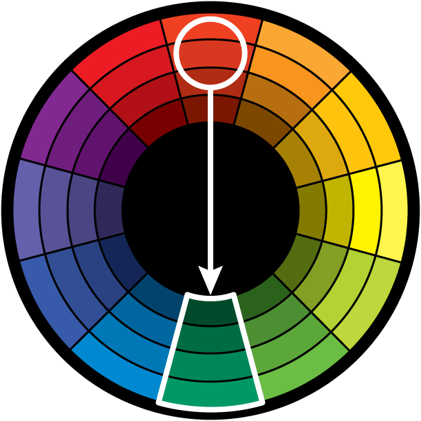
2) Split Complementary: Rather than the point opposite the key color on the wheel, the split complementary takes the two colors directly on either side of the complementary color. This allows for a nicer range of colors while still not deviating from the basic harmony between the key color and the complementary color.
This color scheme has the same strong visual contrast as the complementary color scheme, but has less tension. The split complimentary color scheme is a safe choice for virtually any design as it is near impossible to mess up and always looks good.

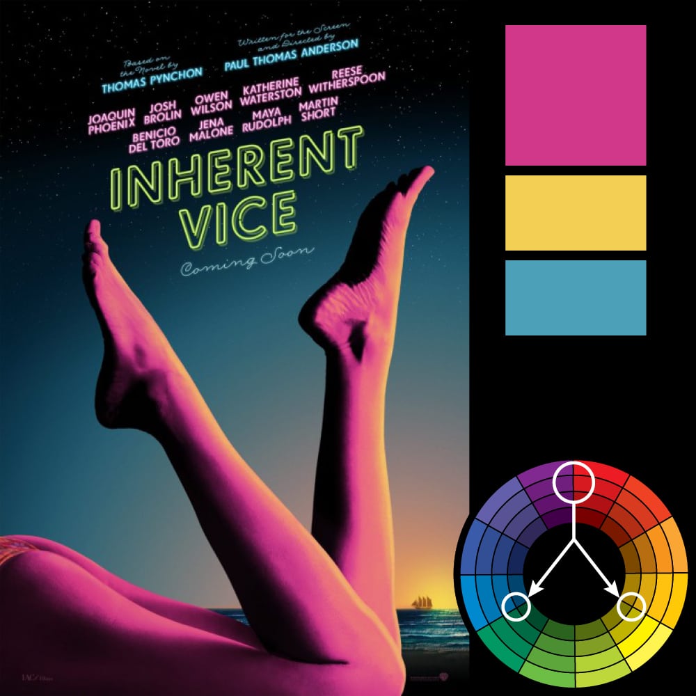
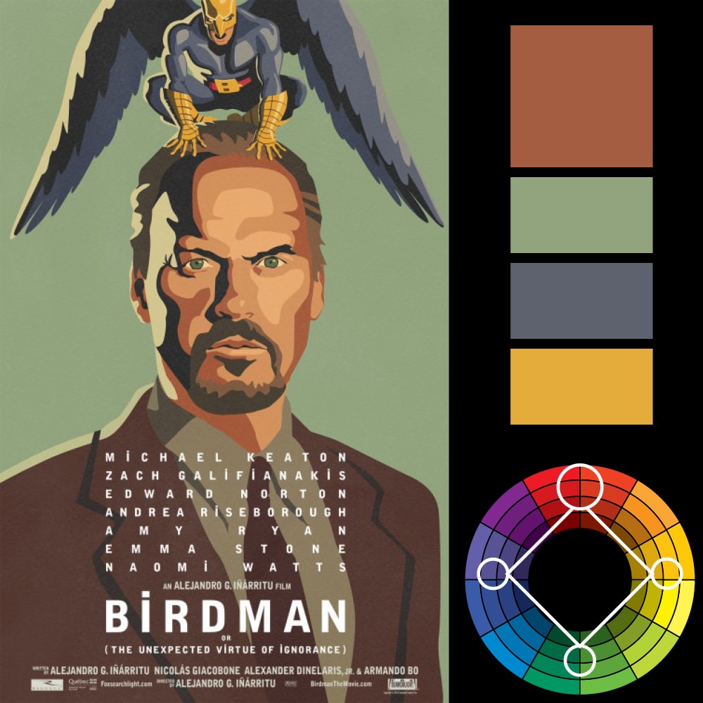
3) Triadic Harmony: Also called Triadics or Triads. This refers to the color two spaces to either side of the key color’s complement. Essentially, with the triadic harmony, you are using three equally distanced colors on the color wheel. As such, you’re stretching the basic idea of color harmony and thus this harmony is best used with only touches of color.
Too much of each color and your design appears to have too many colors and can be too vibrant.
To use a triadic harmony successfully, the colors should be carefully balanced—let one color dominate and use the two others for accent. Or, desaturate all your colors and only use the triadic colors in small spots or touches.
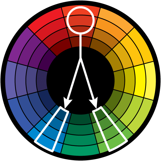
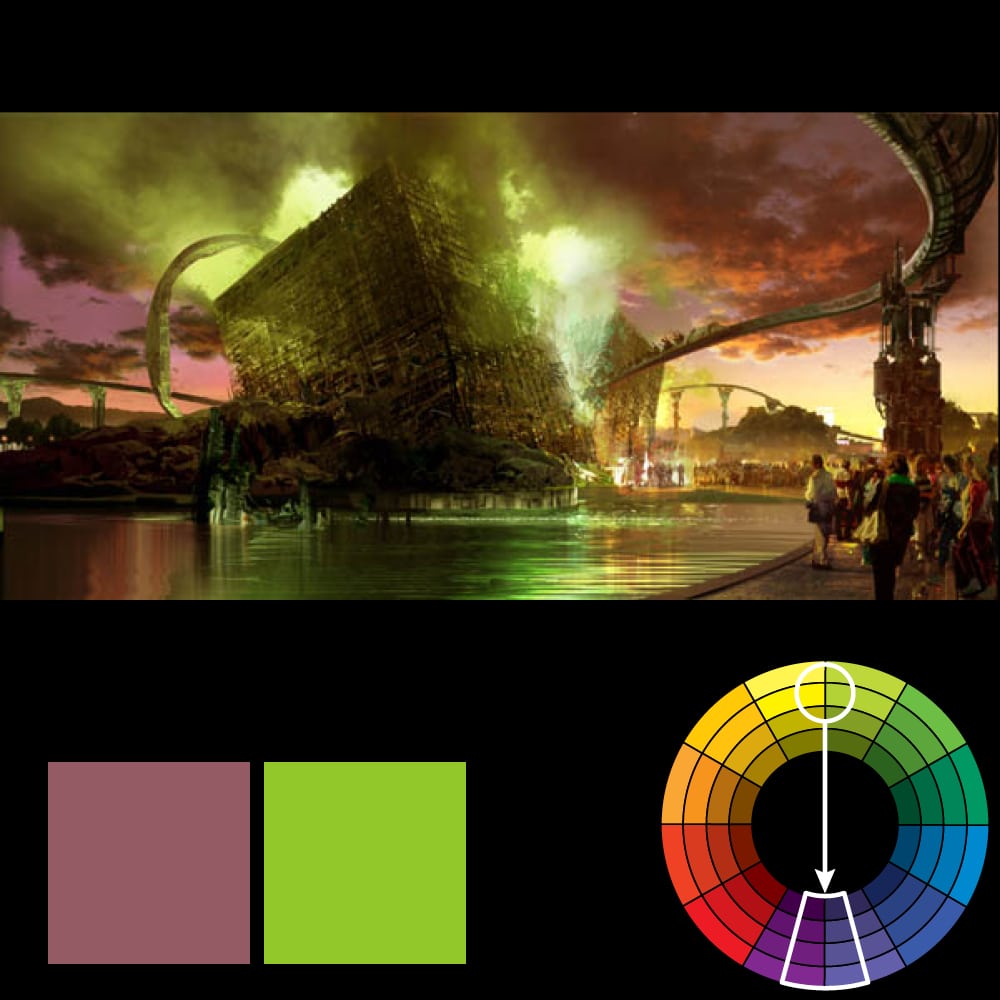
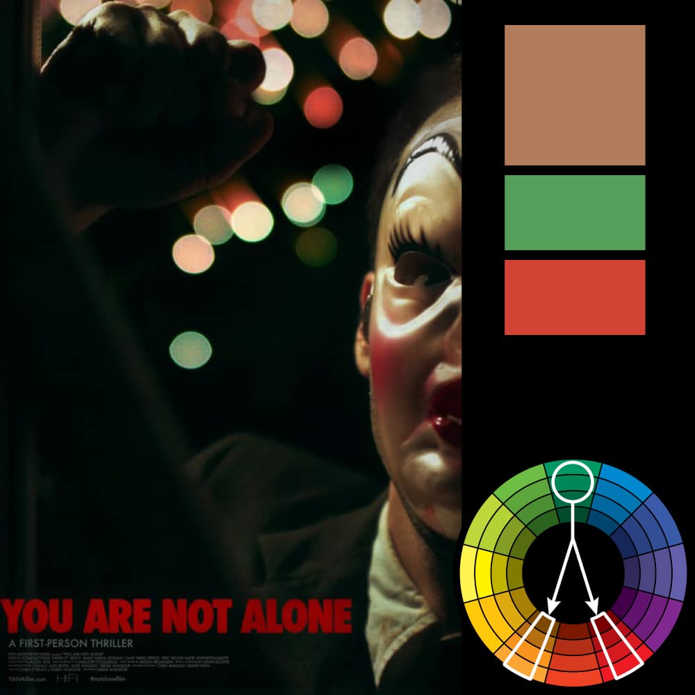
4) Analogous Harmony: Also referred to as related colors, these are the colors directly on the left and right of your key color. They usually match up quite well and create a serene and comfortable design. While this color harmony can be pleasing to the eye, it can also come across as monotone. If you are going for a design that’s primarily one color, this is a good choice.
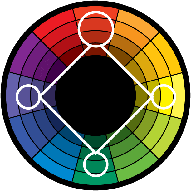
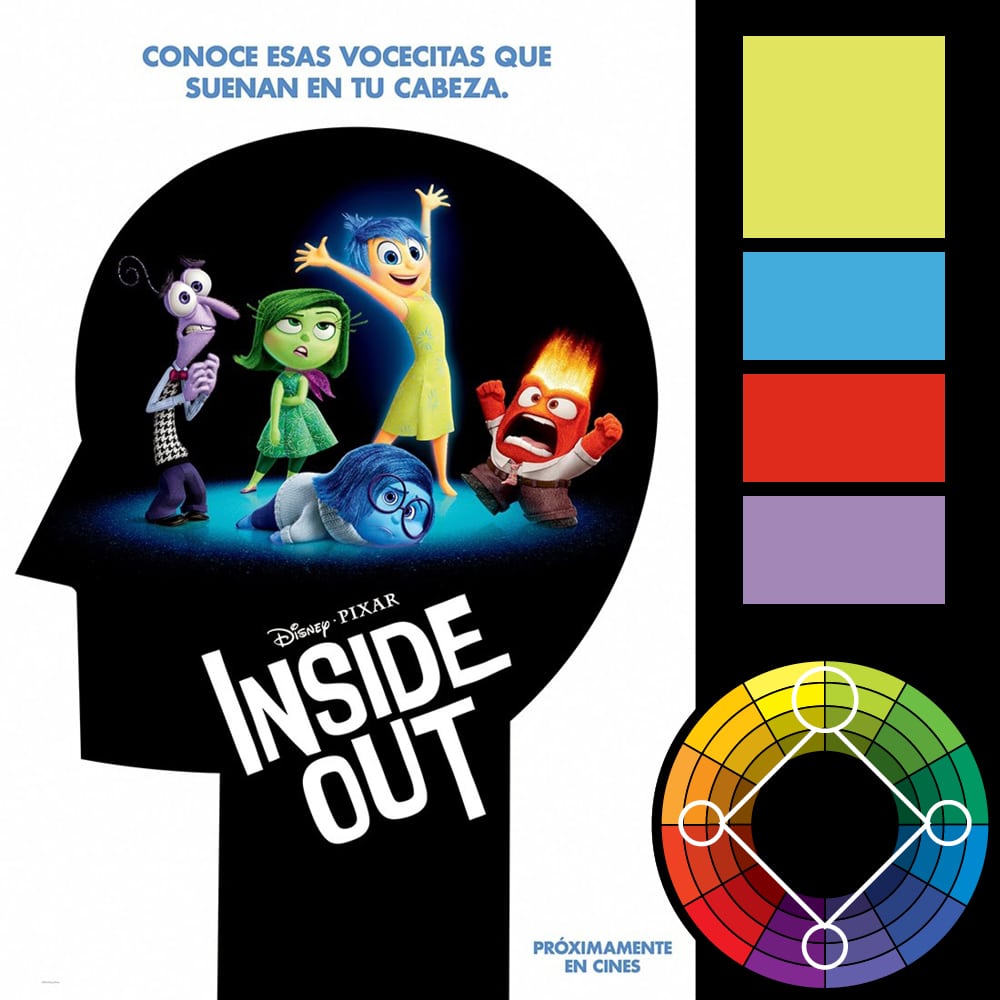
5) Tetradic Harmony: Similar to the Triadic, except that there are four points, all equally distanced on the color wheel. This is a color harmony I’ve only seen mentioned in more recent texts on the subject of color harmony. In my earlier post on this subject, I didn’t even include it. My personal opinion is that a design using this isn’t really using color harmony and is instead using every color on the color wheel. Or, where done more subtly, it is a design simply using two sets of complementary colors.
That being said, this harmony is good when you have numerous elements that all need to stand out on their own—such as a poster that features 4 or more characters. By using colors equally distant on the color wheel, each character gets equal attention.
Examples of Color Harmonies
In this section, I’ve taken posters, ads and concept art and shown how the various color harmonies are used. You can click on a harmony to skip to that section. Or you can browse through all of them.
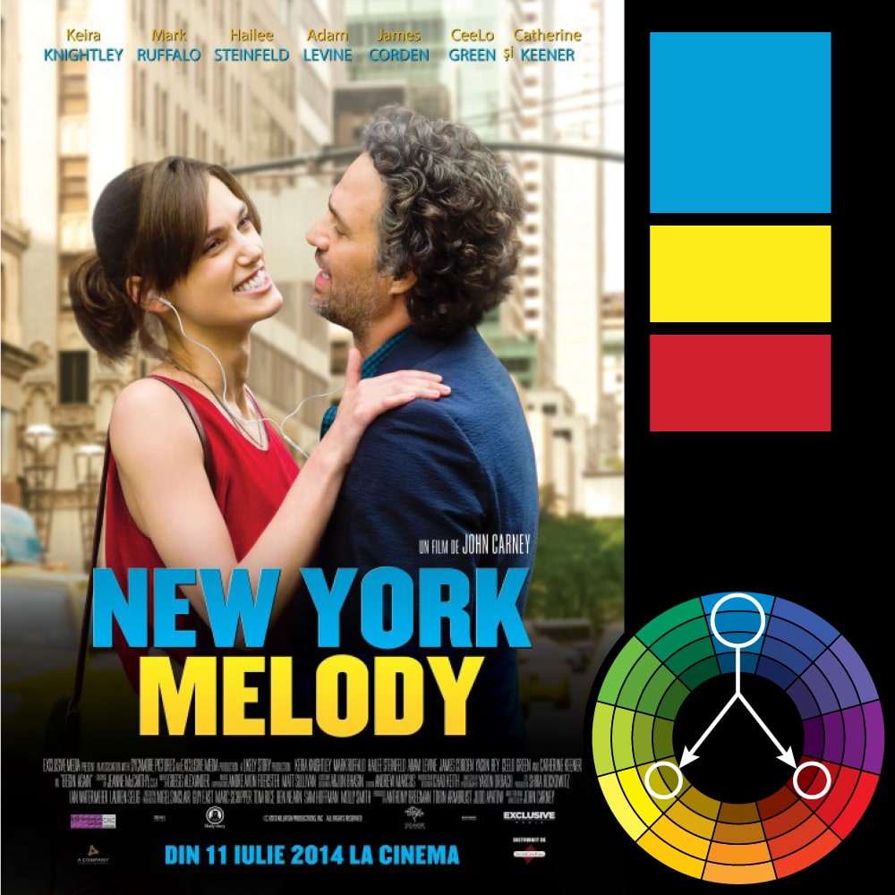
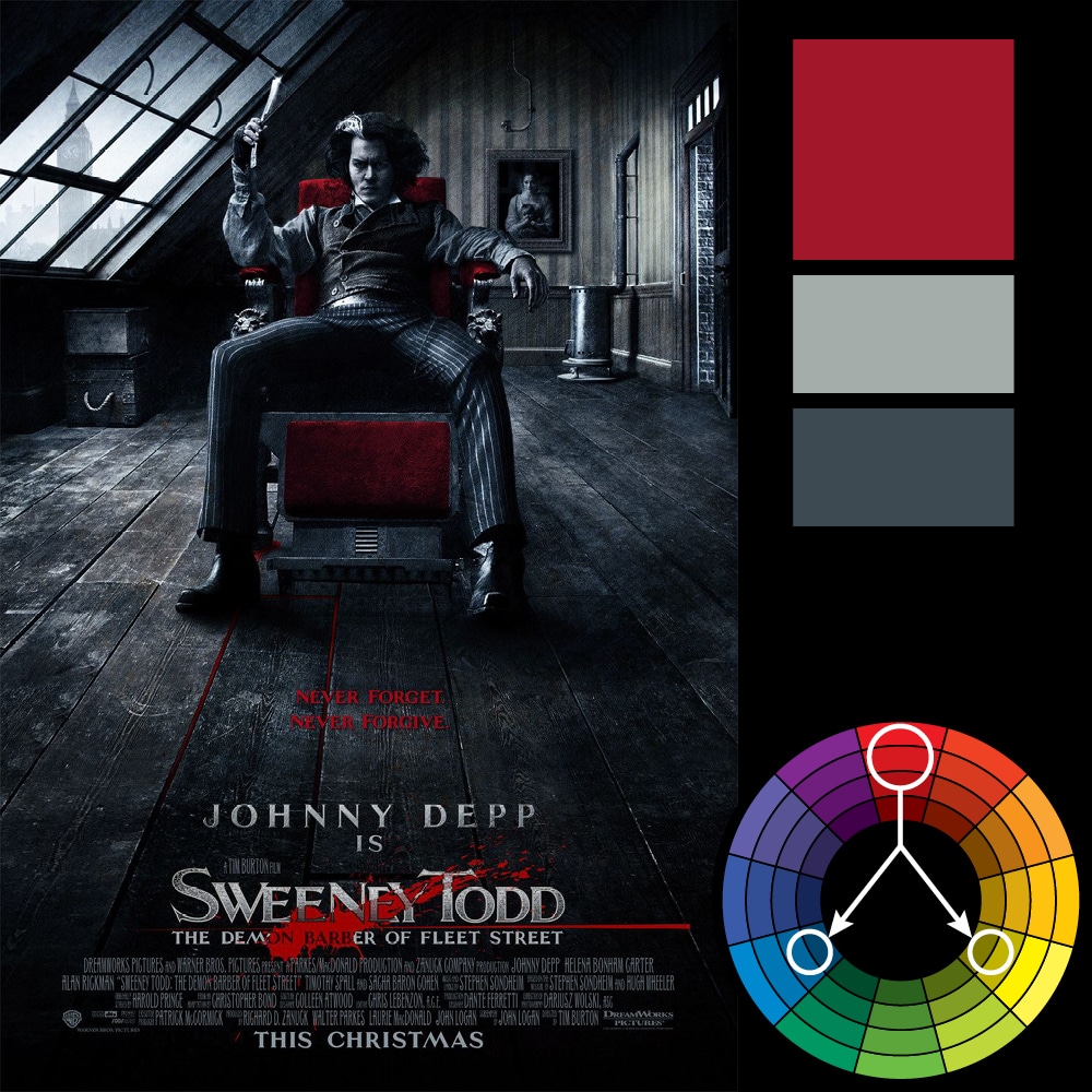
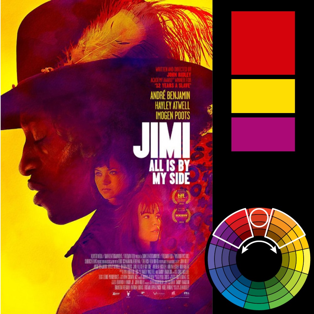
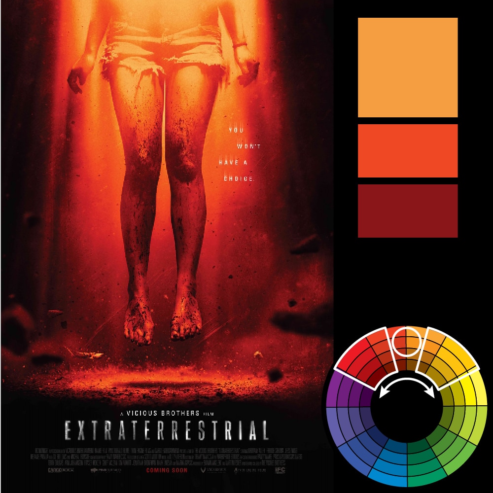
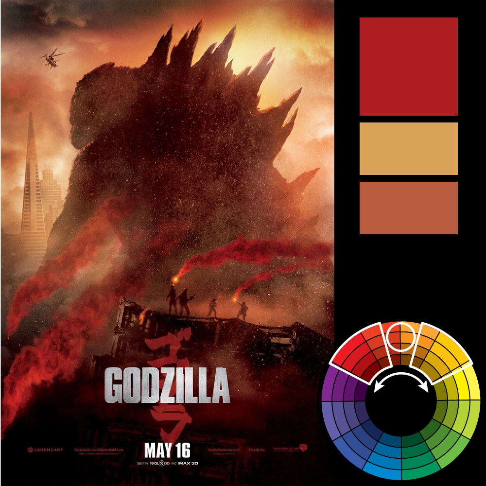
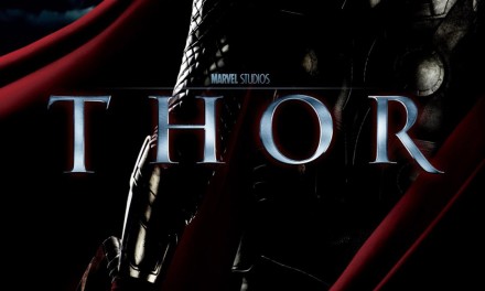
Direct Harmony/Complementary
You can click on an image to see it larger.


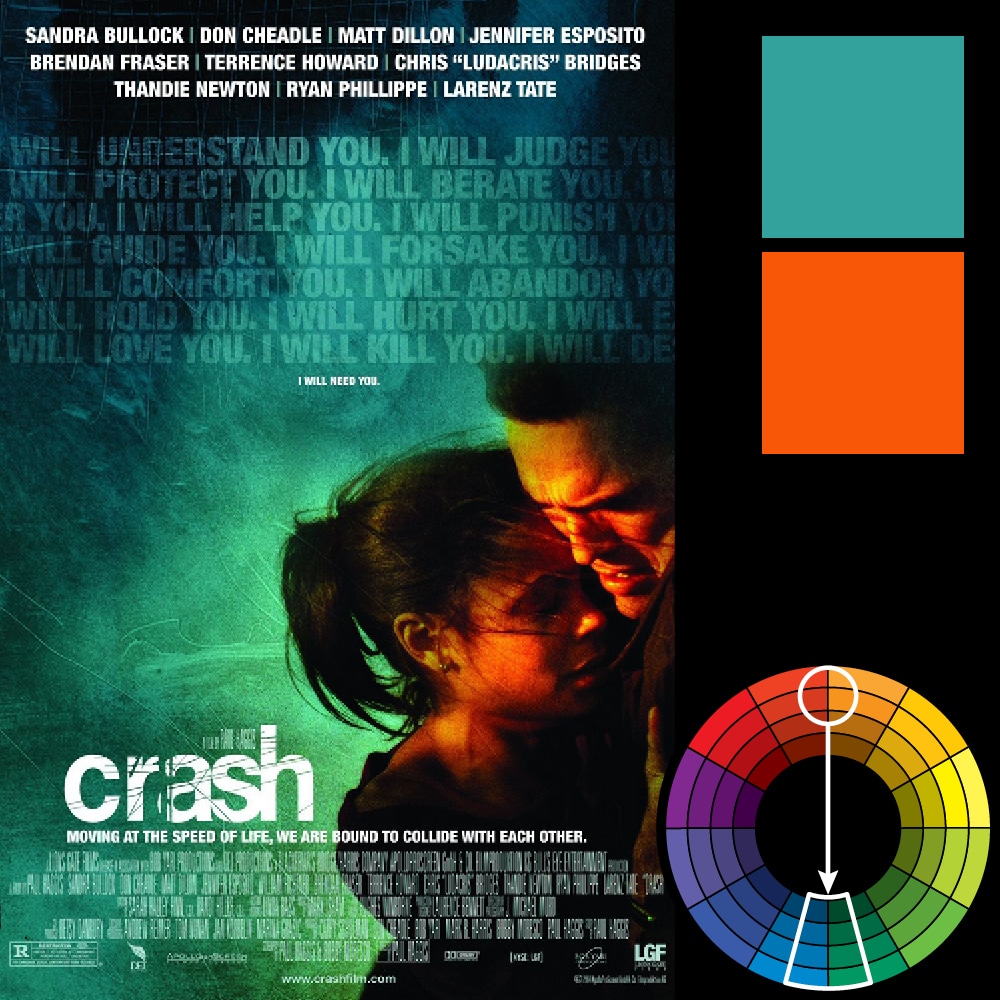
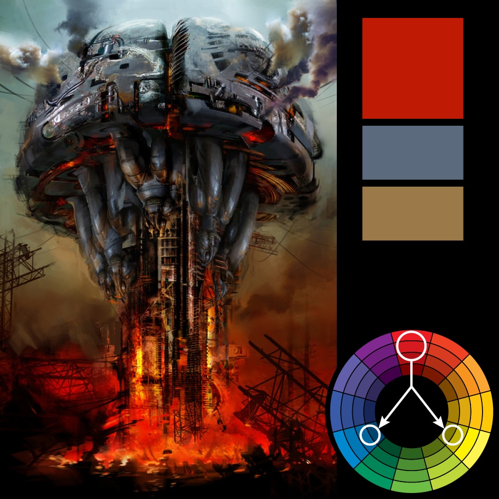
Split Complementary
You can click on an image to see it larger.
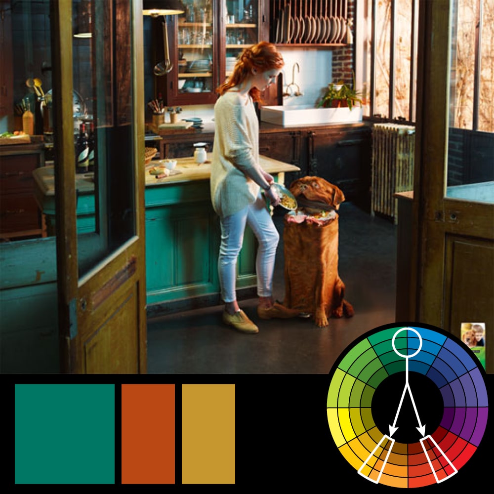
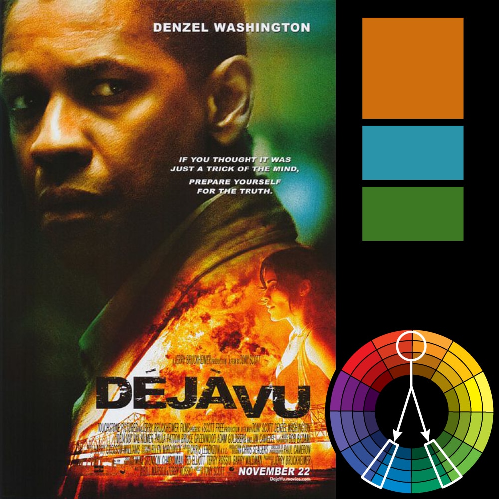


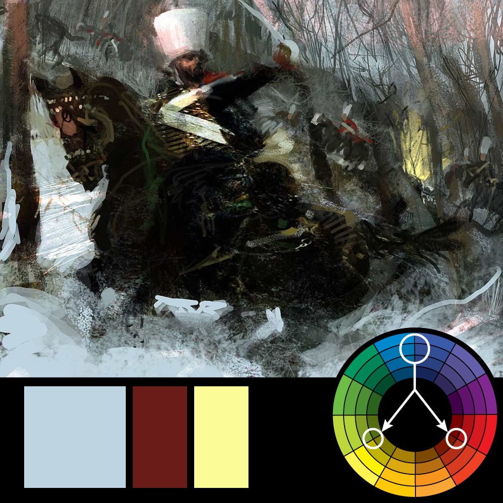
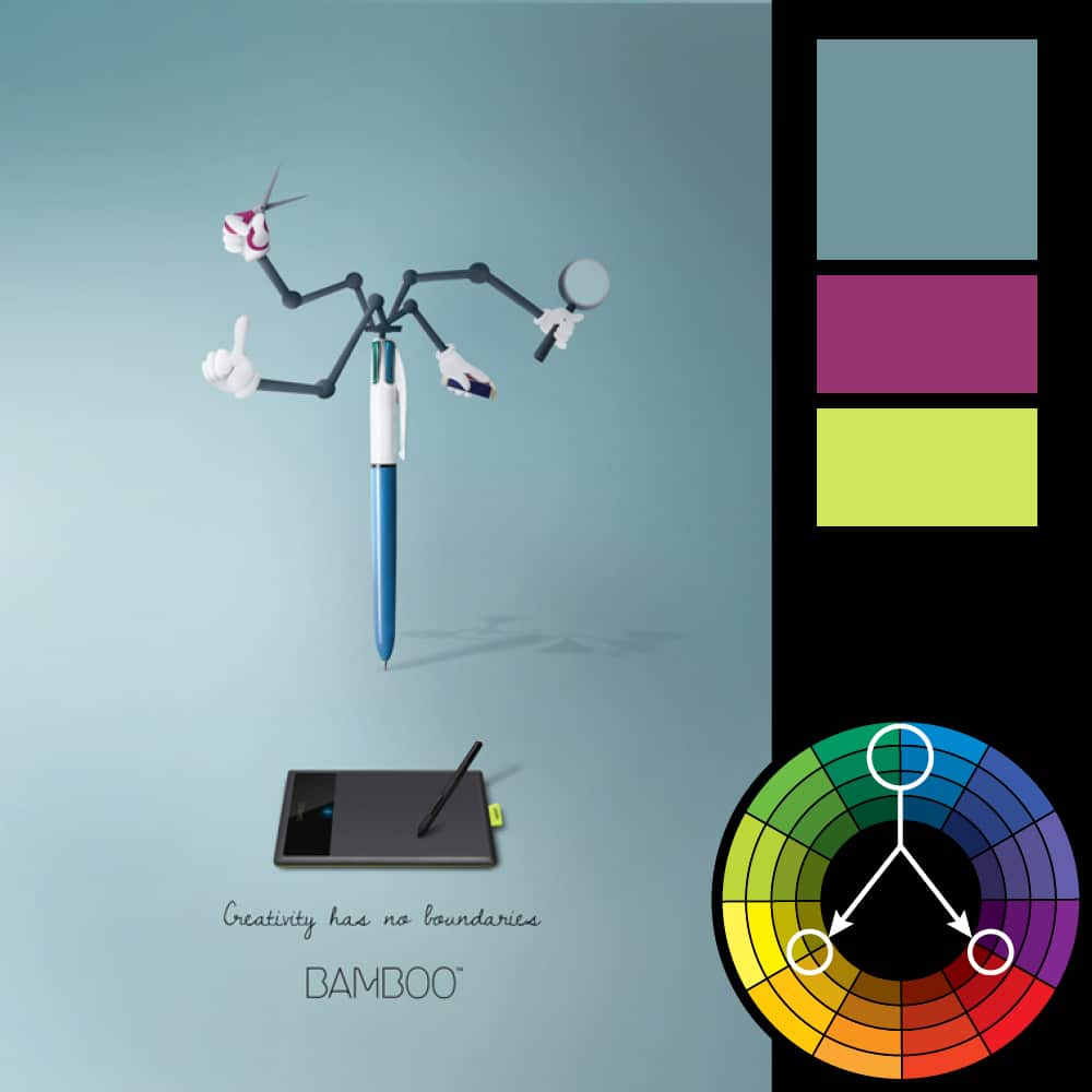
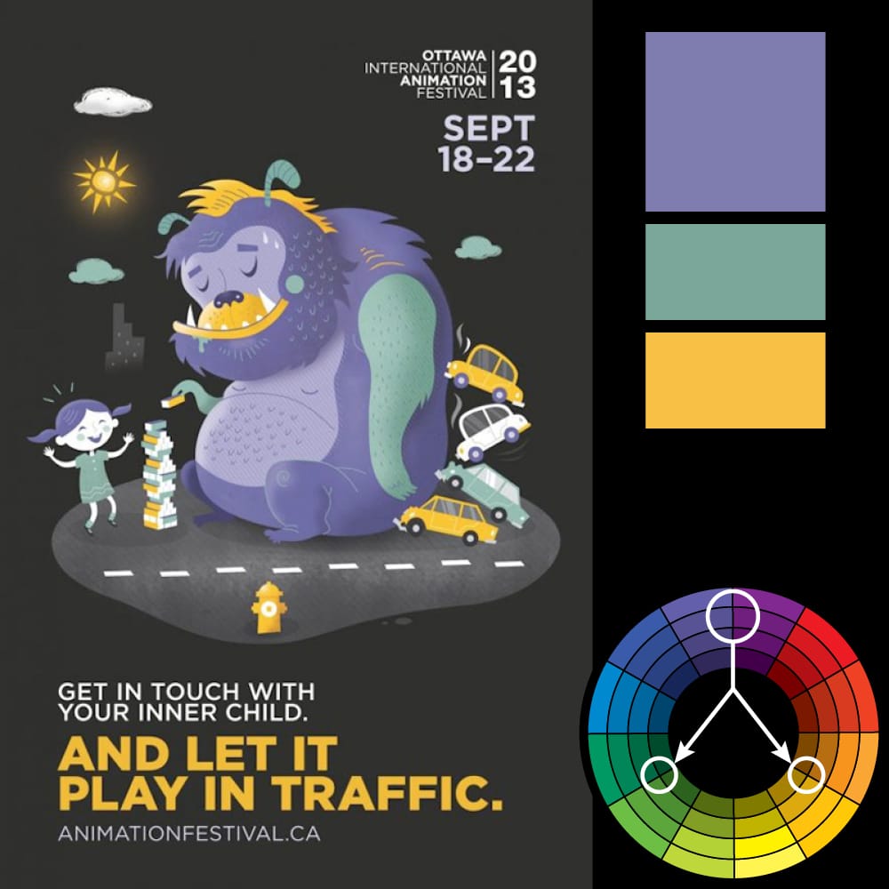
Triadic Harmony
You can click on an image to see it larger.

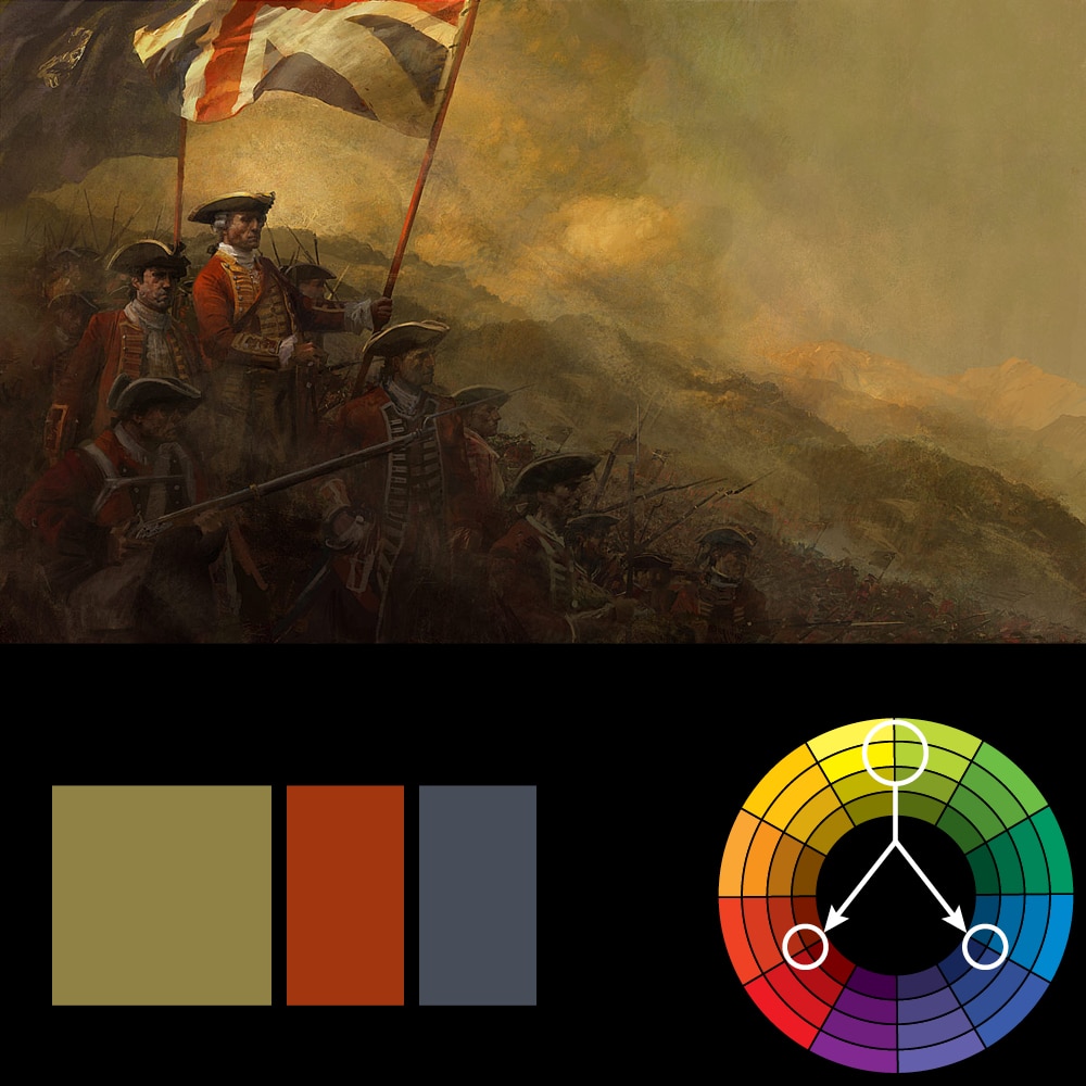

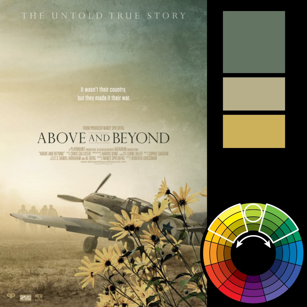
Analagous Harmony
You can click on an image to see it larger.


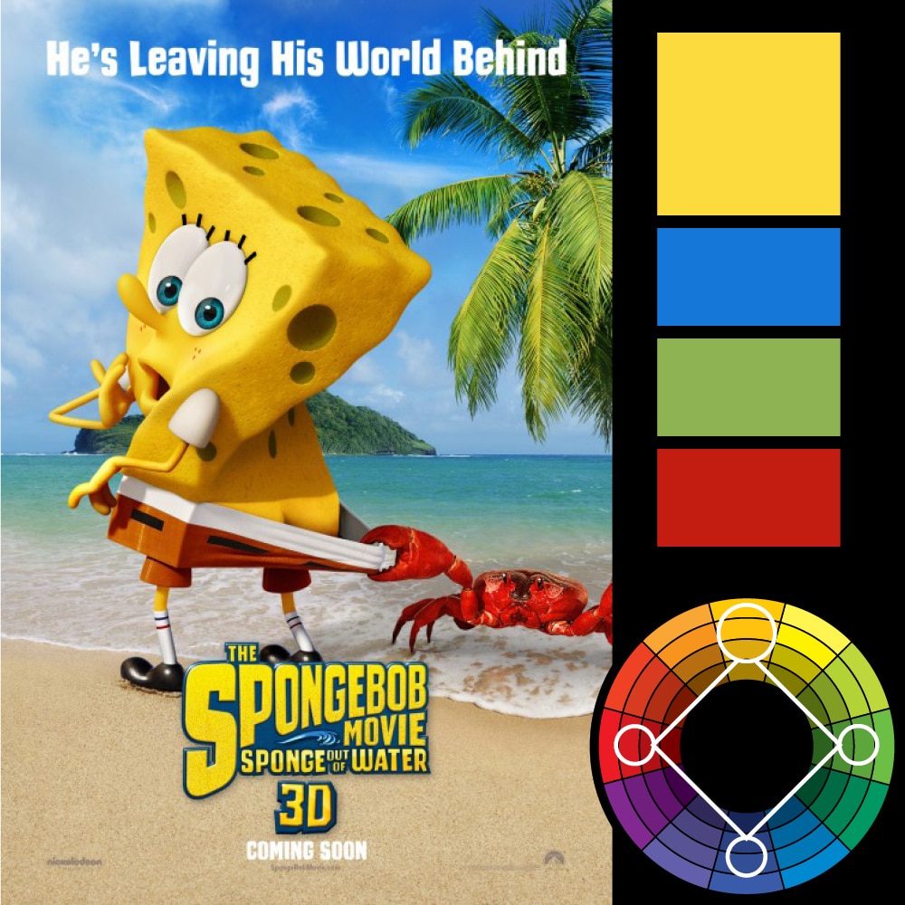
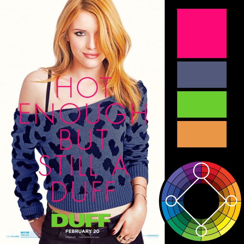
Tetradic Harmony
You can click on an image to see it larger.


Resources & Credits
There are numerous online color wheels, however my favorites are Paletton and the Adobe Color Wheel. Paletton is particularly nice in that it has an “examples” tab where you can see your color scheme in use on a few example images and layouts.
For a hard copy color wheel (which every designer should have), I don’t know of any better one than the one made by Grumbacher Art. You can purchase that here.
The art used above is commercial posters or advertisements and are used for example purposes only. There are a few pieces that I’ve used from two of my favorite concept artists—Craig Mullins and Daniel Dociu. Both are masters at using colors and studying the rest of their work against the color wheel is an exercise I would recommend to any designer.
Lastly, I’ve included the color wheel I used in this article as a layered illustrator file. You can download it below.


wow these graphics are amazing
Solid knowledge about color Harmony. Images are giving clear picture to readers. I have also published a blog. Here is the link of it. http://www.facecool.com/profiles/blogs/harmony-in-interior-design-focus-on-color-harmony
A very instructive article, well done!
Rikard, you’re awesome!
Hi, Sometimes there is no key color in one design. In other words, our design is split 6 colors for example in Mats.
What is idea about key color?
A design always has a key color. The key color can be intentional or by necessity. It doesn’t have to be your primary color — it can instead be the color you can’t change. If you feature a person in your design, then by necessity, a light peach/orange (skin tone) becomes a key color as it’s a color you can’t change. A blue sky. Green tree. Any color that can’t be changed can act as your key color. From that key color you can work out the rest of your colors. Look at the Guardians of the Galaxy poster in the example above — this poster pretty much uses every color it can get it’s hands on. But the designer had to create some depth, which necessitated using blue in the background so that the warmer foreground elements would pop out. Because this blue color, for the purpose of depth, can’t be changed, it becomes the key color of the design, around which the other colors can be chosen.
Rikard
I am a ‘colour deficient’ watercolourist… many times you senior.
In my wonderful journey to learn the “Colour Wheel’s” usefulness,
you can take credit as my best teacher.
I thank you.
PS love your CV, but more so your generous and intelligent contribution to this Colour Harmony explanation.
Thanks Bruce! Really glad you found it helpful.
c’est une tres bonne questions qui vaut la peine d’etre repondu.
moi meme je me demandais pourquoi c’est pantalon son mauve
Thanks for taking the time to put this article together. The real life examples are great. logo design brisbane
Hi ! I send you this message to inform you that I made a free adaptation in french of your article (with a link to your article) 🙂
You can see it here : http://www.aetherconcept.fr/secret-harmonie-couleurs-reussie/
Have a nice day !
Hey! Thanks for this amazing, extensive article on Color Harmony. Hoping that my students will be able to understand these concepts better with your examples. Cheers!
color harmony has nothing to do with manipulation. It’s a simple matter of what colors look best together. quotes about wisdom and love
Wow, this is an amazing article it helped me out with my students… The examples just made everything else go smoother and I’m thankful I came across it… Thanks, Work well done…
I have never come across such an article which have so extensively and so conveniently illustrated the understanding of colour wheel and that too with such apt examples. I have so convincingly understood the depth of its significance.
Saw this on the /r/coloranalysis sub-Reddit. Such a great piece. I think most would like to see more from you in there! Great design work.
Another prime example of Marketing Manipulation. You don’t want, or need what we provide.. So we’ll just manipulate your brain to do what we want rather than what you want.
I think you commented on the wrong article… color harmony has nothing to do with manipulation. It’s a simple matter of what colors look best together.
thanos car