I try to keep up to date with movie posters. They are a great design medium as they need to tell a story within one image. They need to create interest, attract and deliver a message. Further, a well designed movie title follows a lot of the rules of logotype.
That said, here are 15 movie posters of 2011 that caught my interest and which I consider great designs:
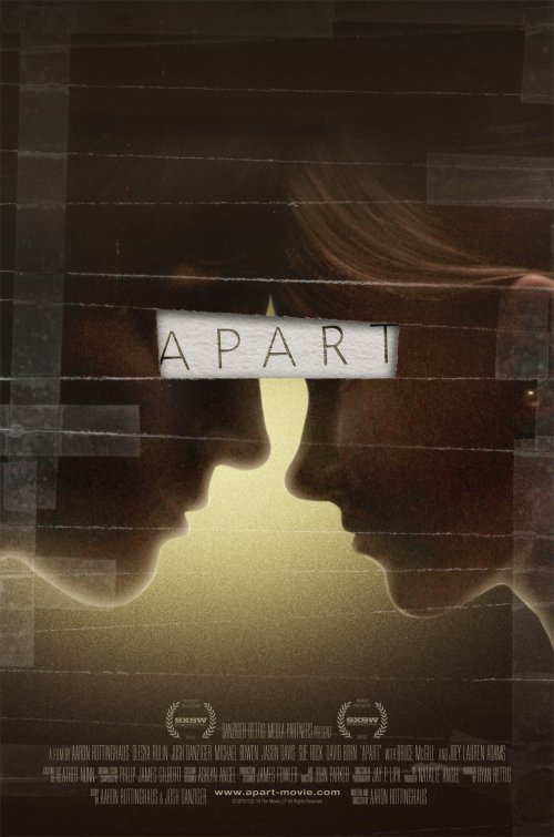
#15. Apart
Admittedly, this isn’t the strongest of the batch. But it has a clear message, interesting execution and a very simple colour palette. Generally, it’s a pretty cool poster.
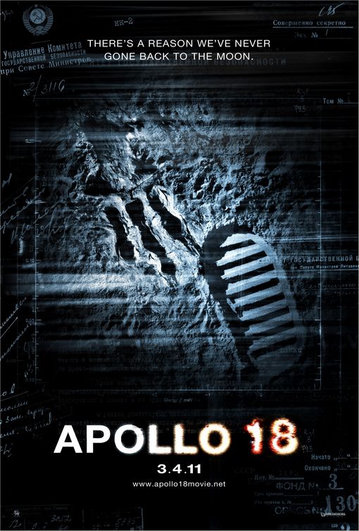
#14. Apollo 18
The central image of this poster says so much while showing so little. The recognizable astronaut moon footprint next to an alien footprint. Immediately you know what the movie has to offer. The text and “grunge” around the image is unnecessary and detracts from the poster. But the central image and even typography got it onto my list.
#13. The Cabin in the Woods
The design isn’t that strong. But the tagline is awesome. I did a separate post on these posters, each of which have a great tagline. Each of the obnoxious things that are the staple cliche of every horror movie is written out as a tagline.
#12. Captain America: The First Avenger
I’m usually not a fan of superhero movie posters as they all pretty much look the same, with just the central hero replaced. That said, I thought this poster was pretty darn cool! (Yes, the dirt is overdone.)
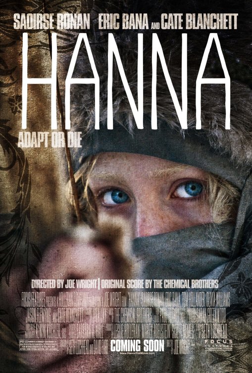
#11. Hanna
The font for “Hanna” doesn’t do anything for me and the graphically ovelaid flower pattern on the top left and bottom right are completely unnecessary. Moreover, the poster looks almost exactly like a female version of last year’s Robin Hood poster. And to be honest, I really, really don’t care that the Chemical Brothers did the original score. But all that said, the poster is mesmerizing. I simply can’t get my eyes off it.
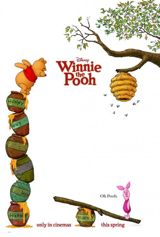
#10. Winnie the Pooh
Straying from the convention of most animated film posters, this one is simple, has a lot of white space and tells a great little story in one image. And the look on Piglet’s face is priceless.
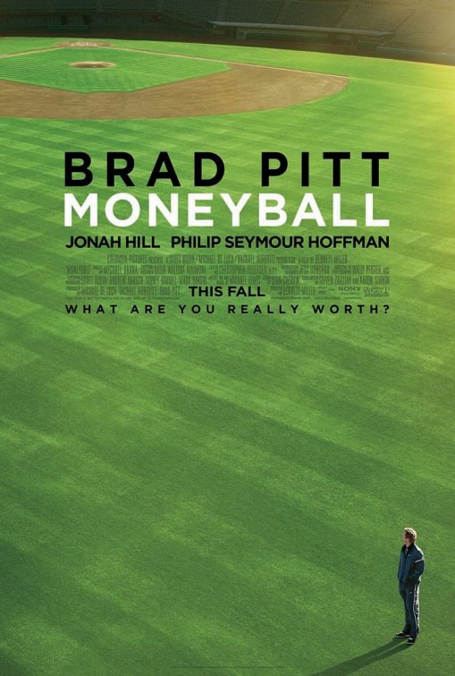
#9. Moneyball
Interesting composition. And while I would say it’s rather daring to not feature Brad Pitt on the poster except as a thumbnail in the bottom right corner, it appears his name is larger than the title of the film (which is kind of ridiculous).
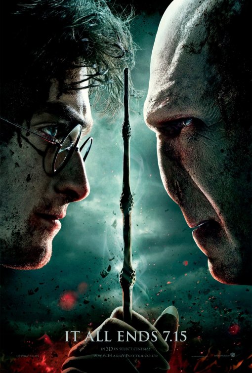
#8. Harry Potter and the Deathly Hallows Part 2
Although this poster doesn’t stray much from all previous Harry Potter posters, it is kind of cool to see Harry and Voldy facing off. Also, the grunge treatment works pretty well and all in all, the poster definitely says that this is a more serious film than all previous ones.
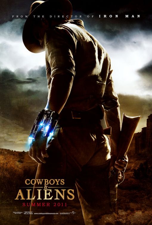
#7. Cowboys & Aliens
Although the movie was apparently a disappointment, let’s face it—the proposition of having cowboys fighting aliens is pretty darn cool. And this poster made it look outright badass!
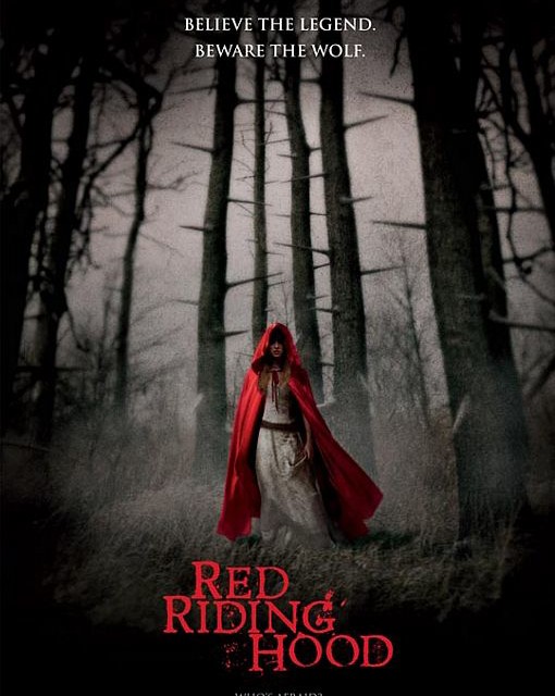
#6. Red Riding Hood
I’ll admit that I watched this epic failure of a movie. I had seen the reviews (not good) and new it was directed by the same woman who directed (Twilight) and yet I still watched it. Why? Because this poster is so damn cool! With this poster I’d expect an eerie, borderline horror retelling of the classic fairy tale. Unfortunately, we got a turd of a movie instead. But the poster still rocks.
#5. Scream 4
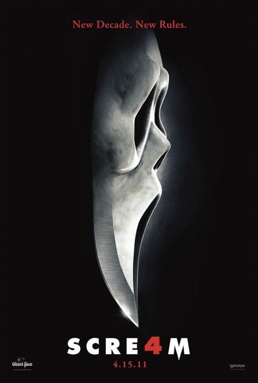
This is the third poster for Scream . The other two were useless. But this one is iconic and scary at the same time. And although there is too much letter spacing for me to appreciate the titling, the use of 4 as an A is quite clever.
#4. Dream House
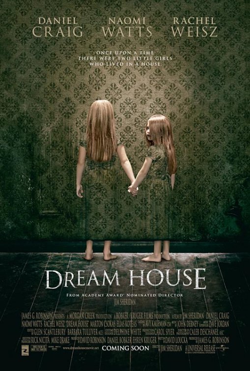
I don’t know whether or not this image is supposed to remind us of the twins in The Shining, but they do, which makes them all the creepier.
 The poster has it’s flaws: the perspective on the floor doesn’t make any sense and the titling is unnecessarily off kilter (using Trajan to boot). But in the end, the poster certainly makes you look twice, gets your attention and makes me want to see the film. All while not showcasing the two actors that would most definitely draw an audience to the film—Daniel Craig and Rachel Weisz.
#3. Fifty One
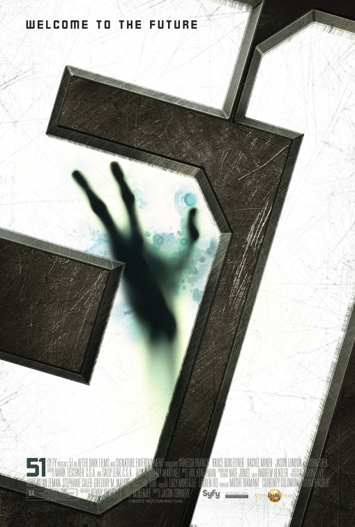
A clever idea—simple, interesting and tells us that this film is about Area 51 (which we all know as that place in New Mexico where all the aliens and spaceships are being kept). The tagline doesn’t make much sense, but otherwise a well executed poster.
#2. Super 8
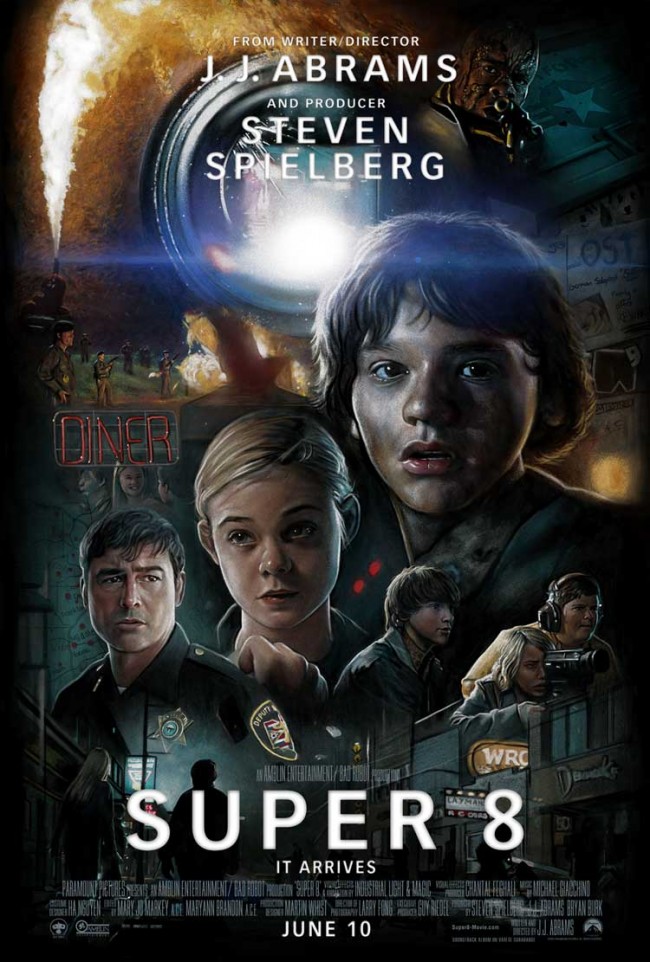
This poster is reminiscent of the great 80’s posters for such classics as Indiana Jones, Back to the Future and the Goonies. It says “Spielberg” just by its style (although not designed by Drew Struzen—the master of the painted movie poster—it is certainly inspired by him). With most posters being no more than a 2-hour Photoshop composite, it’s nice to see a poster so well done.
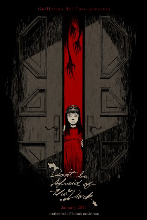
#1. Don’t Be Afraid of the Dark
Using only two colours, an illustration rather than a photograph and custom typography, this looks more like a book cover than a movie poster. And like a good book cover, the imagery stands alone. Even without the title, one can see the story, what it is about, the mood and so much more. Simply an awesome poster.
… and the duds
While going through a ton of posters to compile this list, there were a few so bad I just had to include them…
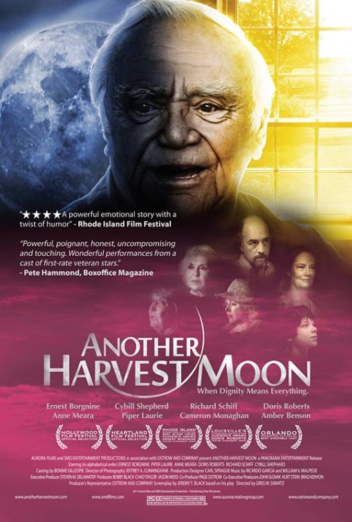
Another Harvest Moon
This poster is so terrible it would be at the top of my list for worst of 2010. It appears whoever “designed” this poster didn’t know the first thing about design…
- The colour palette doesn’t match any of the 4 colour harmonies—which is almost impossible, but explains why the colours look terrible.
- The “colourizing” is about as lazy as it gets.
- The bottom half of the poster looks like a pink disease with 6 random faces on top of it.
- The main character (old man) looks like he just rolled out of a grave. Is this a geriatric werewolf movie?
- Although minor in comparison to the rest, the two quotes aren’t even consistent in their typesetting. One is set in italic, the other isn’t.
The poster would have been better had it simply been the title against a black background.
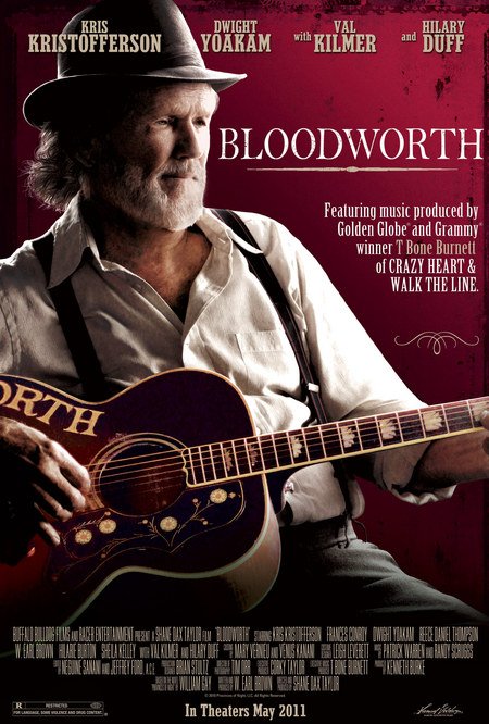
Bloodworth
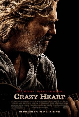
I can’t help but think this poster was a rejected version of the Crazy Heart poster.
X-Men First Class
This poster is just wrong.
Reference: Most posters on here were taken from www.impawards.com, an awesome resource for movie posters.

