Title Design is an art form in itself. Whether designing a book title, an album title or a movie poster title, the basic techniques and rules are the same. It’s a large subject and thus I’ve broken it down into 4 articles. This is the first, covering some basic rules of designing titles. And, as with all rules, they are made to be broken. But it’s my belief that a designer has no right breaking rules until he or she first understands and can follow them. I can assure you that Picasso knew all the basic rules of art and painting, composition and proportions before he then broke those rules.
So here they are:
1) Don’t try to outshine the graphics.
A poster, book cover or album cover is a single design, the title forming only one part of a larger whole. The title should support the graphics, not outshine them. A title that is competing for attention with the graphics is doing a disservice to the overall design.
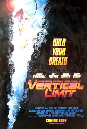
Here is a good example. The title is overdesigned and detracts from the image of the poster.
This leads to the next rule…
2) The less effects, the better. Avoid bevels, gradients, drop shadows and other stock Photoshop effects.
Leave gradients, bevels, inner glows and the like for video games, web graphics and amateur designs. They don’t have a place in title designs.
That said, drop shadows are acceptable only where they are necessary and never as a design element. Outer-glows are rarely useful except in the rare case, such as the Matrix titling. With the ease of adding effects to titles in Photoshop, it can be tempting. Simply don’t do it. It will cheapen your design.

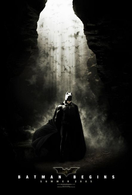
This is a good example. The Ghost Rider poster is riddled with effects—it has a gradient stroke, motion blur and a pattern overlay. On the other end of the spectrum, the Batman Begins poster has no effects. A simple font in plain white. Which looks more sophisticated? Which looks like a better movie? As it turns out, the titling never lies.
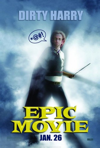
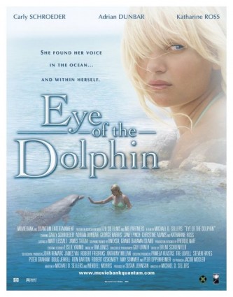
And to drive home the point, here are two more posters that use lettering effects:
One is a terrible movie and the other you’ve probably never heard of.
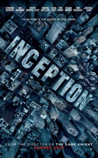
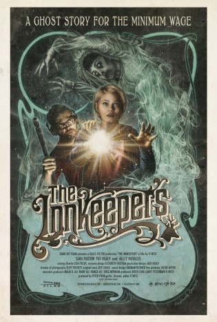
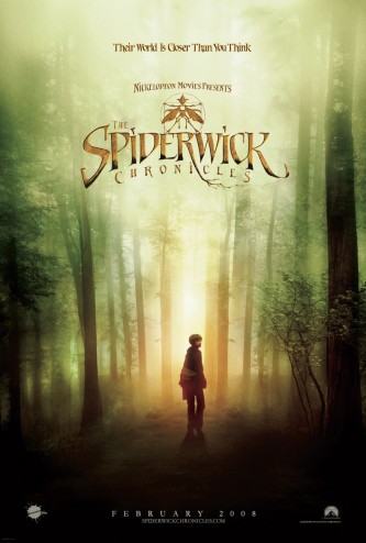
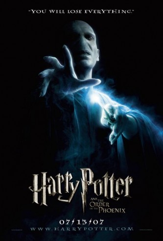
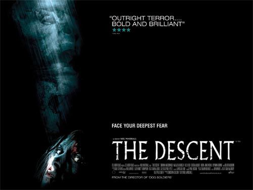
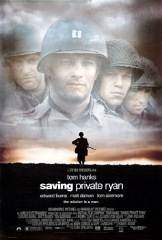
Exception: Some titles are a piece of art in and of themselves. These can stand as the entire cover or poster. They are usually created in 3D or are well illustrated.
Here are two excellent examples:
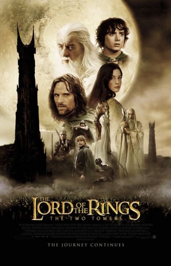
And here are some less impressive examples that use effects well on the titling:
I will mention here that grunge added to text is an effect that can be used effectively, some blur and even some graded colour can work well—IF used tastefully.
3) Stick to 1 or 2 fonts, no more.
Unless you’re writing a ransom note, stick to 1 or 2 fonts—3 at most. This is a basic rule of design but applies especially to titles. While having a secondary font is good to add texture, having three is usually unnecessary.
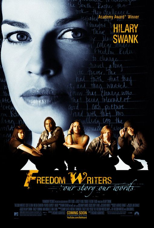
Here’s an example of a title using more than three fonts:
Here we have one font for the “F” another for the rest of the word. Then another font for “W” and yet another font for “our story our words”.
Not a very strong layout. It looks disjointed because it is.
4) Use fonts that match the subject matter and don’t draw attention to themselves.
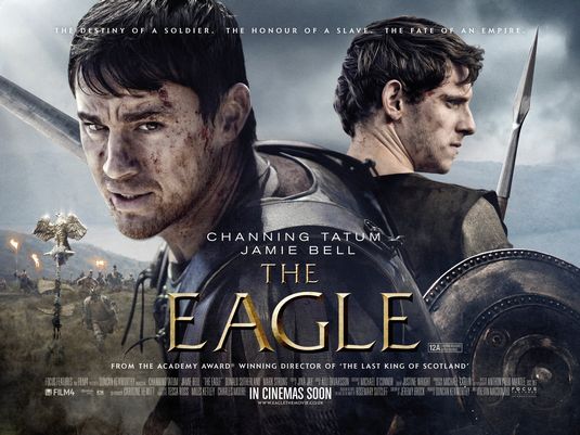
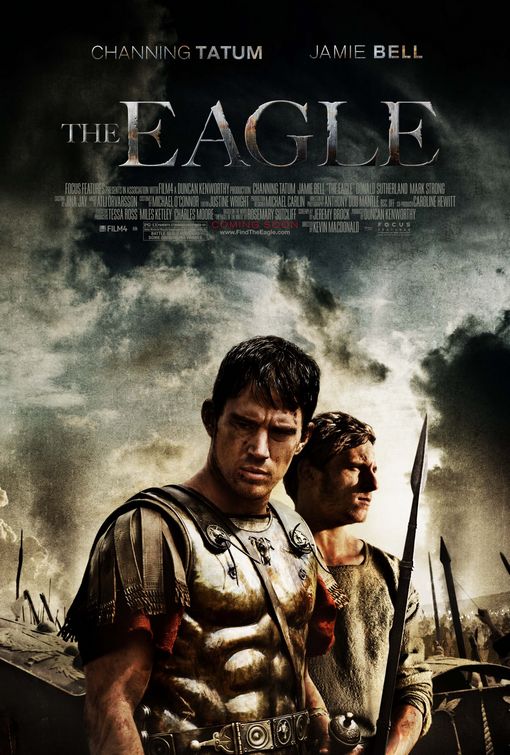
With thousands upon thousands of fonts available, there is pretty much a font for every emotion, message and genre. Some of these are good. Some try too hard. Western posters often use fonts that pay homage to the fonts used in western “Wanted” posters. This is fine and appropriate. However, a font that is decidedly from the era of metal-type printing doesn’t belong on a poster for a movie about Ancient Rome.
Here is another great example:
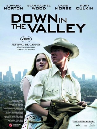
The poster on the left uses Bank Gothic for a movie that is clearly about a cowboy. Simply doesn’t make sense. The photo on the right, which came later, appropriately used a western font.
5) Follow the basic rules of grammar, punctuation and typography. Don’t stretch fonts. Don’t track lowercase letters. Don’t use italics. And NEVER italicize all caps.
As a designer, you need to learn the basics of typography. And use these when designing. Here are a few off the top of my head:
1) Don’t track lowercase letters.
2) Don’t stretch fonts. Or, more properly, don’t stretch fonts to the point where you can see it has been stretched. Trajan is a font that can be stretched quite well without it being obvious. On the other hand, a font with a circular “O” would not stretch well. Designers will obviously notice stretched fonts more than your average Joe Blow, but even if a designer notices it, you haven’t done your job well.
Here’s an example of a title where I immediately saw that the title had been stretched (in this case made taller):
3) Don’t use italics for a title. The fact that it is the title already places emphasis on it. Adding italics is thus unnecessary and doesn’t look good.
4) Capitalize proper nouns. For titles, capitalize all words except conjunctions (and, or, but). Some titles use all lowercase. This is okay if it actually serves the design. But if the title has an “I” as a first person pronoun, then this wouldn’t work. Unfortunately the designer of this poster thought it would. As a result, the movie bombed in the box office (I actually don’t think this was the reason, but it could have been):
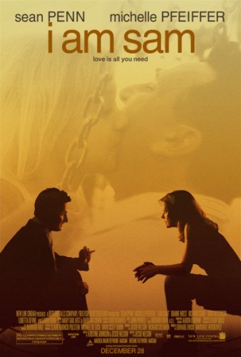
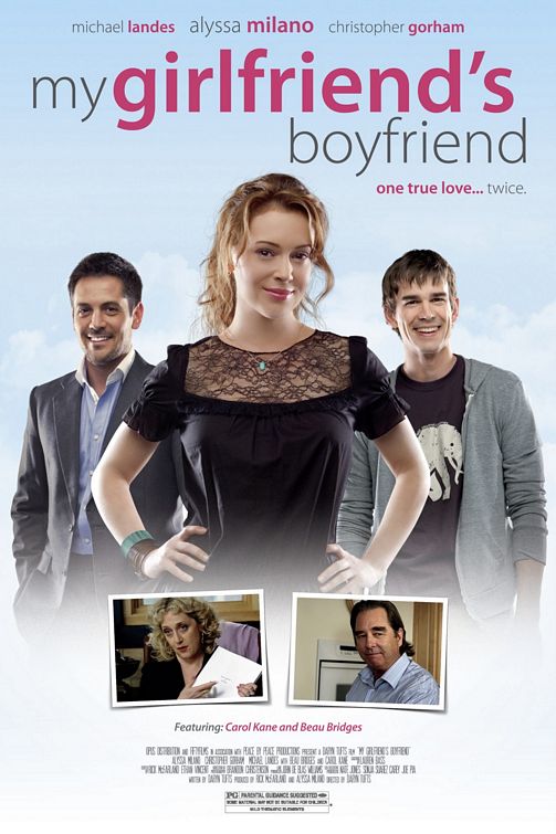
On the other hand, here is a poster that uses lowercase letters quite well:
5) Properly kern the title. Kerning is the adjustment of the individual spaces between characters. All typesetting programs do this automatically. However, when you’re designing a title, you should take the time to go through it and make any needed adjustments manually. Here’s an example of bad kerning:
There’s far too much space between the “A” and the “V”. Consequently, the titling design looks amateur.
Summary
Okay, there you have it, my 5 basic rules for designing titles.
I should make a mention of overused fonts, although there really isn’t a rule about not using them. The most prevalent font on movie posters is Trajan. It has even become known as the “movie font”. Another font that is used all too often is Bank Gothic. And, more recently, the use of Helvetica Condensed Bold is becoming annoying. But there is no rule against using them. Sometimes they are the perfect font. And there is a reason they are used so often—they are great, versatile fonts.
Good luck!







Thank you for your article!
I have a question to which I can’t find any certain answer. when breaking the titles between lines do we have to leave the preposition on the first line, or could be pass it to the second line?
Great question! I usually move the preposition to the next line but this is something that will vary depending on the title. “Romeo and Juliet” is one where it could be on either line. “Harry Potter and the Sorcerer’s Stone” — put it on the second line.
Hello! Would you mind if I share your blog with my facebook group? There’s a lot of people that I think would really enjoy your content. Please let me know. Thank you
Yes, go ahead and share. Please link bank to the site wherever possible.
Your style is so unique in comparison to other folks I have read stuff from. Thank you for posting when you have the opportunity, Guess I will just bookmark this page.
Very nice post. I just stumbled upon your blog and wished to say that I’ve really enjoyed browsing your blog posts. After all I will be subscribing to your feed and I hope you write again soon!
Very good write-up. I certainly appreciate this website. Keep writing!
Hi! I’ve been reading your site for a while now and finally got the courage to go ahead and give you a shout out from Huffman Texas! Just wanted to tell you keep up the excellent work!
Good article. I absolutely love this site. Keep writing!