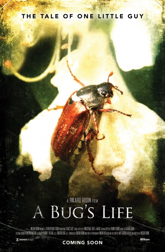
Here are 5 easy steps to creating a movie poster. For this tutorial, I’ve used a mock poster for a movie called “A Bug’s Life” (I know it’s a Pixar rip-off, but I already had a photo to go with).
1. Get a good photo.
Pretty obvious. You need a good photo to turn into a movie poster. If you’re doing a poster for an actual movie (not like my example), then get a good still from the movie. And a screen grab won’t do. You have to get an actual photograph. It could also be a photograph taken after the fact FOR THE POSTER.
Here’s the photo I used (taken with my Nikon D90):

2. Add some effects to the photo.
Very few posters are a straight photograph. Most, if not all, have had some manipulation done to the image. There’s a lot to be said about photo manipulation for posters and there’s a lot of tutorials you can find. Trying to cover it all here would be impossible but if it’s a person, then basic retouching is pretty much a must. As a broad statement on this step, the effects should:
- Draw attention to the primary subject of the poster—the center of attention.
- The effects should be relevant to the message of the poster.
- The effects should not be there for the sake of being there.
For my poster, I first added some blur to the top and bottom of the image and also vignetted it. This draws attention to the bug in the center of the poster, which is the “main character” of my poster.
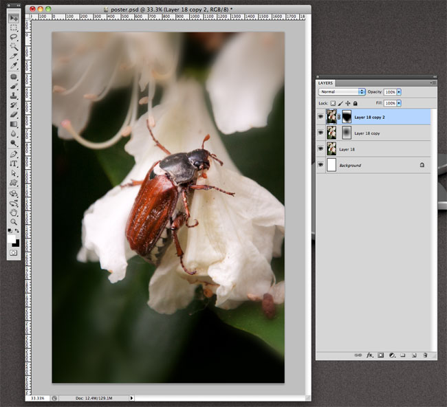
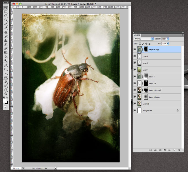
I also added some grunge, which you can see around the edges.
3. Give the poster a title.
All movie posters need a title. Kind of obvious, but worth saying.
At some point, I’ll do a post on designing titles. But suffice it to say, that on my mock poster, I’ve used the cliche movie poster font: Trajan! Probably used on more posters than any other typeface, but there it is. It works and it looks good (which is why it is used so often).
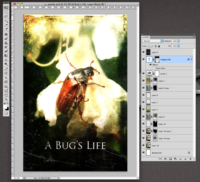
I added a bit of grunge to the title. Otherwise, AVOID effects on movie titles. A drop shadow if needed and that’s about it. Anything else will make it look cheap. Take a look at a bunch of movie posters and you will see that the good ones don’t have text effects. Bevels, gradients, outer glows, etc., don’t belong on a movie poster title.
4. Add the credits to the bottom of the poster.
This is easily overlooked as a technicality. DON’T IGNORE IT. If you did only one step, do this one. It will take your image and turn it into a poster. Use the MOVIE POSTER font. You want the full credits at the bottom along with a couple “studio” logos. You should also have a small title right above the title. This is usually the name of the director, producer or studio. In some cases, it’s the name of the actor. You will see this above any good movie poster title: A STEVEN SPIELBERG FILM (or any other director).
The easiest way to do this step is to take a movie poster for a blockbuster film, copy it exactly and then ONCE YOU’VE COPIED IT EXACTLY, change the text. For my movie poster, I copied the SUPER 8 film credits.
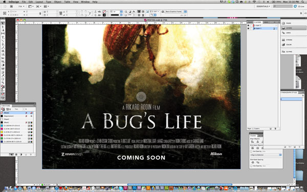
I also added the “COMING SOON”. You could replace this with a date.
5. Add a tagline.
A good movie poster needs a good tagline. Some of the most memorable posters also have the most memorable taglines. The Alien poster—”In space, no one can hear you scream.” Classic. Like the bottom “small type”, a tag line adds credibility to the movie poster.
With the tagline added, my movie poster is complete. I’ve included it at the bottom of this article.
There you have it, creating a movie poster in 5 easy steps. Good luck!




I have been student and i learned that i need something like this!
I was raelly confused, and this answered all my questions.
Pretty insightful and helpful! I’m really interested in the one you mention on fonts (other than Trajan!).
Your ansewr was just what I needed. It?s made my day!