One of the first things to learn about color is the difference between RGB and CMYK. I imagine most designers already know the difference. But I’ve met some people who work in design and assume they know the difference while really just knowing what each one stands for.
So let’s start with some definitions.

RGB stands for Red, Green and Blue. It is a color space—a means of representing color—that is based on light. Through the combination of red, green and blue light any other color can be created. Because of this, these three colors are referred to as additive primaries. Primary is in reference to the fact that they are the base colors used to create all other colors. Additive is in reference to the fact that white is created by adding equal parts of all three. Conversely, black is created by the complete absence of red, green and blue light.
CMYK standards for Cyan, Magenta, Yellow and blacK (or Key). These are the subtractive primaries. Like red, green and blue, these colors—mixed together—can create all other colors (this is theoretical, see below). Subtractive is in reference to the fact that subtracting all of these colors creates white. And mixing equal parts of all these colors together creates black. (For the absolute beginners, cyan is an aqua blue color. Magenta is a strong pink color.)
So why two color spaces? The simple fact is that RGB is based on light. And printers can’t print light.
The RGB color space is used by monitors (TVs, projectors, etc.). CMYK is used by any printing method (paint, dyes, etc.).
Now that we have some basics out of the way, let’s go a little deeper.
The Differences
Aside from the obvious differences between RGB and CMYK explained above, there are real differences that a designer must be aware of.
- First and foremost, more colors can be created in RGB than in CMYK. Every color space has a gamut. And while there are more color spaces than just RGB and CMYK, we’ll stick to these for the purpose of this article. A gamut is the full range of colors that can be recreated within a color space. Overall, RGB has a much larger gamut than CMYK.
- Blues normally look better in RGB than in CMYK. You can have a great looking blue on your screen (RGB) that prints like a flat purple.
- Bright greens will look flat when converted from RGB to CMYK.
- Some reds and burgundies look better in CMYK than in RGB.
What to Use When Designing
The simple answer is RGB.
When you are working on a design in Photoshop or some other editing/compositing program, you should use the RGB color space. There are two reasons for this:
- In today’s audiovisual world, it is more than likely your design will be multi-purposed for web or video use. Having your original design in RGB will mean the nicest design possible.
- There are a lot of blending tools and effects that will work in the RGB color space but will not in CMYK. A good example is the screen blending mode—extremely useful in design. Works in RGB, is terrible in CMYK.
Thus the best design method is to design in RGB and convert to CMYK as close to the printing stage as possible. If you are working on a design that starts in Photoshop, goes through InDesign and finally prints from a PDF, then convert to CMYK while PDFing.
So are there any scenarios where it is better to design in CMYK? Yeah, afraid to say there are. While there are probably a few, the one that comes to mind is a design that is predominantly grey. And predominantly is the key word—because designs that are entirely grey should be done in greyscale. Let’s take, for example, a photo of a silver globe. There’s some subtle color in the reflection, but it’s mostly grey. If this is created in RGB, the grey will be made up of equal parts of red, green and blue. When converted to CMYK, it will be made of equal parts of cyan, magenta and yellow. This will be very hard to control when on press. And, more than likely, will come out pink when printed.
But if the design is being created in CMYK, you can control the grey and create it using the black channel. The result is that the item will actually print looking grey with almost zero effort by the printer.
Color Correcting for Print
In many cases, no color correction is required when converting from RGB to CMYK. But it’s a good thing to preview your RGB image in CMYK before converting. If you are using photoshop, go to the menu VIEW > PROOF COLORS. This will show you what the image will look like when converted to CMYK.
You’ll usually notice differences in the bright blues and bright greens.
For greens, use a SELECTIVE COLOR adjustment layer and pull out cyan and add yellow. Do this until you see the detail come back into the image.
For blues, also use a SELECTIVE COLOR adjustment layer—pull out magenta, add some cyan and some black. This will avoid the blues turning purple.
Obviously the above is a simplified version of everything that goes into color correction. But rest assured it will handle 90% of the problems you run into.
Other Incidental Facts
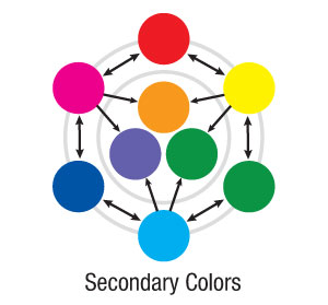
 Secondary Colors: The mixing of two RGB colors results in one of the CMY colors and the mixing of two CMY colors results in an RGB color. Red and green result in yellow. Red and blue result in magenta. Green and blue result in Cyan. These can be a bit confusing because colors are created by the mixing of light. The CMY combinations are more obvious—Cyan and Yellow result in green. Cyan and Magenta result in blue. Yellow and Magenta result in red.
So are there any secondary colors that are actually secondary? Well, secondary colors commonly refer to
the “in-between” colors of Orange (Yellow plus some Magenta), Violet (Cyan plus some Magenta) and Green (Yellow plus Cyan).
In addition to equalling each other in mixing, every RGB color has an opposite in CMY. This is good to know when color correcting.
Red is the opposite of Cyan
Green is the opposite of Magenta
Blue is the opposite of Yellow
So if you have a photo that is too pink and you are working in the RGB color space, you can add green to counter act the magenta.
Summary
As a designer, it’s important to know the differences between RGB and CMYK, when to use them, their advantages and disadvantages.
Hopefully this article will help.


Cool blog! Is your theme custom made or did you download it from somewhere? A design like yours with a few simple adjustements would really make my blog jump out. Please let me know where you got your theme. Cheers
Wow – so true, I knew when to use but never really understood the ins-and-outs of it. Stumbled and tweeted 🙂
Home run! Great slugging with that asnewr!
Great post. You did a great job explaining the differences and when to use them. I will keep this in mind on future design projects.
Thanks.
Thod24
TYVM you’ve sovled all my problems
Short for Hexadecimal, Hex is a color model used within HTML and other Web programming languages. Computer Monitors