The Hollywood Reporter defines the term “key art” as “the singular, iconographic image that is the foundation upon which a movie’s marketing campaign is built.”
It is the image that appears on the film poster, in magazine ads, on the DVD/Blu-Ray Cover and on the streaming movie thumbnail.
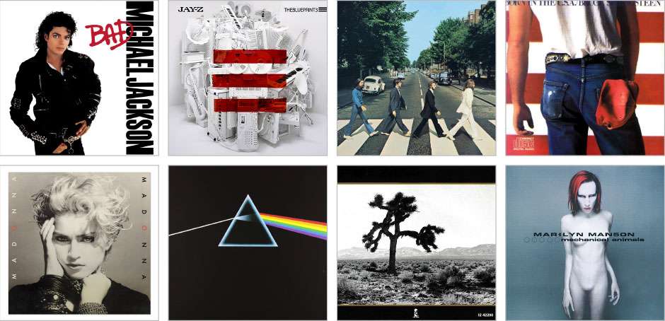
From a graphic design perspective, key art can be extended from the realm of film to any intellectual property. A book cover, an album cover, a game cover—all of these have key art that is repurposed across the marketing campaign. And the good key arts—the ones that leave a lasting impression—immediately bring to mind a title, without ever having to show it. They have become a part of pop culture—they are iconic and they are memorable.
Art vs. Design
Art and design aren’t one and the same. The purpose of art is to communicate to it’s viewer on a subjective level—to resonate in some fashion; to provoke some form of emotion, even if just admiration.
The purpose of graphic design is first to attract, create interest and then deliver a message. The message delivery is the ultimate purpose and is accomplished through information hierarchy—the balance, placement and composition of a message in a way that it will be most easily assimilated and understood.
Art can be done for art’s sake. Design cannot. The end result of design is never the design—it is a person interested, a person buying, a person accepting an idea.
In the case of a movie poster, the purpose is to get people interested in seeing the film. If an actor is the reason most people will see the film, then featuring the actor makes sense. If the character is the reason people will see the film, then featuring the character makes sense (superhero films). Look at most movie posters and you will see right away what the marketing folks thought would sell the film.
A book cover has a different, but similar, purpose. With a book cover, you need to grab someone’s attention long enough that they will flip the cover and read the back. And the purpose of the back is to be interesting enough that someone will buy the book. The full design still follows the pattern of attract, interest and deliver a message.
A video game cover falls somewhere in between a movie poster and book cover—it needs to sell the graphics but the story, theme and gameplay are just as, if not more, important. So it has a dual purpose of selling the graphics while also getting people interested in the story and gameplay.
A music album is unique in that people buy an album based on the artist or a song they heard. In this case, the album works as a brand reinforcement for the artist. With streaming services, I think the significance of an album is diminishing and with it, the album cover. Which is a shame as albums were once as significant as book covers and movie posters in popular culture—if not more so.
Blurring the Line
So why key art and not key design?
Key art blurs the line between art and design in that it is, in and of itself, a piece of art that should be able to stand on its own. The graphic design happens around it—either framing it or reinforcing it or, in some cases, working intrinsically with it to create a final design.
Movie posters are hung on walls. Book covers decorate bookshelves and coffee tables, as do album covers and game covers.
The same cannot be said of fliers, brochures, magazine ads, websites, banner ads and other graphic designs. These things have a short lifespan. Movie posters, especially good ones, will be around for decades. Book covers become collectors items. And album covers do as well.
What Makes Great Key Art
So what separates the mediocre key art from the excellent key art? A whole lot of factors that are far too wide and varied to cover in a single article. But here’s a cheatsheet of the questions you should ask of your key art—a litmus test of sorts:
1) Is it memorable?
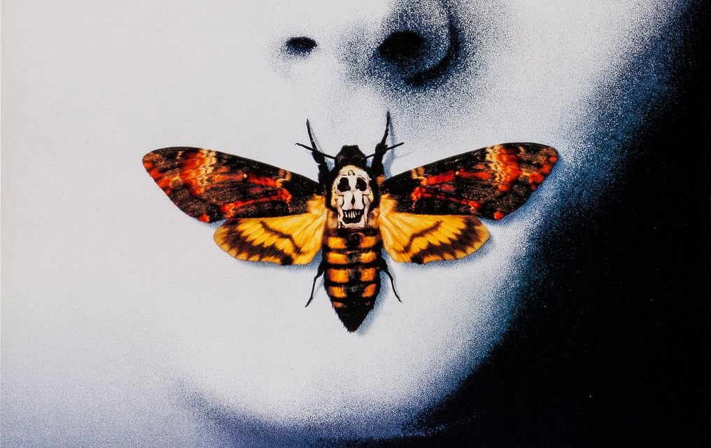
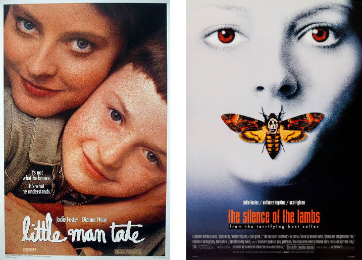
In 1991, Jodie Foster starred in two films. Both posters featured a photo of her. One looked like a typical family portrait that you might find filling the photo frames at Walmart. The other features a moth.
To create a memorable image requires imagination, a willingness to deviate from the expected and a bit of luck. Movie posters are all too often plagued by formulaic imagery, repeated over and over again with different characters and different settings.
There are articles dedicated to movie poster cliches. You can try to create an image that doesn’t fit into any of these cliches, but the reality is that almost any image CAN be categorized, especially if there are enough categories.
And this is where some imagination comes in. Here are three iconic movie posters.
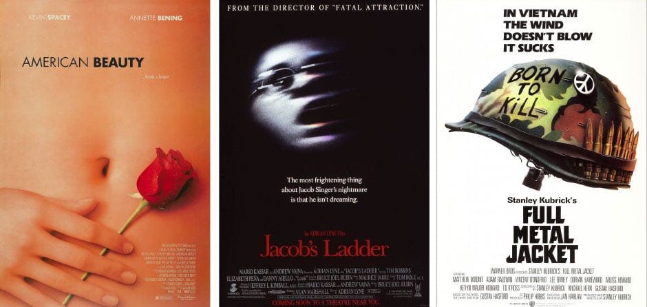
Crop, negative space and isolation are used effectively here to create some very iconic movie posters.
Let’s take a cue from the American Beauty poster and “look closer…”
- American Beauty uses a crop that feels almost voyeristic—giving you nothing to look at except a naked woman’s torso, offset with a single red rose. It’s an image that is both captivating, sexy, beautiful and a bit unnerving all at the same time.
- Jacob’s Ladder blurs the image of the movie’s star and isolates it in black. The strange coloring, the eye in focus—it all gives a sense of dread and dreaminess. You can’t help but be captivated by the image and yet still feel confused by it.
- Full Metal Jacket shows the dichotomy of war in an isolated helmet—“Born to Kill” and bullets are book ends to a peace sign, which your attention is drawn to with a small flare. The entire point of the film in a single image—pretty genius.
It’s interesting to note that all of these posters (and virtually all iconic movie posters) have key art created strictly and only for the poster. These aren’t photos taken on set. And they definitely aren’t frames taken from the film itself. Some include imagery that don’t even appear in the film.
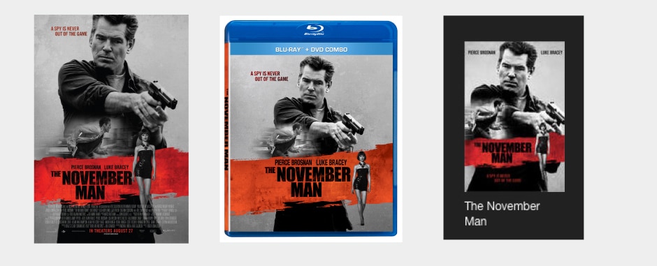
Compare that to these mediocre posters, all of which seem to follow the trend of taking images from the film, putting a title on it and calling it a poster.
2) Does it evoke an emotion?
This is the intrinsic purpose of art—to resonate subjectively. And it comes into play in the creation of key art. Fear, uneasiness, happiness, joy, excitement, intrigue, anxiety. Everyone wants to feel something. And key art that makes you feel something is immediately a step up from the competition.
Creating an emotional impact with a single image is no easy task. And it’s becoming more of a challenge as people become desensitized to violence, gore and sex. But shock and awe aren’t the only emotions to convey.
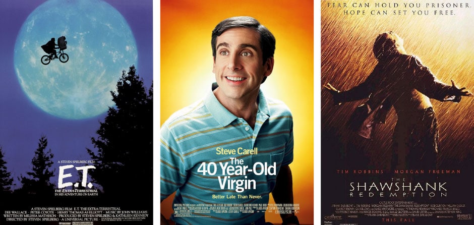
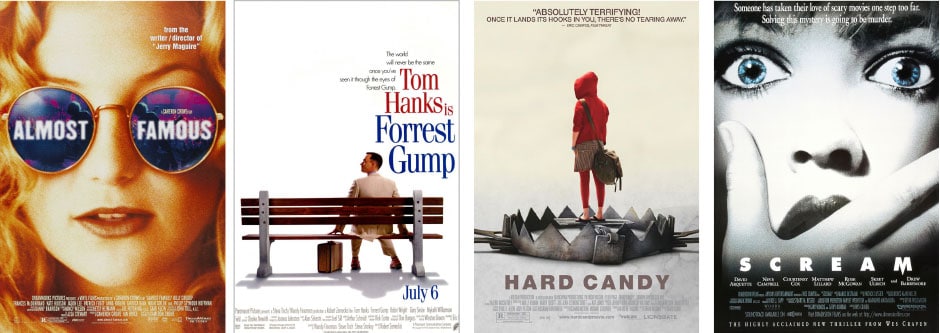
Here are some posters that evoke happier emotions extremely well:
3) Does it deliver a message?
A photo of an actor can be just that—a photo of an actor.
If your marketing brief is to feature the actor, you can take two very different approaches. The first is to literally feature the actor. While this might sell a movie, it’s a piss poor approach to a movie poster and most likely not help sales.
The second approach is tell a story through the image of the actor.
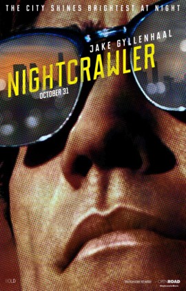 The poster for Nightcrawler says a lot more than you would initially think.
Here’s a man wearing sunglasses after the sun has set—that makes him suspicious, maybe he has something to hide? And why is he furrowing his brow? It’s in LA (shown by the skyline). The poster looks like a pulp cover with the pronounced rosette pattern and screen printed lettering—giving you an idea of the tone of the film-—most likely crime noir. The distinctive lips tell you it’s Jake Gyllenhaal, but something about him looks different than we’re used to seeing him. And the crop of the image is super close, telling us this is a portrait of a man—a story driven by a single character.
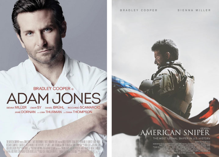
Compare these two posters. Both feature a nearly full body photo of the primary character. But one is actually designed as a piece of art and the other is just a photo with a title slapped on top of it.
This leads to the last and probably most important point.
4) Does it invite contribution?
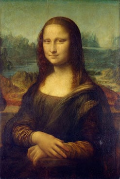 A great piece of art invites the audience to contribute to it. The Mona Lisa isn’t a particularly great portrait—in fact a 10 second internet search will find portraits far better—but it has something other portraits don’t—a faint smile. A smile that could mean so many things to so many people.
Some of the best posters and covers are those that leave room for the audience to project their own thoughts and ideas into it. To fill in some of the blanks with their imagination.
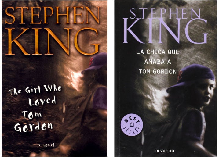
This is especially important in book cover design. One of the rules I have for myself is to never feature a face of a character on a cover. The reason for this is simple—your idea of the character may be different from mine. But more importantly, it allows you to contribute to it.
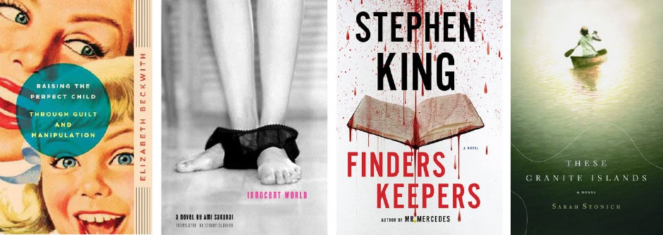
Compare these covers for the same book. One shows the girl’s face and the other doesn’t. Which is the stronger cover? Which pulls you in? Gets you more interested?
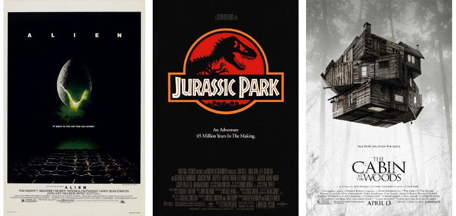
Movie posters are obviously a different animal in that the characters are shown, but that doesn’t mean the same principle can’t be applied. The original poster for Alien didn’t feature a xenomorph—instead it featured a cracking egg with green ooze coming out of it. Thus the audience is left to “fill in the blank.” This actually heightened the movie-going experience as people seeing the original didn’t know what to expect. Even the trailer didn’t show the alien.
This also doesn’t mean every piece of key art shouldn’t show you the actors or characters in the film—remember the most important thing is that the design delivers it’s message and gets people to SPEND THEIR MONEY ON IT.
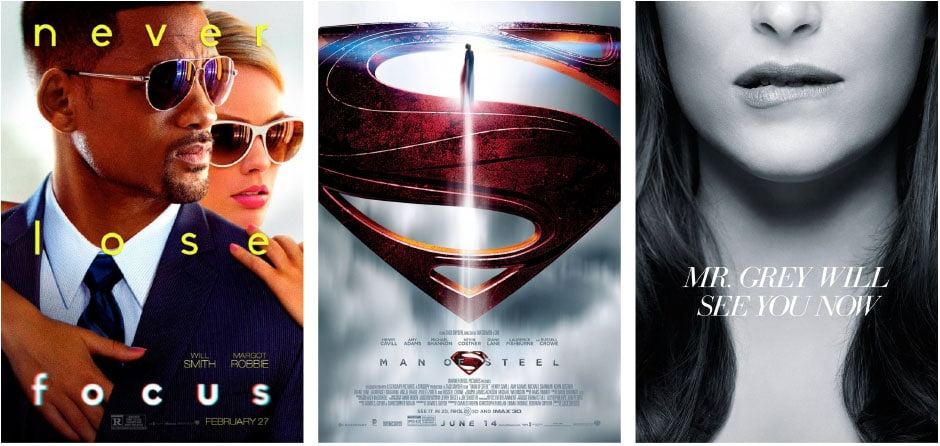
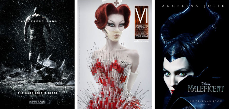
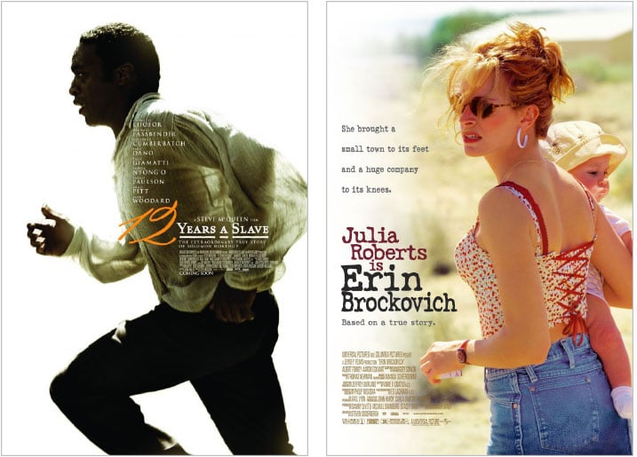
These posters all feature the character/actor on the cover, yet they do so in an interesting and different way that allows you to project your own ideas and feelings on them.
Summary
Creating key art is one of the more challenging aspects of graphic design—and also one of the more fun parts of the job. You get to truly be an artist. This article only scratches the surface of key art. Composition, color, typography and all manner of other things come into play, but this should give you the nuts and bolts of what separates the great from the blah. And if it’s worth doing, it’s worth doing right.






Really liked your article. Googled Key Art as I didn’t know what it was but Disney Insiders had some pieces on offer and I was curious. Your article explained it beautifully. Thank you! Only thing, as an old retired elem. teacher, I did wonder about the statement ‘furling of the brow’ in regards to “Nightcrawler”. We furrow our brows. I believe furling has something to do with sailing.
Thanks! And nice catch on the brows… I fixed it.
You’re wrong about art vs. design. Art doesn’t need to “evoke” or “communicate”…it can express. Also, you’re completely backwards on what is the trend. The posters for Blackhat and It Follows are actually more interesting in how they juxtapose extreme close-ups with wider shots of thematic elements. If you’ve seen the films, you’d understand the symbolism.
You like the cliche stuff, following the Kool-aid logic of the design world. Posters like Nightcrawler and Silence of the Lambs ARE the trend. It’s more ambitious these days to use actual frames or photography from the film, but according to your condescending thinking, the designers are merely slapping a title on. See propaganda’s work, they use almost exclusively photos or frames and their work is among the best. You may want to challenge the prevailing logic once in a while. You may learn something.
Thanks for your thorough response! I really appreciate it. “Express” is just another word for “communicate.” On the Blackhat and It Follows posters—I’ve seen both films and simply don’t find the posters interesting at all. There was another poster done for It Follows that I found infinitely better than the juxtapositional poster. You can check it out here: http://www.impawards.com/2015/it_follows_ver2.html. This one DOES have some symbolism and separates it from the cliched juxtapositional poster.
To me, the juxtapositional poster IS the cliche. It’s the “easy” method for creating posters and thus a lot of posters use this method. But that isn’t to say that using photos and frames is inherently wrong or that amazing posters can’t be done with this method. The Shawshank Redemption poster uses a photo from the film and is one of my favorites.
Silence of the Lambs is anything but the trend. There’s a reason it ends up on every list of “best posters.” Posters that good become a part of pop culture and SET the trend for years to come.
I’ll check out Propaganda’s work.