I’m doing a catch up on my yearly movie poster reviews. Here’s a round up of some great movie posters of 2012. I’ll be doing one for 2013 soon, followed by this year.
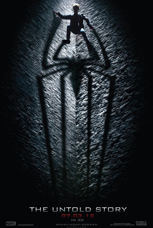
It’s a bit rough to come up with new ideas for a Spiderman poster. This is evidenced by the other posters, which all look pretty much exactly the same as the posters done for the previous trilogy. For that reason alone, this poster steps up above the rest in terms of creativity.
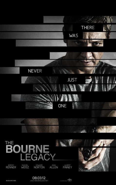
This is again a rather challenging poster design. A Bourne poster without Bourne… But I felt this design did quite well. Yes, it doesn’t really justify no Bourne in a Bourne movie, but it shows the new character in a clever way, through what appears to be the “black outs” on a confidential government document. The implication I get is that the Bourne program had more to it that hasn’t yet been uncovered.
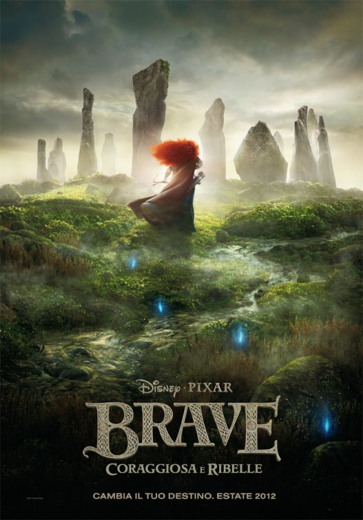
Not much to say about this poster except that it is beautiful. The colors, the composition, the typography—pretty much everything about it is extremely well executed. Whereas most movie posters for cartoons are headshots of the characters in some fun or adventurous pose, this one reminds me of a good oil painting.
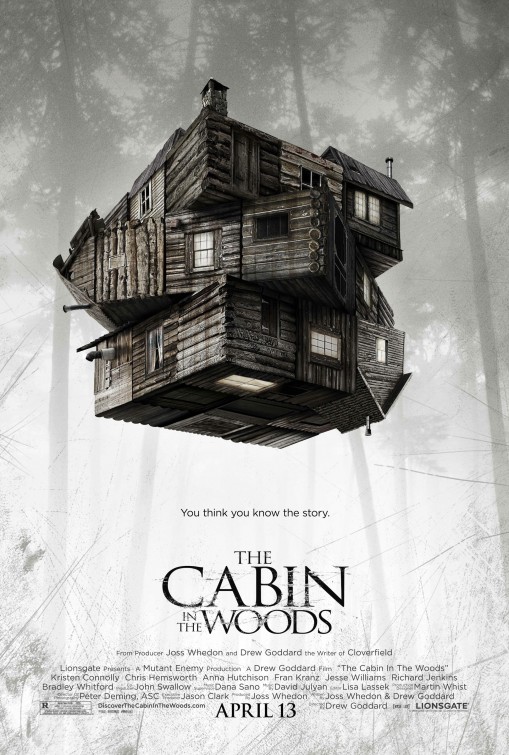
I’m including two posters for Cabin in the Woods. This is the first, which visually, is excellent. It isn’t what you would expect to see and certainly gets you thinking. After you’ve seen the film, it makes a lot more sense. But even without seeing it, it certainly makes you interested. As a side note, I did a separate blog post on the tag lines for the teaser posters, which were absolutely brilliant. You can see that post here: Hilarious Taglines.
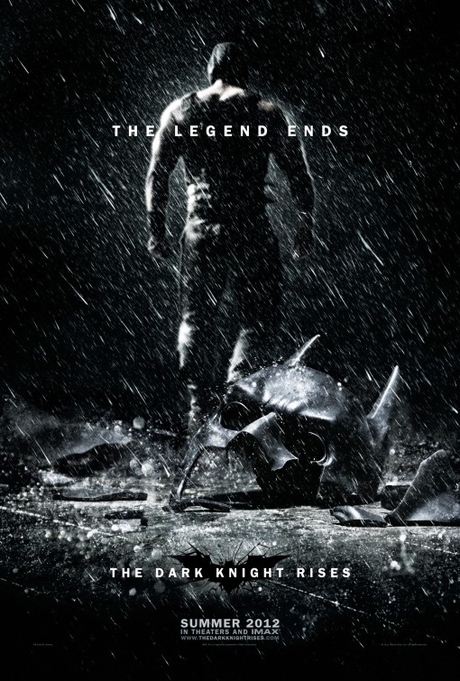
There were quite a few posters done for TDKR, all of them pretty good. This one stands out above the others, however, in telling a story. I also really like the desaturated colors, the depth of field, the composition and especially the simplistic typography.
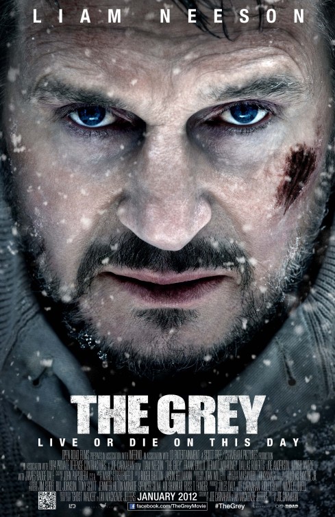
This is the most boring and uncreative poster that I just happen to think works. The film’s title is “Grey” and so is the poster. The snow is a nice touch and the make-up on Liam Neeson makes him look like he’s cold. This is a case where execution is good enough to make up for very little creativity in coming up with an original idea.
The icon image of the play turned into a photograph. Yes it’s simple and yes, I was expecting a poster like this as soon as I heard the movie was being made, but it’s still impressive and quite well executed.
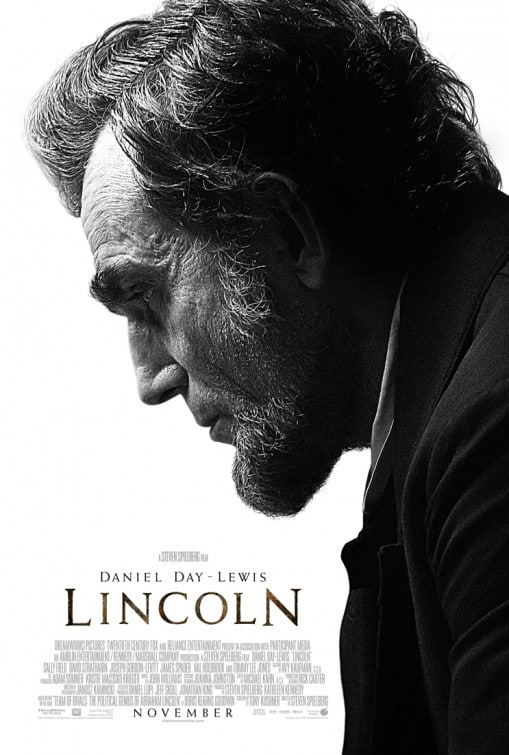
Understated and very powerful. The fact that Daniel Day-Lewis looks so much like Lincoln is what makes this poster work. And it works quite well.
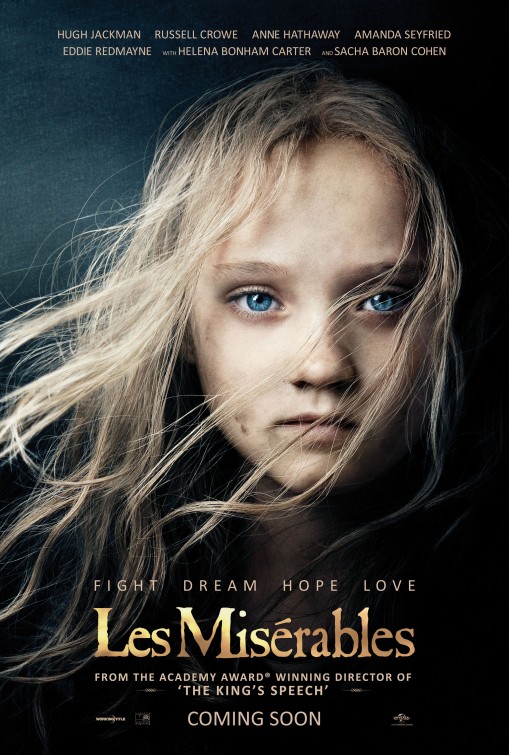
Honestly, I was hoping for something better on these posters. I think the concept is excellent but the execution could have been better. But, with virtually all movie posters all falling into one of about 5 basic designs, it is nice to see something different.
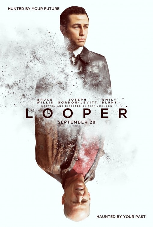
As far as movie posters go, this is an overused cliche of an image and composition. But despite that, it still looks awesome and has great use of negative space. It’s well designed poster. Expected, but very nice.
Bad Movie Poster
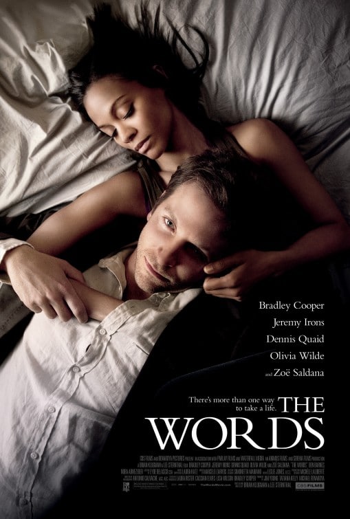
I could and probably will do a separate post of the “bad” movie posters of the last year. However, I wanted to take a quick second to mention the poster for “The Words.” I walked past this poster in a shopping center and it wasn’t until walking past it the third time did I see it was for a movie. I honestly thought this was a poster for either a men’s fragrance or a clothing line. It says absolutely NOTHING about the movie except that it stars Bradley Cooper and Zoe Saldana. But their poses are so POSED that it looks like a fashion shot.

