For a while I’ve wanted to do an article on the design of logos. There’s a lot to be said on the subject and thus the first wall I hit in trying to write about it is “Where do I start?”
So I decided I would instead do a run through of one logo design from start to finish. The logo is for a cupcake bakery. It’s a small company (currently made up of two people). They work from home and deliver in southern England. The cupcakes use the finest ingredients and each one is home-made (literally and in the broader sense of the term).
This logo started one step ahead of the design: Coming up with the name.
THE NAME
The first challenge was coming up with a name. The problem we faced was that there are thousands of cupcake companies across the world and thus all the obvious and not-so-obvious names were already taken. In coming up with the name we had several criteria:
- The name had to relate to cupcakes in some manner.
- The name couldn’t be the same as an existing cupcake bakery (or too similar to one of the big names—such as Crumbs).
- The name had to be memorable. While a name like “KupKayks” sounds good, when someone gets home and types “cupcakes” into Google, they aren’t going to find your site.
- And finally, the clincher, it had to be a name for which the URL was available. Ideally the .com, but .co.uk would do.
The first ideas were “Sweet & Delicious” and “Cherry on Top.” Aside from the fact that the names were already taken, they both weren’t that memorable. And both were not original enough that the name would help in a web search.
So we started down various roads, coming up with name after name, checking each one as we went. We’d do a google search and check the URL with a domain checker for every idea. It got a little exhausting after trying 24 names and still not finding anything.
Well, with a little persistence, we finally found it: Delishcup! A combination of “Delish” (slang shortening of “delicious”) and “Cup”. It says that it tastes good and has something to do with a cup. And to top it all off, both the .com and .co.uk domains were available!
LOGO INSPIRATION
The next step (after immediately registering the domain names) was starting the logo design. The first step of designing a logo—or anything really—is gathering up some inspiration.
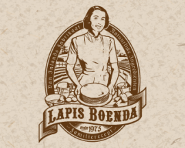
I had already decided on a basic approach for the logo. I wanted something detailed, reminiscent of an old time bakery or barber shop rather than a modern, simplistic logo. So I gathered up logos that were correct in terms of look. While I was at it, I also looked at other cupcake bakery logos so that I wouldn’t end up designing something too similar.
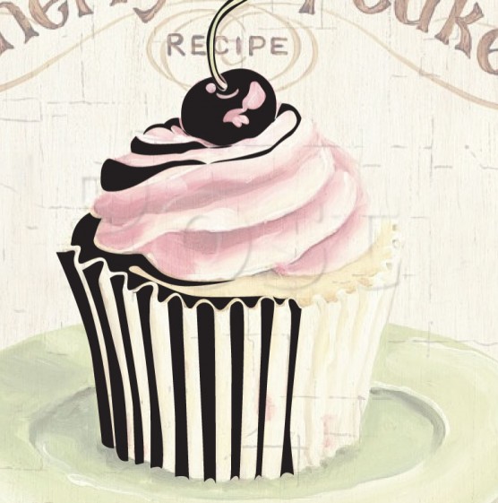
In addition to other logos, I also gathered up cupcake illustrations/photos that I liked the shape and profiles of, knowing I would need this for my logo design.
SKETCH
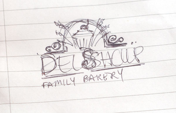
In searching for and finding inspiration, the idea for the logo started to form. So the next step was putting it on paper as a sketch.
TYPOGRAPHY
With the sketch in place, the next step was finding the right typeface. When doing a logo design, I never assume I know which typeface I should use. I’ll sometimes have a few ideas to start with, but for every logo I go through hundreds of fonts and select the ones I feel have what I’m looking for.
In the case of this logo, here are the fonts I went through.

I decided on one that had what I was looking for—readability, character and a somewhat vintage feel.

ILLUSTRATION
To do the illustration for the logo, I started with a good image of a cupcake. Using illustrator, I recreated the cupcake image as a vector black and white piece of art. For the rest, I used the sketch as a basis and put the vector art together accordingly. Having a good library of vector elements can be very helpful in this regard.
In doing this step I regularly referred to other similar logos to see how to best handle various aspects of the illustration. I went through several iterations of the background behind the cupcake until I arrived with the one that’s there now.
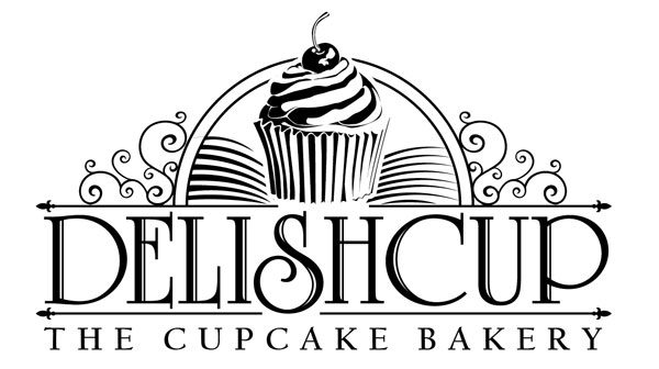
For the lettering, I am not a huge fan of logos that use straight typography. The reason is simple—if someone can recreate the logo on their own computer by just typing a word with the right typeface, then we really don’t have a logo. So I made some small changes, making the bottom of the “S” larger and also adding a secondary line to every character.

Here you can see the final logo, as completed in illustrator:
FINAL TOUCHES
With the logo fully finished in illustrator, I pulled it into photoshop and added some colour to it. While on the subject of colour, I make it a general rule for any logo that the design MUST work in black and white before any colour is applied. The reason for this is that many logos will have multiple applications, from foil stamping, engraving, screen printing, etc., and many of these require a single colour.
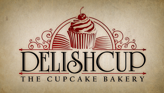
I put the logo onto a background for presentation purpose. This is always a good idea when showing the final design to your client.
SUMMARY
So there you have a run through of one logo design, from start to finish. You can see the final logo, on the website, at www.delishcup.com.
In the future, I’ll post my list of logo design do’s and don’t’s, although this article mentioned a few.



Great design! I’m curious though, why did you add color to it in Photoshop instead of Illustrator?
I wanted to add some grunge to it as well as a letterpress “deboss” for presentation purposes. For a final vector logo provided to a client, I would definitely add the color to it in Illustrator (after making sure it works in black and white).
I typed in “Logo Design” into google.co.uk and this page came up about half way down the 1st page!
Sweet! Just checked it myself and it’s still on the first page.
As always. Ricky designs rock!
Going to put this aitrcle to good use now.