I just did a post on the new ebay “logo.”
Unfortunately this redesign isn’t the only recent logo design “update” which in fact just get’s rid of character.
Let’s take a look at the Arby’s logo:
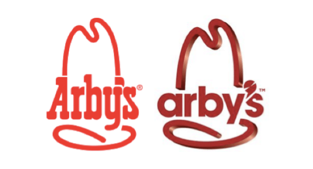
Another example of a logo made worse. The old logo had some unity. The upright of the capital “A” lead into the top the hat. The apostrophe was nicely tucked between the bottom of the hat and the line of the “y”. Moreover, although subtle, the bottom of the “y” looks like it hints at a ribbon of the hat. The whole thing was flat and thus easily retooled for different purposes. For example, if you wanted to make a 3D version of the logo, you could simply extrude the whole thing.
Now to the new logo—the type, which looks like Futura Bold, is boring. It isn’t an internet company and so having it all in lower case seems like a mistake. (Grammatically, it IS a mistake. With the boom of internet companies came a trend of logos done in lowercase so that, with a “.com” added to the end, they represented the URL.)
The hat element of the logo now has no relation to the type. So much so that the hat element is “3D” while the type is flat. And the apostrophe seems to be cut into the type because they couldn’t figure out a good place to put it.
Sad excuse of a logo redesign in my opinion.


I could not agree more, the apostrophe is really distracting where the old was subtle and suited the whole logo. The original font is iconic and ties in with the age of the brand.
Neither element compliment each other and the 3D hat clashes with a flat typeface.