As a designer, I am always intrigued by movie posters. They are a great example of design. Why? Because in a single image they need to tell a story. Further, a well-designed title is like a logo.
So, with all that in mind, let’s take a look at the Thor movie posters. There’s been a few designed and I am going to give my review of them. Not that my review means much, but after seeing them I couldn’t help but think of things that could have been done better.
TEASER POSTER
Here we go, starting with the Teaser poster:
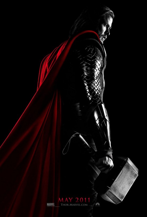
Let’s start with the good. The image is strong and works well as a teaser. You can see enough to clearly see it is Thor. The hammer, if nothing else, gives it away. The image gives some idea of how the costume has been treated. And the date tells us when the movie is going to come out. Overall, this could be a great poster.
The problem with it is the fact that it has been desaturated (except the cape). This was a design decision gone wrong. Why take all the color out? No good reason. It isn’t like the posters for Sin City, which used the same technique. Sin City had a similar color treatment. This film doesn’t.
A much better solution would have been to take most of the color out and leave just a touch of the red with hints of other colors. Taking the poster and with a few minutes in Photoshop this is what I would have done:
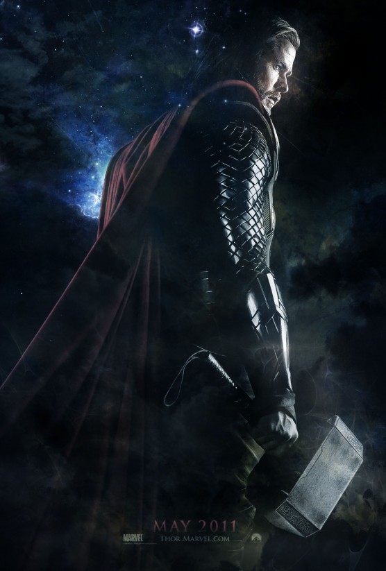
The main difference is that the color isn’t entirely taken out and there is some ambiance added to the image. If I had the original image I would have done something better. But to see the best example of the “desaturation” trick, I give you the Schindler’s List poster:

Alright, enough about the Teaser poster. Let’s get onto the posters.
FIRST THOR POSTER
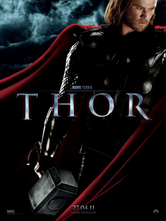
This poster is pretty good although it really doesn’t add anything to the mix. We’ve seen it all already in the Teaser poster. My complaints with the poster is the lack of grunge. Seems too clean for someone who fights for a living. I think Marvel did a much better job with the Captain America poster (although a little overboard with the flying dirt particles).
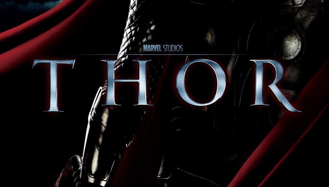
But my biggest complaint is the logo. While I love Trajan as a typeface, it’s called the movie font for a reason. It’s entirely overused on movie posters. And the letterspacing just makes the whole title look weak. Why not something a little more original? And why not something more relevant to Thor? I would have started with the hammer, which already has the shape of a “T” and done something with more weight and substance.
Ok, onto the next poster.
THOR FACE POSTERS
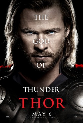
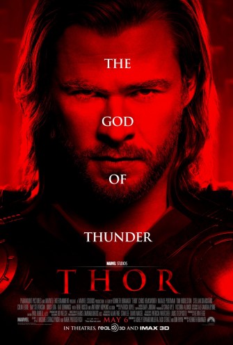
The next two posters are from a series of character posters. I’ve put both of them here as they are essentially the same (except the fact that one has been colored red):
Obviously the red poster is a waste of time. Thor isn’t associated with red, so why make a red poster? Enough said about that.
As for the colored poster, my main objection is the placement of the text. It’s distracting of the image. It isn’t big enough to make the poster (as in the Micheal Clayton poster) and it isn’t small enough to go unnoticed. So instead, it’s like a fly that landed on your TV screen. You just want to get it the hell off there!
THOR ENSEMBLE POSTER 1
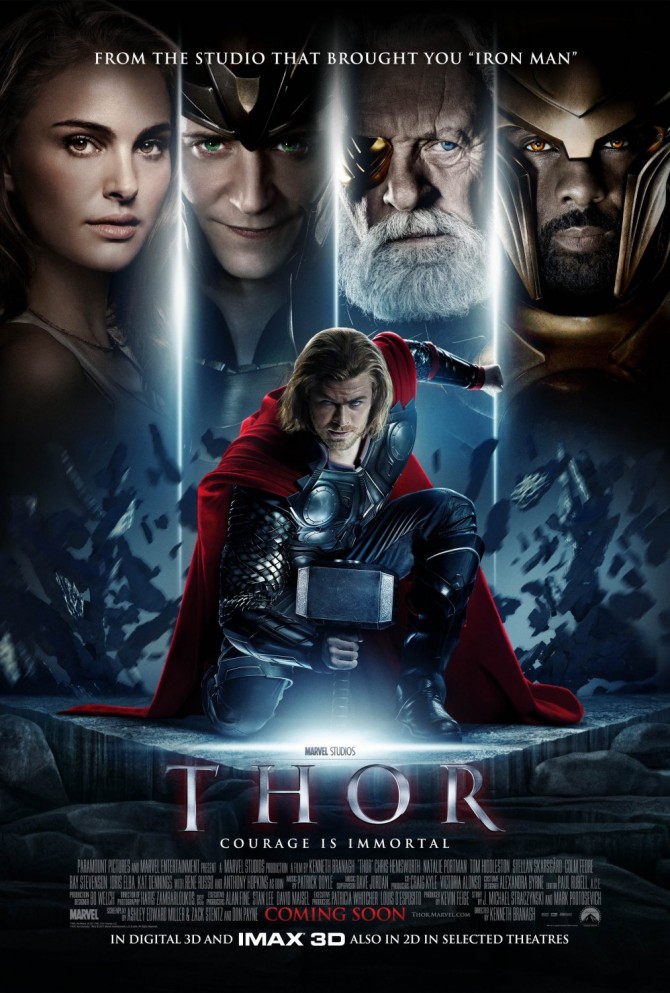
Even Natalie Portman can’t save this poster. Okay, maybe she can. Overall, it isn’t too bad. I like the pose of Thor. The explosion behind him looks entirely fake. And the other character face shots are too painted looking. And the fact that each is divided doesn’t help. Better if they were composed into a single scene, so that it didn’t look like 4 windows with characters in them. A similar composition, better executed, can be seen in the Saving Private Ryan poster.
THOR ENSEMBLE POSTER 2
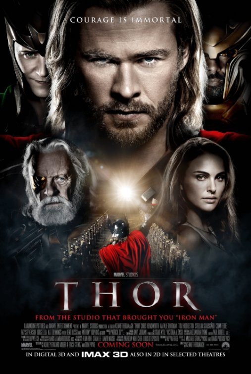
Last poster, which seems to be a different take on the prior version, except with Thor being larger than the supporting characters.
This poster falls short on its use of perspective. Two obvious perspective errors in one poster. First off, you have characters behind Thor and in front of Thor being the same size. Doesn’t happen in reality. And doesn’t work on the poster. Secondly, the small Thor image has very strong perspective lines and an obvious horizon line. These don’t match the rest of the imagery on the poster.
Reference: Movie posters for this article were taken from the IMP Awards website.




Hey, excellent job on writing this Thor Posters Review | zevendesign.com up, I am going to link this from my personal blog!
I love it, I would love for you to be a guest writer on my blog sometime, let me know.
You did the a great work writing and revealing the hidden beneficial features of
Hey! Do you advantage Twitter? I’d like to cultivate you if that would be ok. I’m undoubtedly enjoying your blog and look saucy to strange updates.
I use Windows Paint to edit movie posters
Windows Paint… hmmm, never used that. I’m in a monogamous relationship with Photoshop.
Sweeeeet
BION I’m ipmresesd! Cool post!
Great common sense here. Wish I?d thgouht of that.