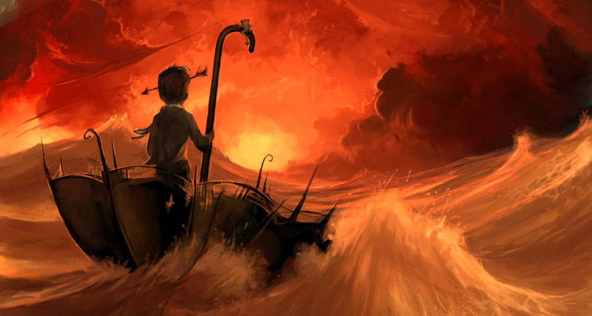
Feature image by the talented Cyril Rolando. Check out his Tumblr here.
Lines have been used by artists and designers to convey mood since the first drawings in cave walls. Through repeated use, certain patterns and lines have gained universally recognized meanings. These were documented in Landscape Architecture, by John Ormsbee Simonds, who put together a diagram of 48 Mood Lines. Whether this was the first place they were documented, I have no idea, but it is the diagram I’m using for this article.
Despite the fact that mood lines are ubiquitous in art and design, there are few references or resources on them as a subject.
For this reason, I’ve put together this article, where I’ve taken each mood line and shown it in use. Hopefully you’ll find this helpful in understanding the various mood lines and seeing how you can use them in your own designs.
The Mood Lines
This is the most complete list of mood lines I’ve come across, which comes from Landscape Architecture, by John Ormsbee Simonds. I’ve put it together in a single diagram so that it can be easily assimilated. You can download the diagram at the bottom of this article.
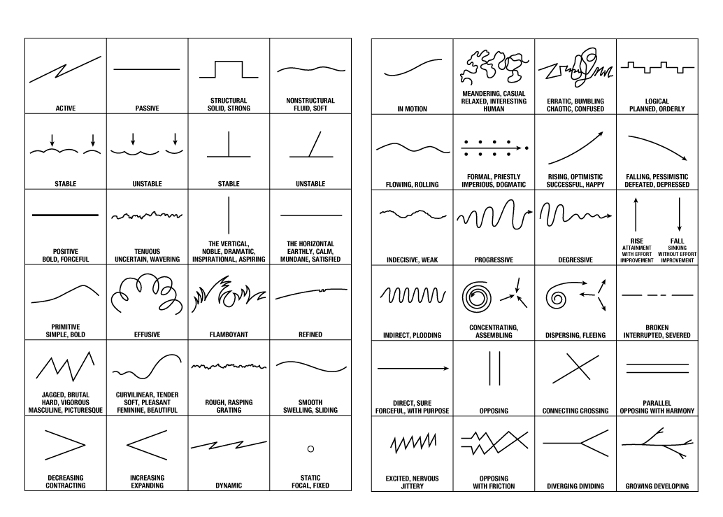
In going through the list, you will find some that are repetitive. You will also run across some that are almost too specific to use in any setting except the most obvious. That said, it’s a very good reference and the most complete list I’ve been able to find.
Using Mood Lines
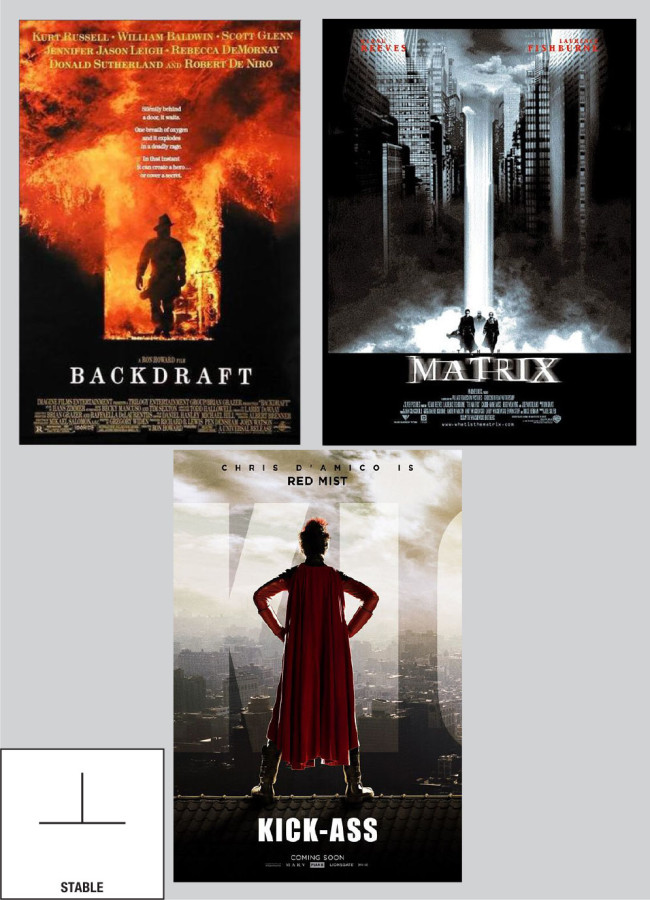
You can use mood lines in virtually every element of your design. Or you can contrast different mood lines in different parts of your design to create a more layered design. Take, for example, the “STABLE” mood line. You can use this in creating your layout. You can use it in your photography. And you can use it in your font selection.
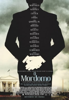
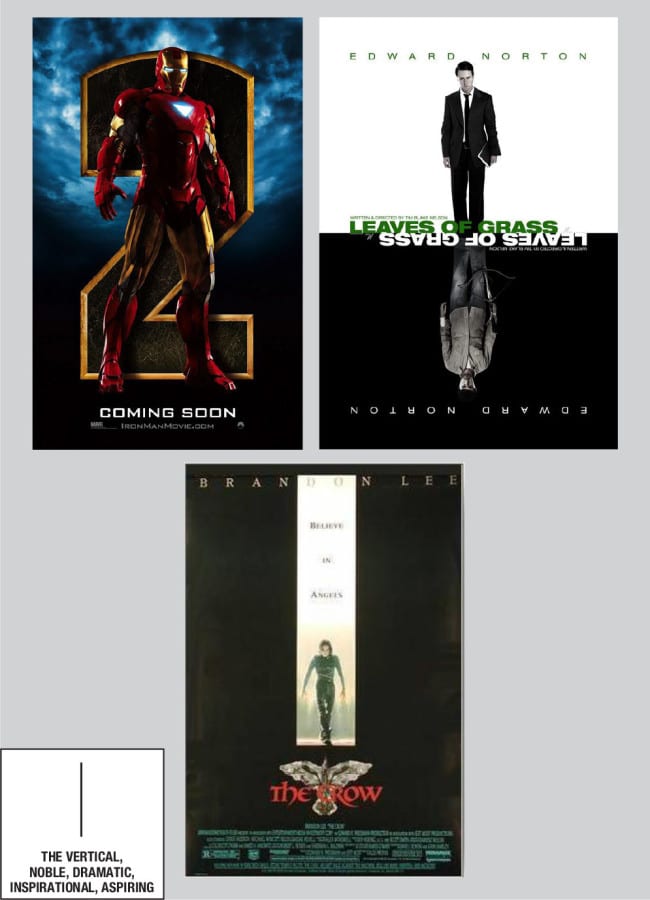
The most common mood lines can be easily seen in practice—the vertical line indicating “noble, dramatic, inspirational, aspiring” is a good example. This mood line is very common in movie posters. A good recent example is the Interstellar poster, but if you’re looking, it’s very easy to find.
Because they are easy to see in design and art, certain mood lines are used much more commonly than others. They are also the most common moods one would want to express. Optimism, happiness, sadness, nervousness—when you’re familiar with mood lines you will be able to picture the lines that go with these moods instinctively. And you will use them almost subconsciously.
My personal experience through some 15 years of graphic design is that mood lines are an underlying guide, much like a grid in layout design. In most cases you stick to them, but violating them can also create some interesting designs. So that’s my caveat—use mood lines as a guide to help create the mood you want for your design, but know that they are but one tool in a larger box.
Mood Lines
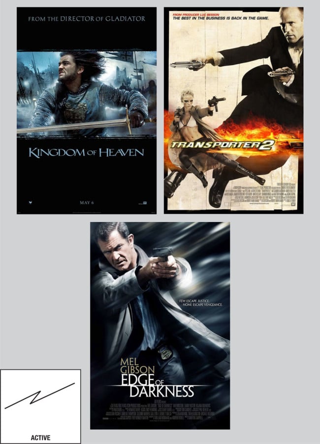
- Active
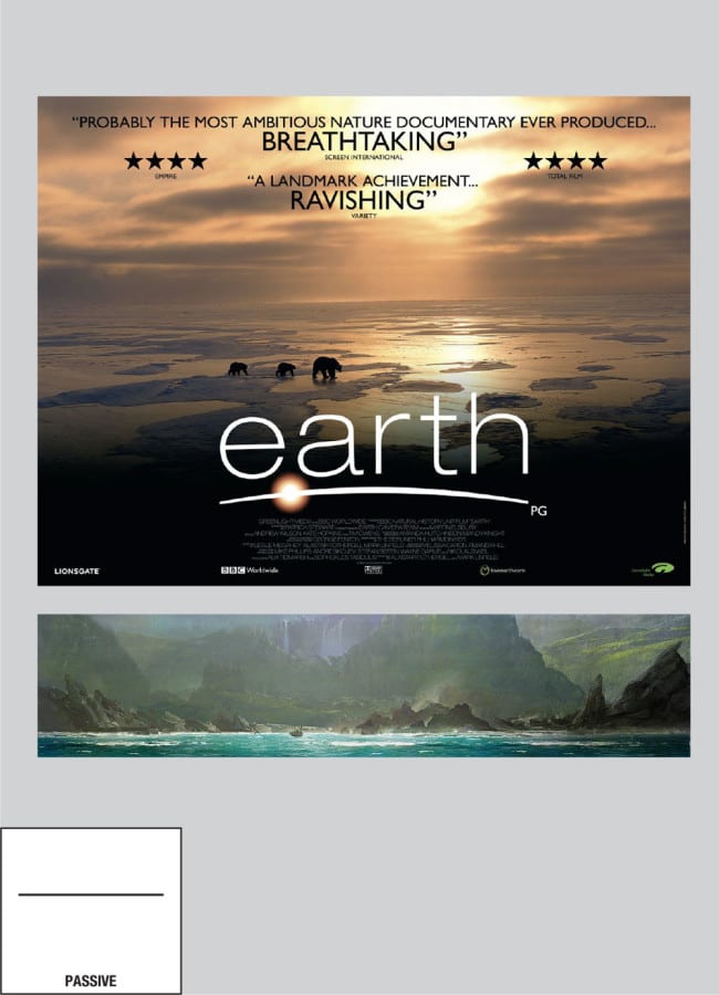
- Passive
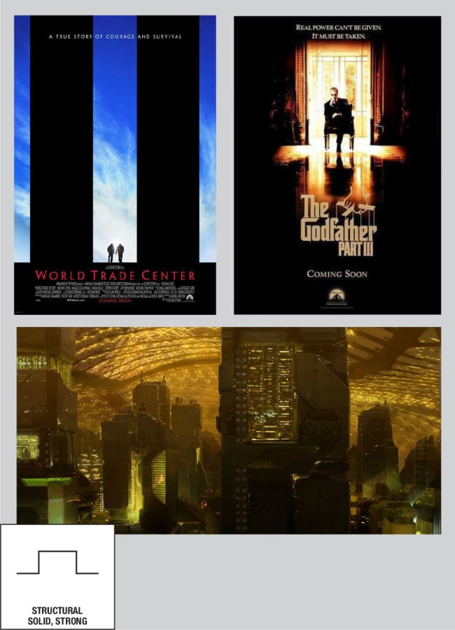
- Structural, Solid, Strong
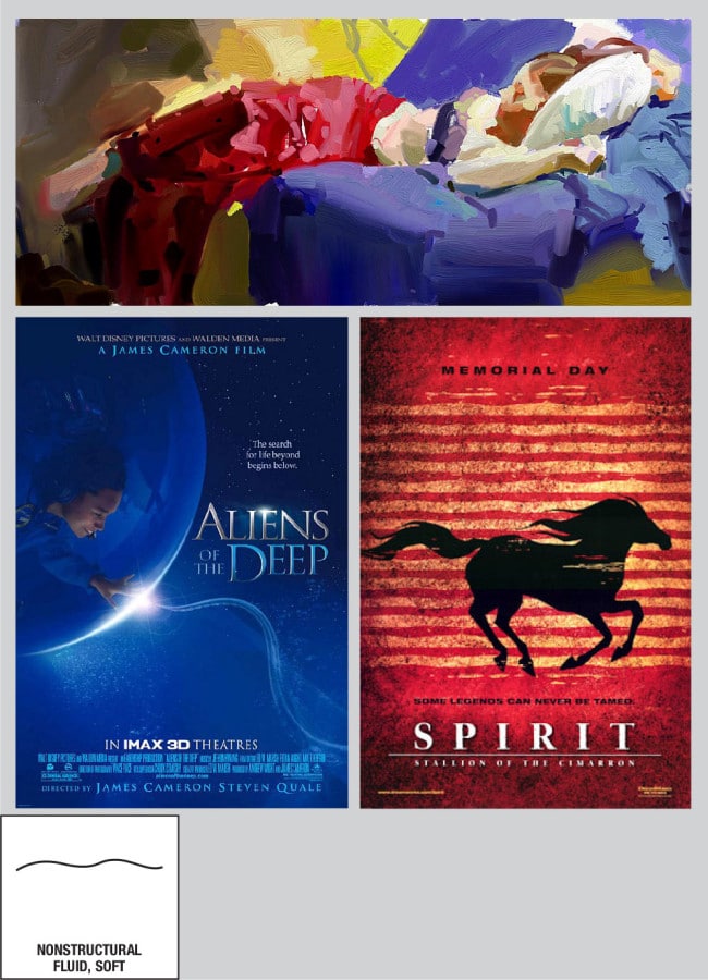
- Nonstructural, Fluid, Soft
- Stable
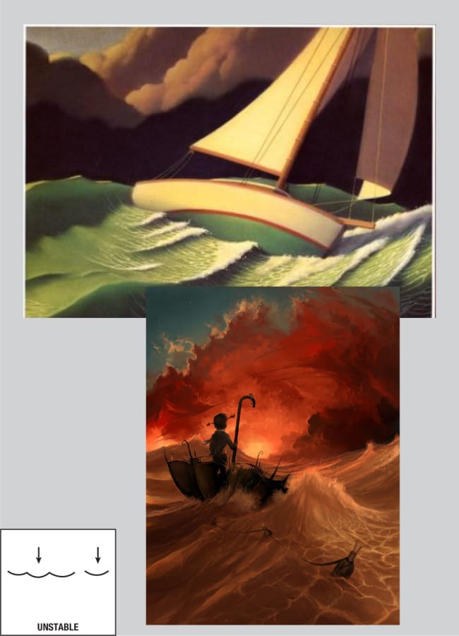
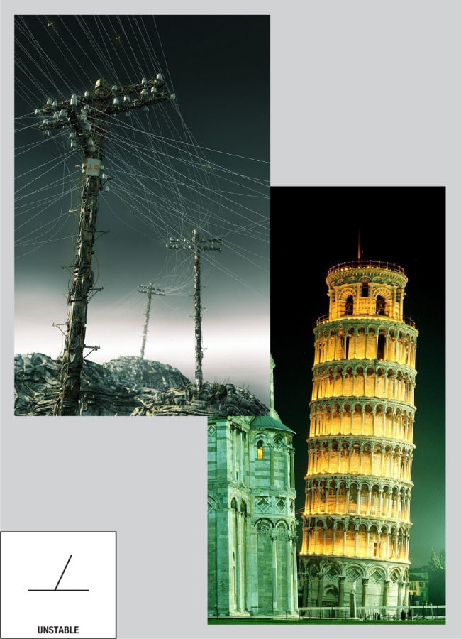
- Unstable
- Stable (2)
- Unstable (2)
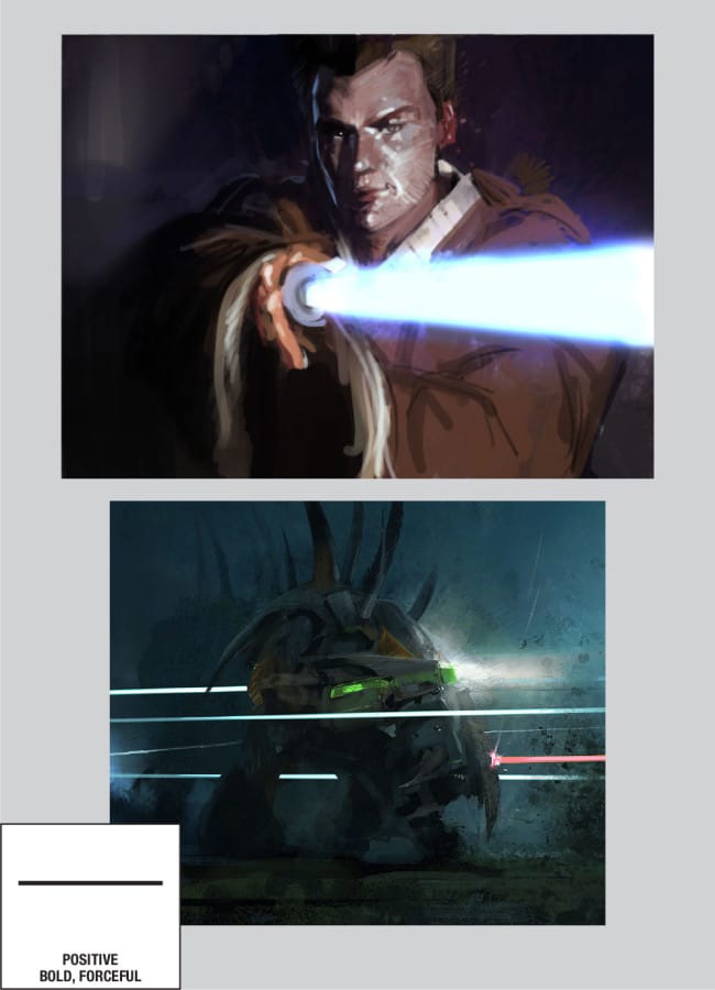
- Positive, Bold, Forceful
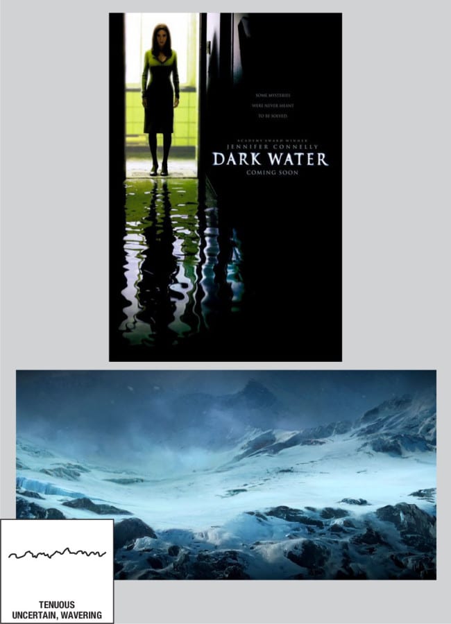
- Tenuous, Uncertain, Wavering
- The Vertical—Noble, Dramatic, Inspirational, Aspiring
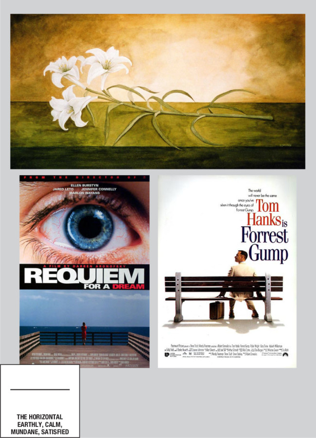
- The Horizontal—Earthly, Calm, Mundane, Satisfied
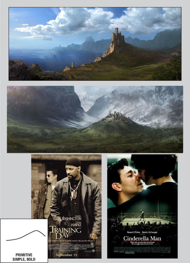
- Primitive, Simple, Bold
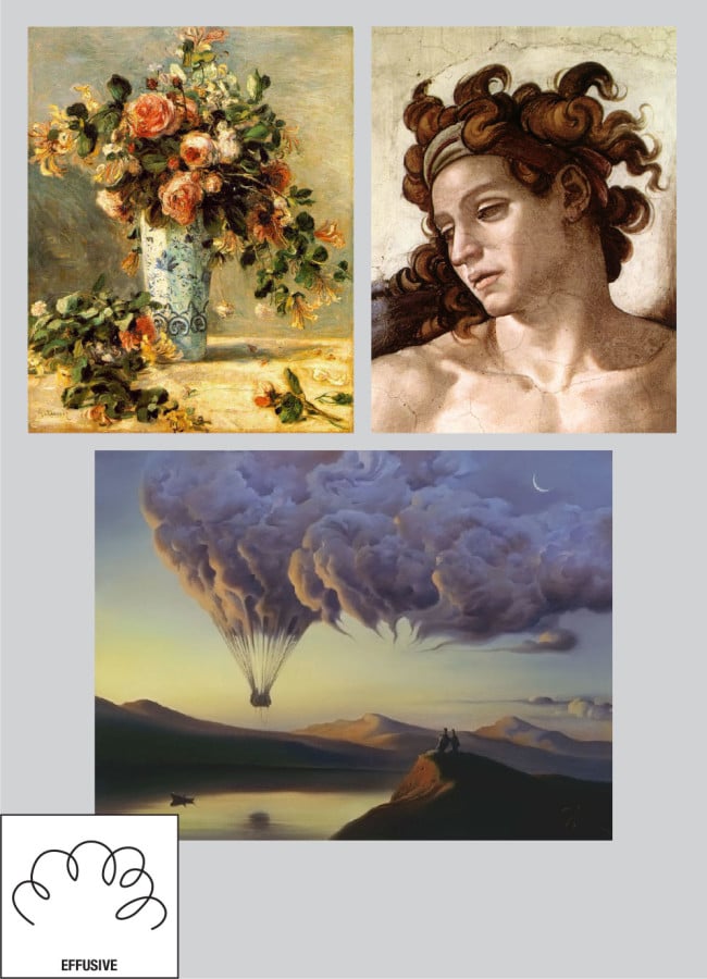
- Effusive
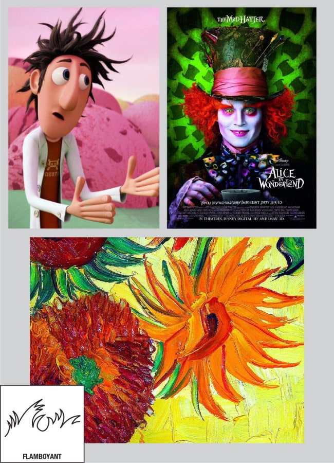
- Flamboyant
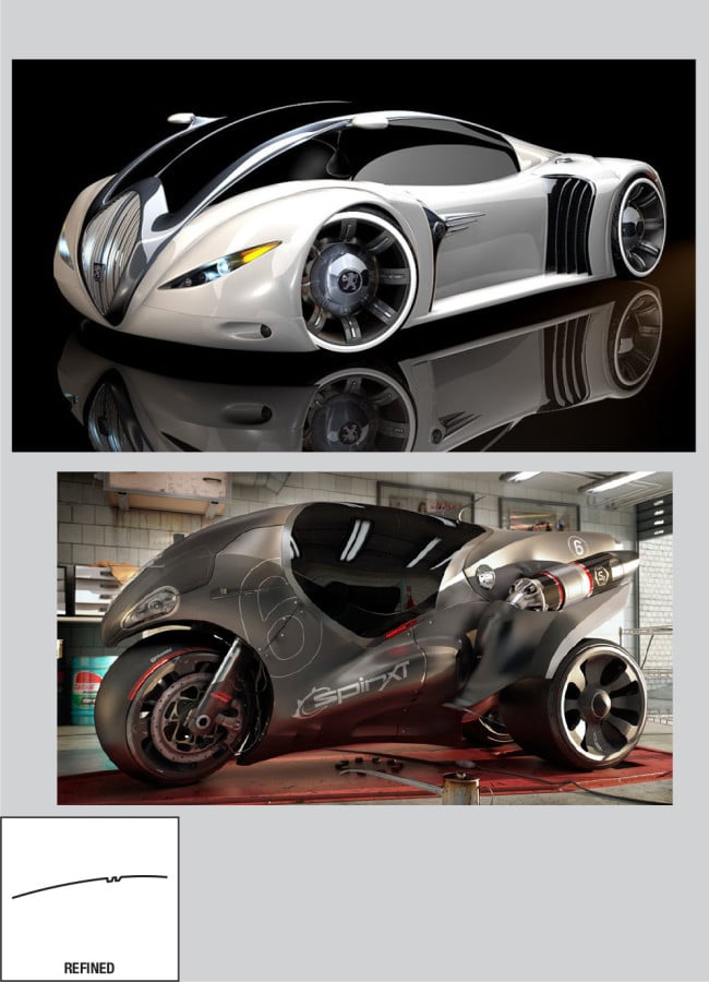
- Refined
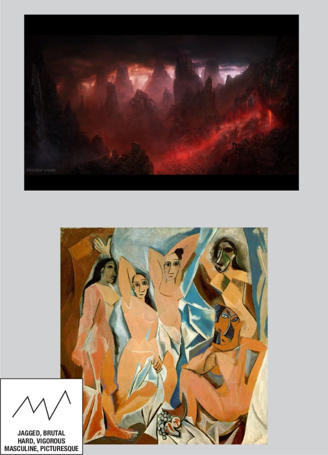
- Jagged, Brutal, Hard, Vigurous, Masculine, Picturesque
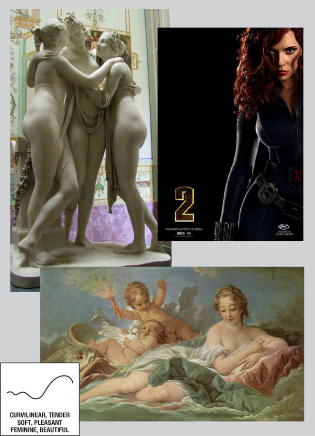
- Curvilinear, Tender, Soft, Pleasant, Feminine, Beautiful
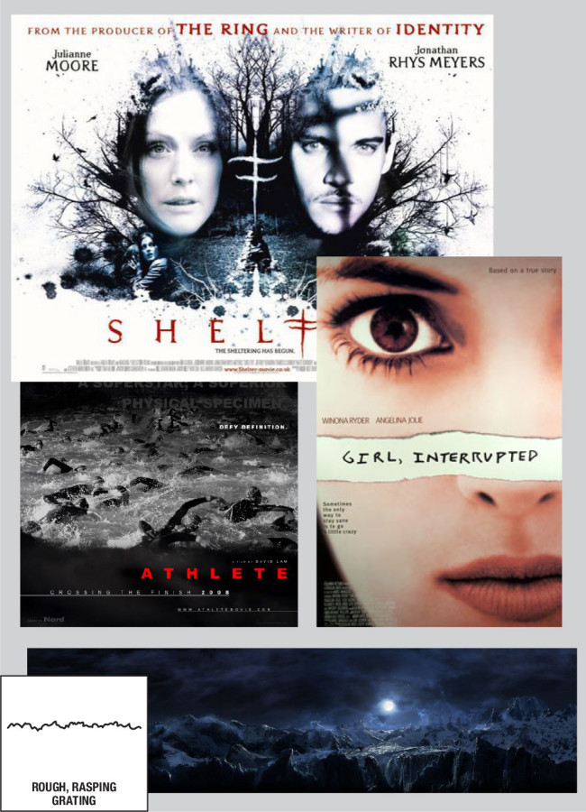
- Rough, Rasping, Grating
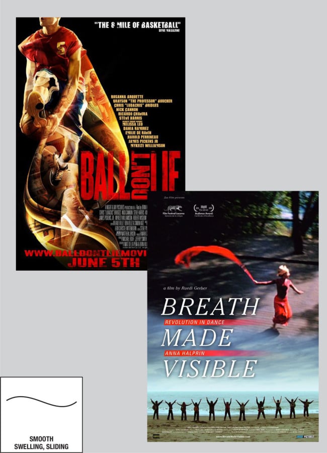
- Smooth, Swelling, Sliding
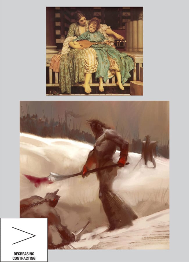
- Decreasing, Contracting
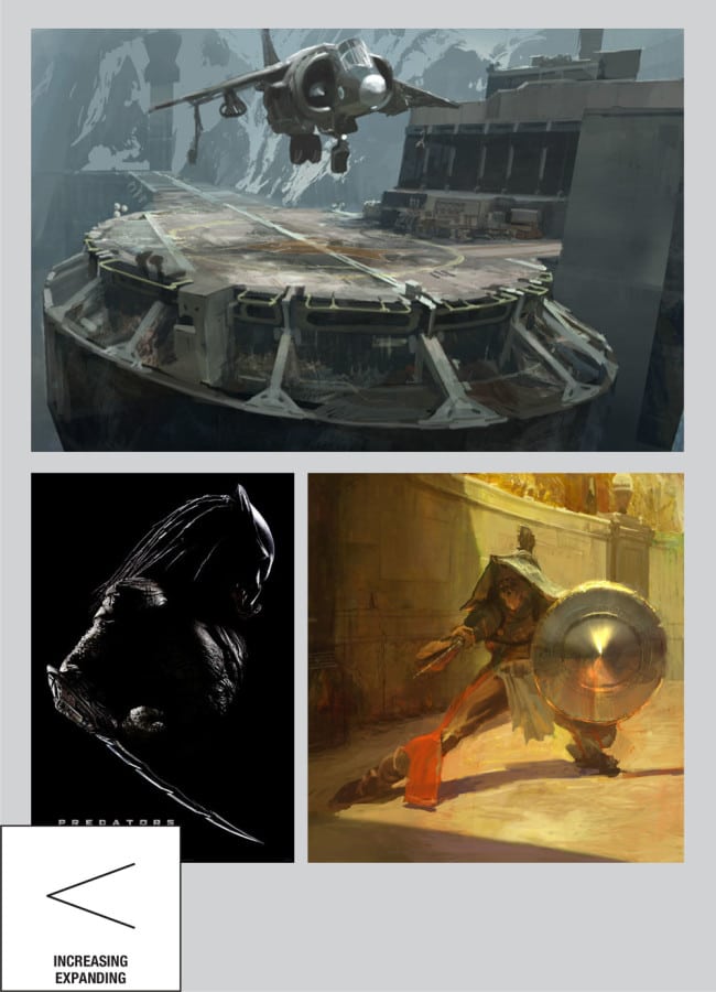
- Increasing, Expanding
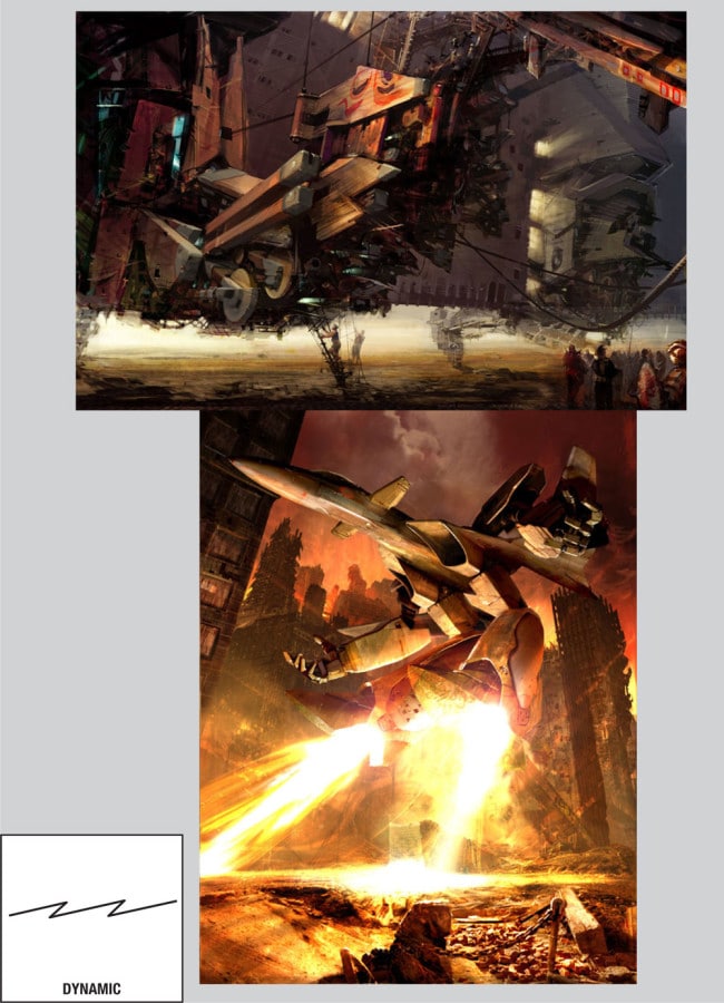
- Dynamic
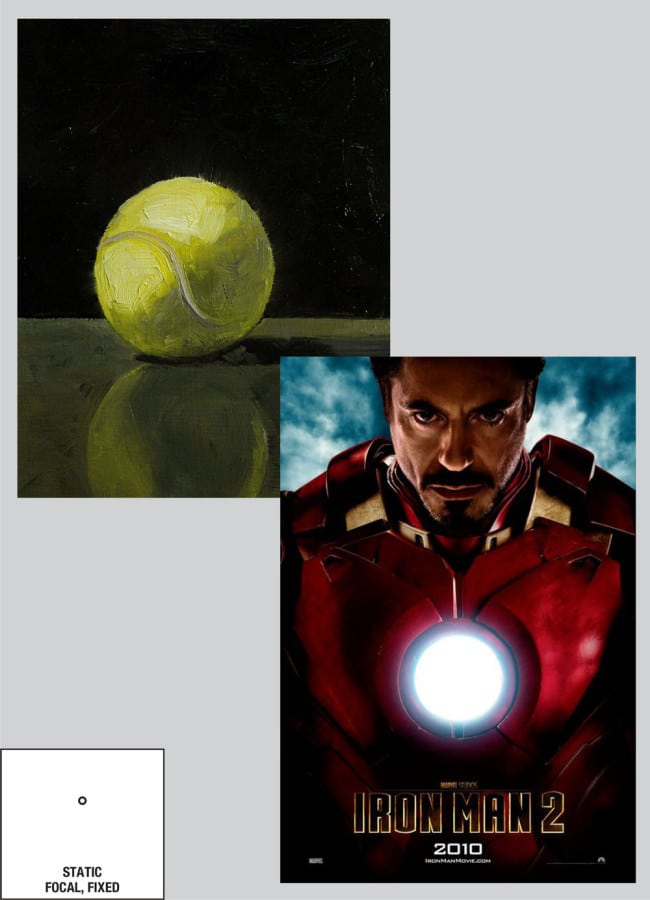
- Static, Focal, Fixed
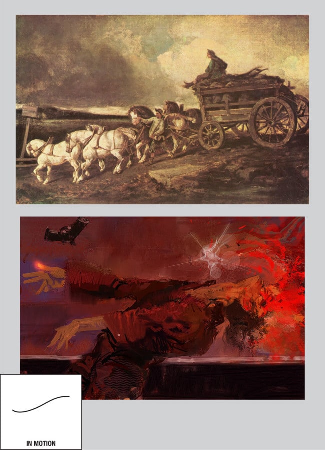
- In motion
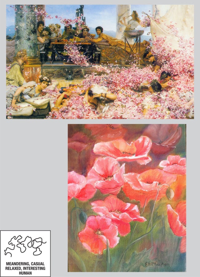
- Meandering, Casual, Relaxed, Interesting, Human
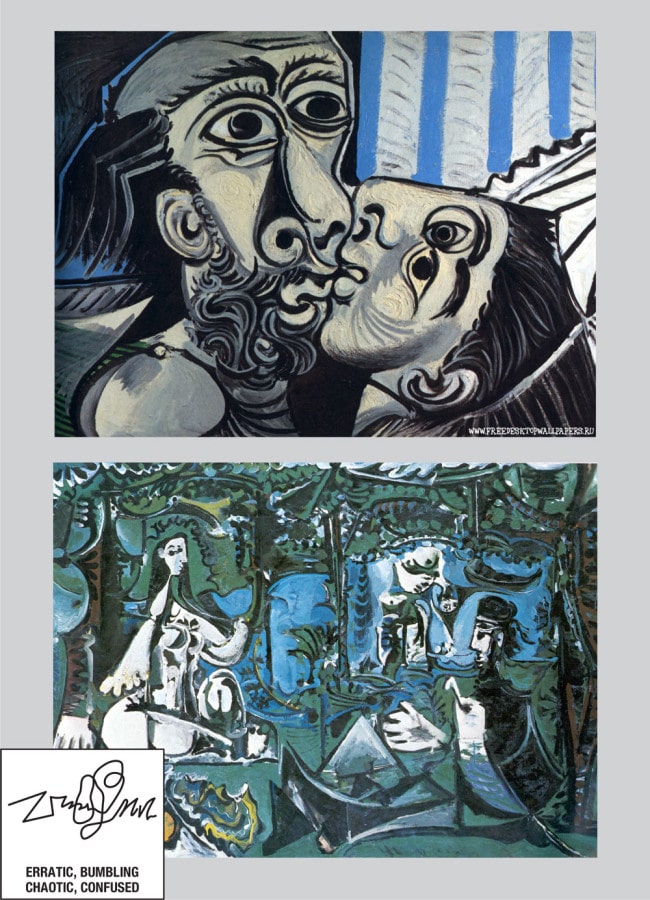
- Erratic, Bumbling, Chaotic, Confused
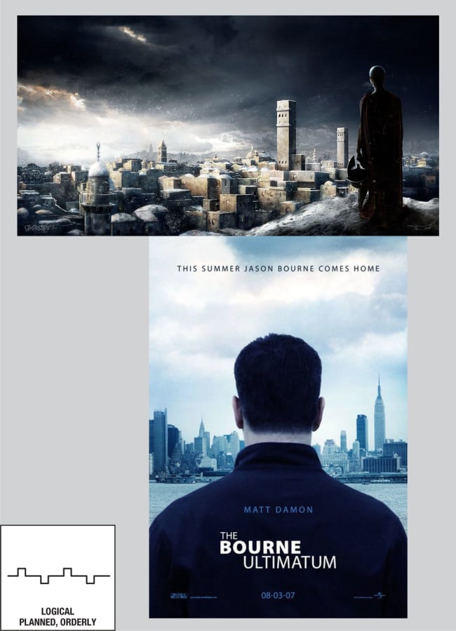
- Logical, Planned, Orderly
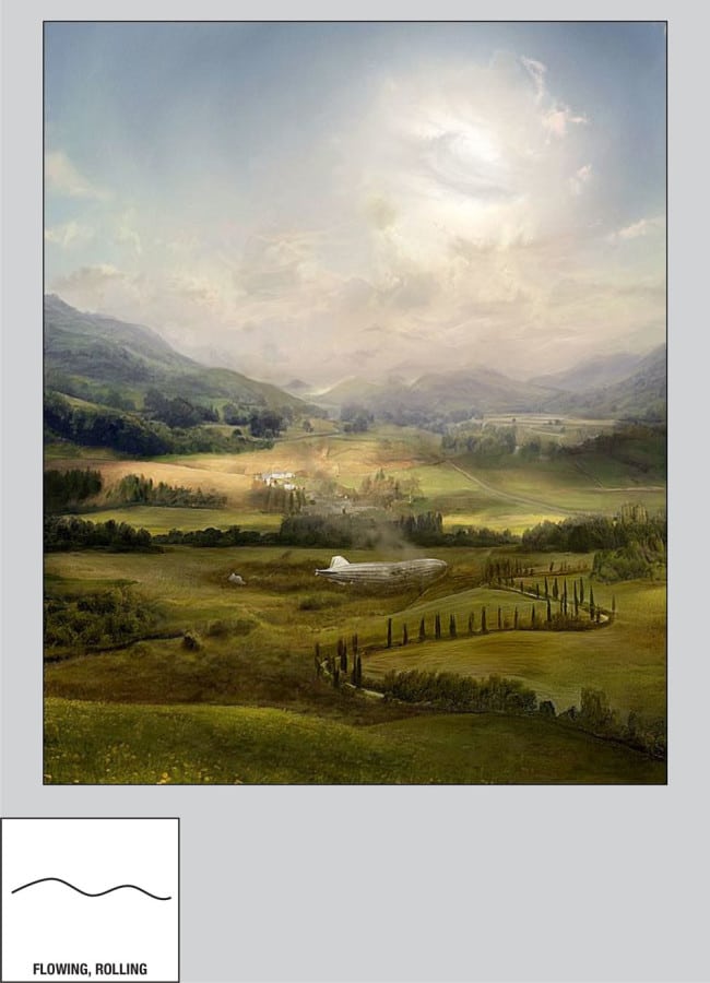
- Flowing, Rolling
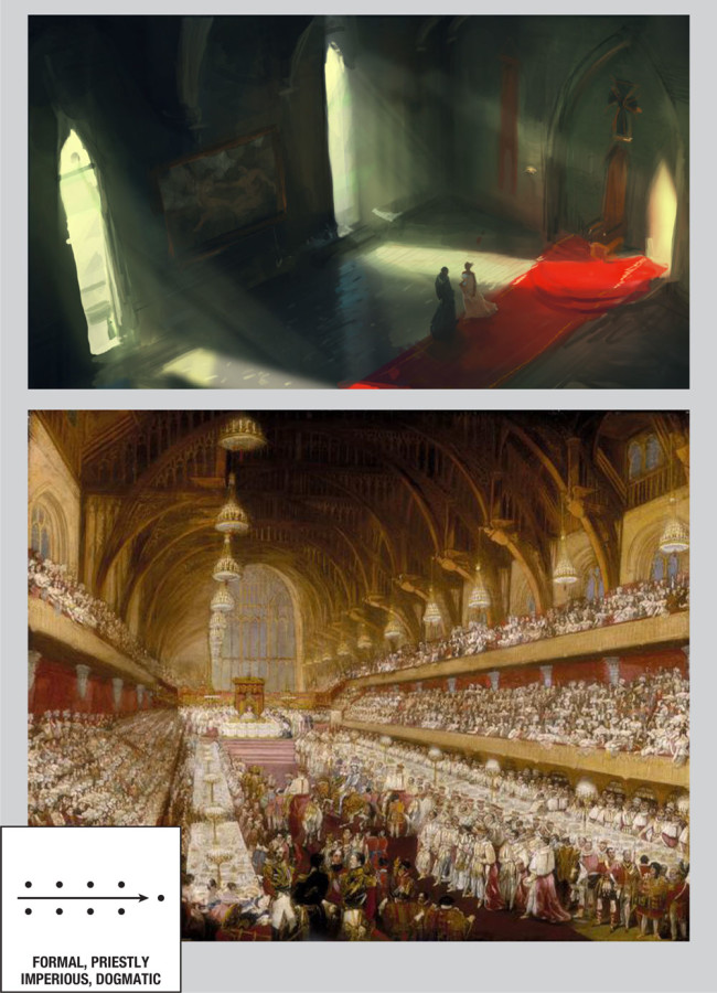
- Formal, Priestly, Imperious, Dogmatic
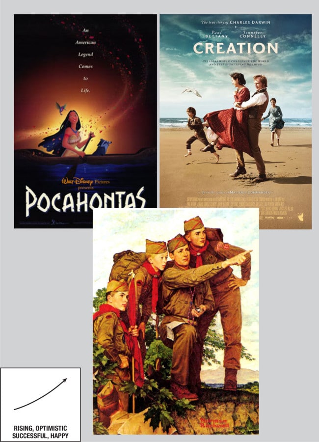
- Rising, Optimistic, Successful, Happy
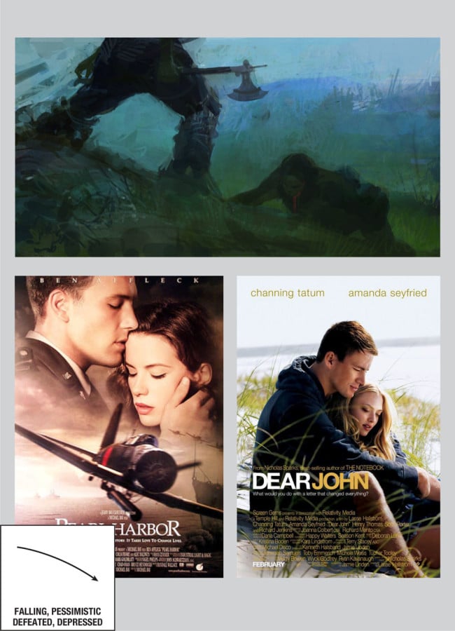
- Falling, Pessimistic, Defeated, Depressed
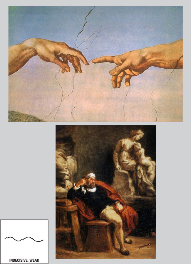
- Indecisive, Weak
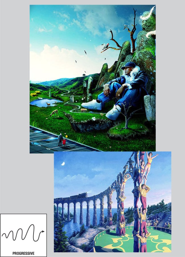
- Progressive
- Degressive
- Rise—Attainment with Effort, Improvement // Fall—Sinking without Effort, Improvement
- Indirect, Plodding
- Concentrating, Assembling
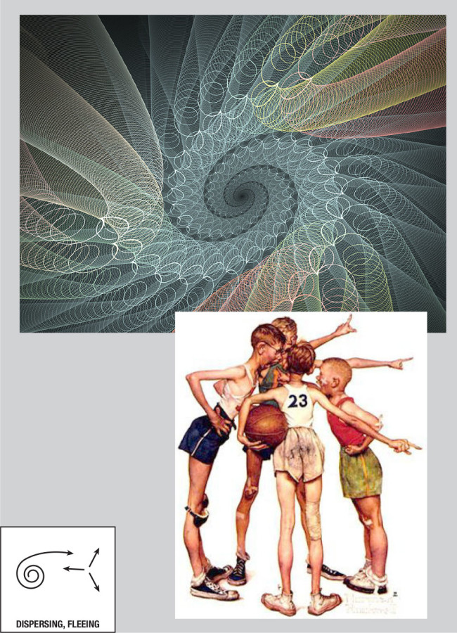
- Dispersing, Fleeing
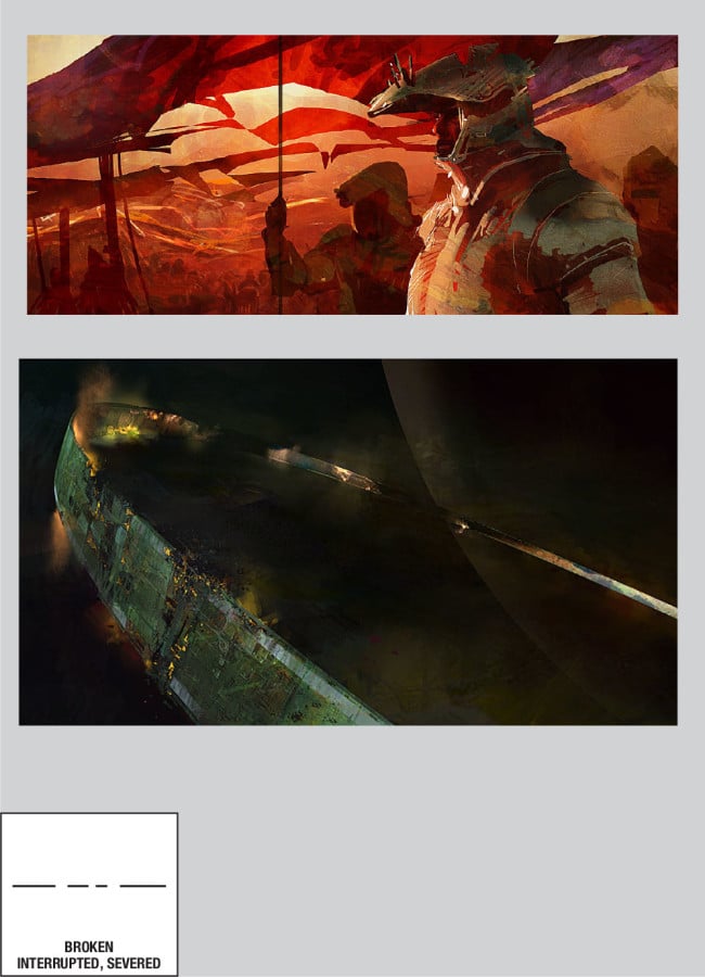
- Broken, Interrupted, Severed
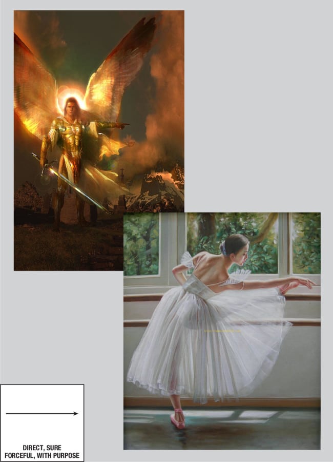
- Direct, Sure, Forceful, with Purpose
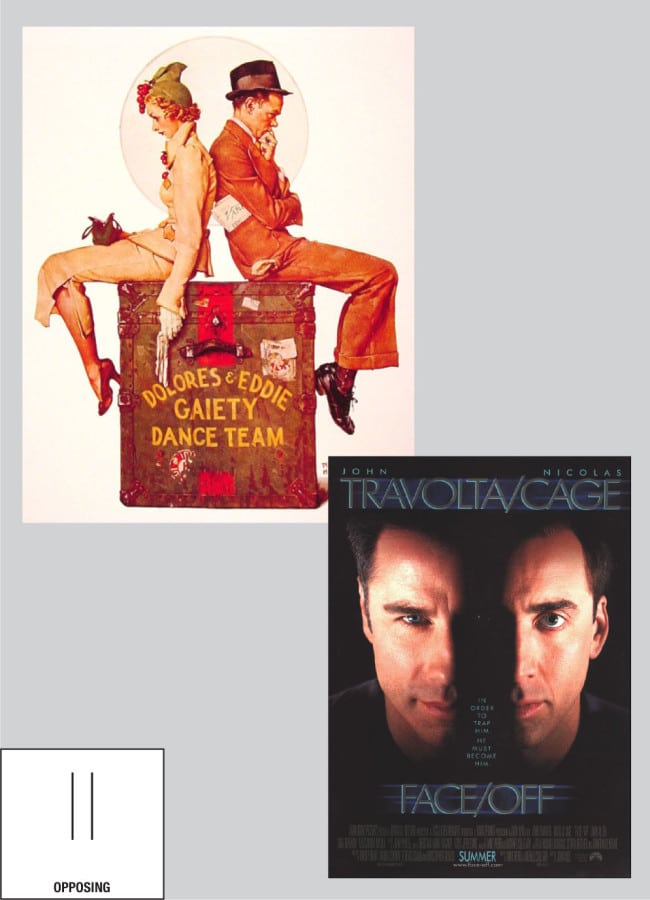
- Opposing
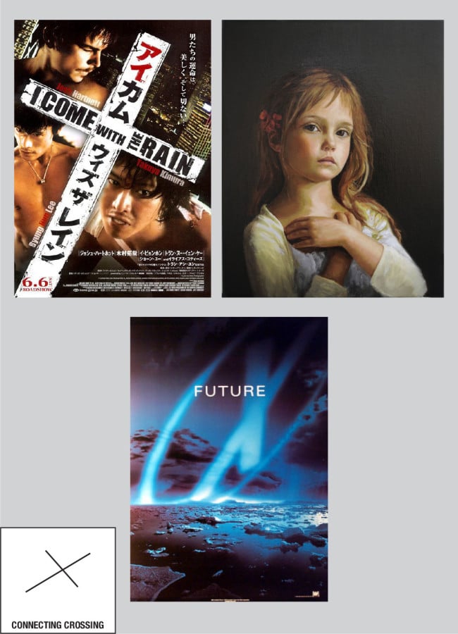
- Connecting, Crossing
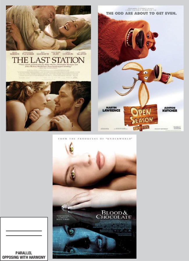
- Parallel, Opposing with Harmony
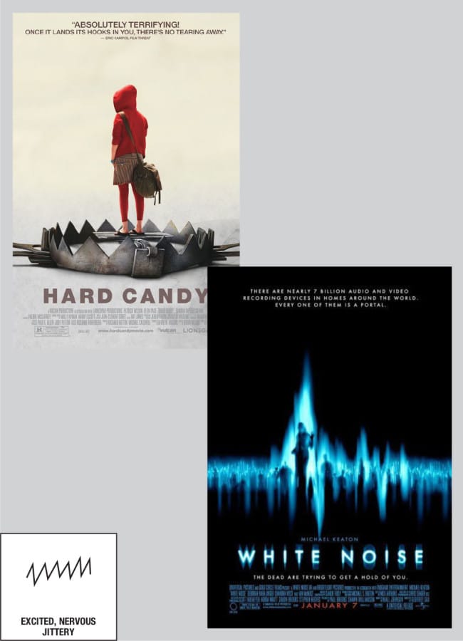
- Excited, Nervous, Jittery
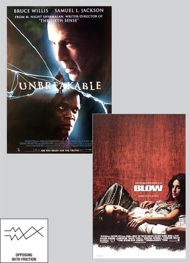
- Opposing with Friction
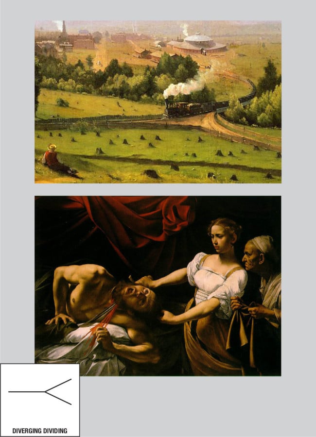
- Diverging, Dividing
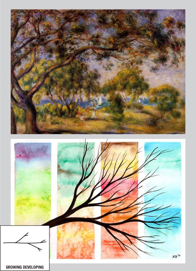
- Growing, Developing





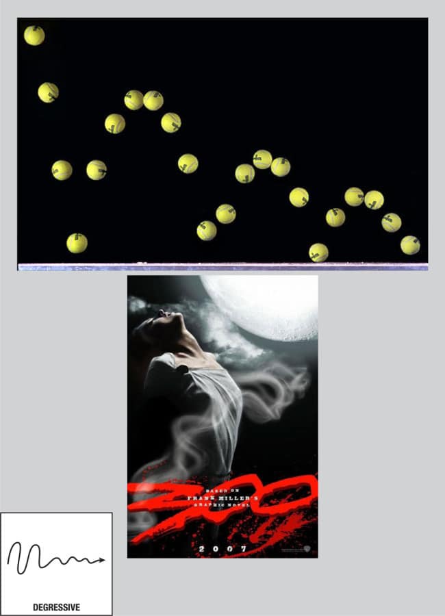
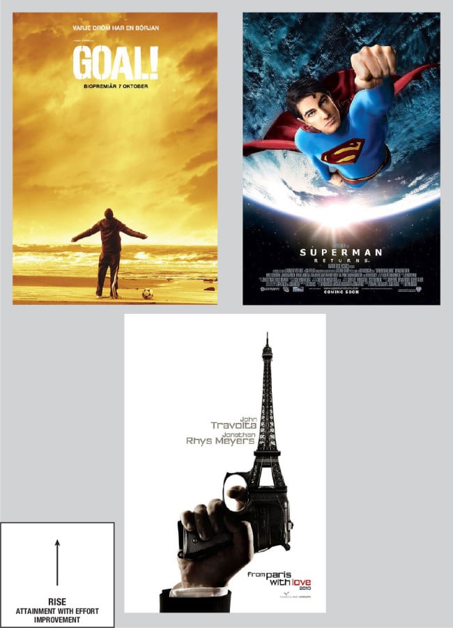

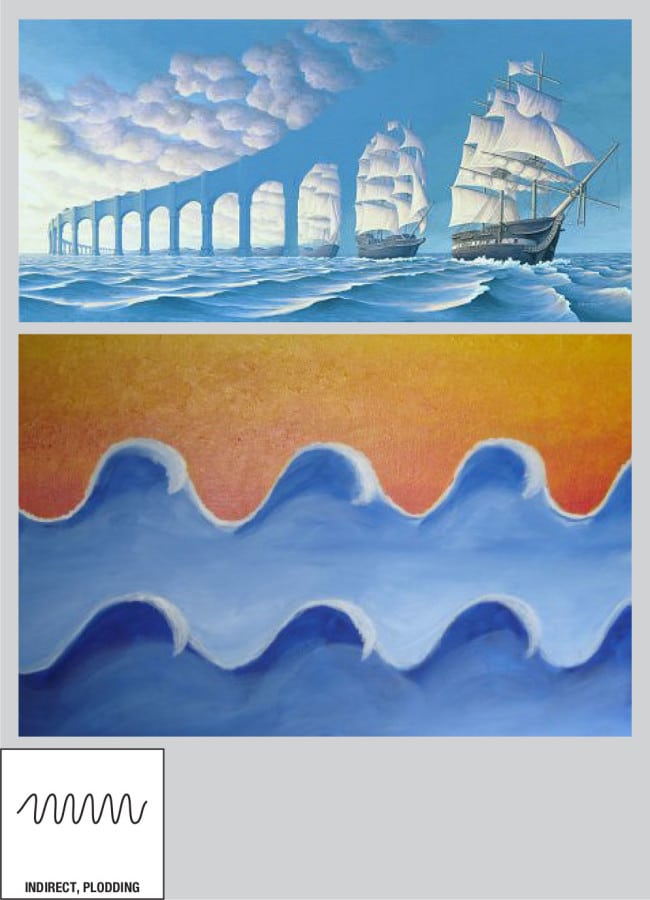
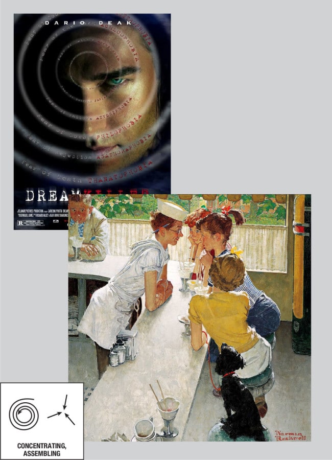



Jsut wanted to say I’ve had this bookmarked for years and keep coming back to this article. It’s such a useful, underused technique for motion graphics / animation as well as still images. Thanks again!
good job mate
comprehensive image of mood lines. fantastic.
I was doing a literature survey for my Art Therapist Diploma course assessment and found this gem of an article.
hope you wouldn’t mind my downloading your image and mention this web-page for reference.
nice article
I first saw these mood lines in the late 1970s and recently began looking for them again.
Superb article. Thanks!
Le passage à un pur luxe semble avoir travaillé pour le spectacle. Il peut chanel j12 imitation y avoir imitation Chanel eu moins d’exposants l’année dernière, mais le nombre de visiteurs a augmenté. Et il ya encore beaucoup d’exposants. Grands scientifiques devraient faire de grands mentors, et Szybalski,chanel j12 imitati montre chanel blanche ceramique on, qui en so
Great!!. Thanks a lot for sharing!!
amazing article!
Awesome article! What I read here can apply not only with design but also with photography! Thank you!
Thank you, I will use it for sure.
Amazing work! Thanks for sharing.
Interesting. I’d never thought of design elements as lines with emotional content before. These are great ideas and ones I plan to take into my book cover design. Thanks!
–Michael W. Perry, http://inklingbooks.prosite.com
This is very interesting. Liked and shared. Whether your examples were good or bad doesn’t matter. You obviously got the point across and the mood lines poster in itself is the gem here. Some people just love to hate what they didn’t come up with or don’t understand. Kudos holmes.
As a designer, 20 % of it is obvious, it is actually taught in good design schools anyways. But the rest is really far-fetched, multiple posters could correlate to multipe mood lines, which is very contradictive and inconsistent, therefore not really helpfull.
Also movie posters are not representive enough to come up with a design guideline. This is bullsh***
Thanks for commenting. These are examples. Possibly not the best. You can decide to use this information or not. As a designer, I found it helpful so decided to do an article on it.
For a poster to correlate to multiple mood lines doesn’t make it contradictive. That’s like saying a design can only use one color or that using more than one color makes color associations contradictive. Possibly some of the examples I found aren’t the best. At the end of the day, you’re free to use these or ignore them. Doesn’t make any difference to me.
Nice!! Thanks! Very helpfull and inspiring
Waw…. such a great topic, now i can see the power of line… thanks for publishing, keep going
Wow! This was fantastic! Thank you so much. I absolutely love to learn more on how to incorporate emotions in my designs. Very important stuff.
Oh man! These are glorious and educational. Some of the mood lines are self-explanatory. Some of them require more understanding. Is there a technique to interpreting an image’s mood line? Left-to-right? Top-to-bottom? How do you identify it?
Good question. Mood lines are more for the designer than for the viewer. It’s hard to study an image and try to identify a mood line. It’s either obvious or subtle or isn’t there at all. A designer could decide not to use the mood lines at all or could decide to use one that contradicts the rest of the design for the sake of contrast or comedy (see posters for Anchorman 2). Your best bet is become familiar with them and use them like any other design tool – to get a design that delivers your message to your audience effectively.