Here’s my annual top picks for movie posters of the year. I’ve also included a few misses.
First, here are the posters which I thought stood out from the crowd. I don’t particularly have a “top” poster, so I’ll just go ahead and list them with my comments on each:
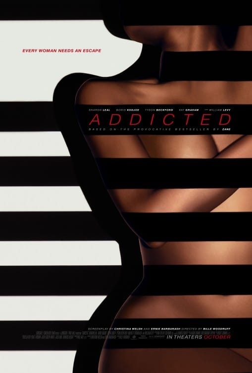
I haven’t seem the film, but from the looks of the trailer, this is the black version of 50 Shades of Grey and the release was timed to capture some of the buzz surrounding that film. Having said that, this poster is quite clever. The black bands across the naked woman at first appear to be some kind of shadow. However the one around her neck ends there, indicating that these aren’t shadows but instead some kind of bands. Beyond that, however, the whole image has several metaphors: Voyeurism (looking through blinds at a naked woman), bondage, erotic asphyxiation, censorship, ownership, freedom, chains. Quite a lot for one poster image.
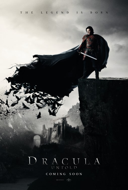
Great image, great type, and a great tagline at the top of the poster. The only part of the poster that isn’t great is the subtext under the title. From a design perspective, it’s too close to the title. And from a Creative perspective, it feels unnecessary as there’s already a good tagline at the top of the poster.
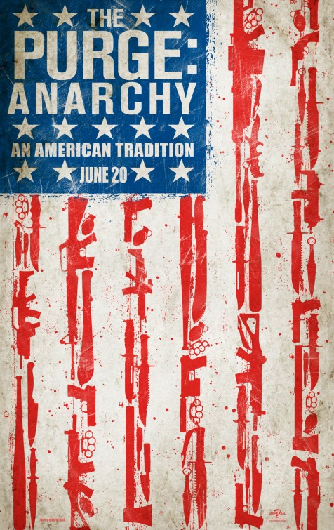
This isn’t amazing, but it’s good nonetheless. The American flag made of weapons, the propaganda style imagery, the tagline. All of these work in favor to position the film as an anarchy during the purge and not a single home invasion story, which was the biggest gripe people had with the original film.
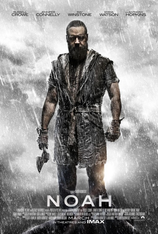
I watched this film in the theatre and it was a huge disappointment. The terrible CGI rock transformers, the misuse of Anthony Hopkins, the main character acting irrationally—I could go on. But… the marketing of the film was really good. The trailer, the hype leading up to it. I believe without these, the film would have crashed and burned entirely. That said, the poster here is quite amazing.
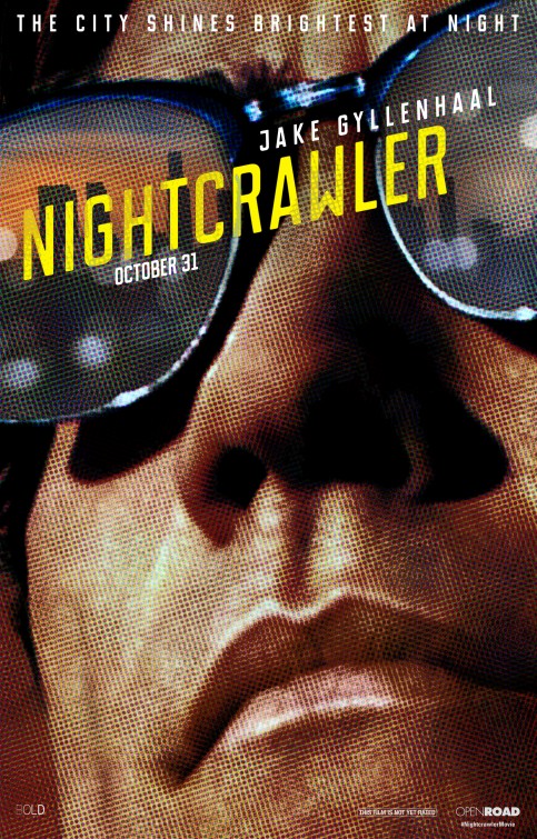
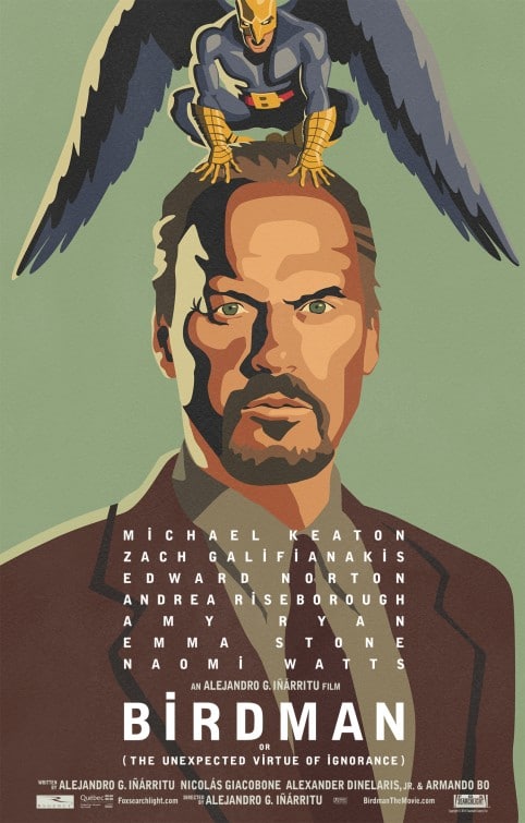
This poster feels like a Chip Kidd book cover—it’s that good. The typography, the close up photo, the city in the glasses, the rosette pattern. All of it works to make this one of my favorite posters of the year.
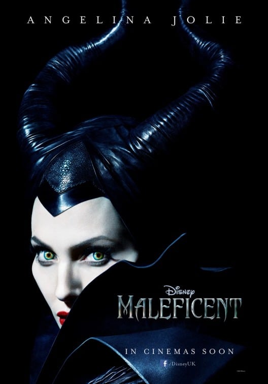
This poster was great in that it really captured Maleficent as a real character. In a single image, the movie immediately became interesting and relevant.
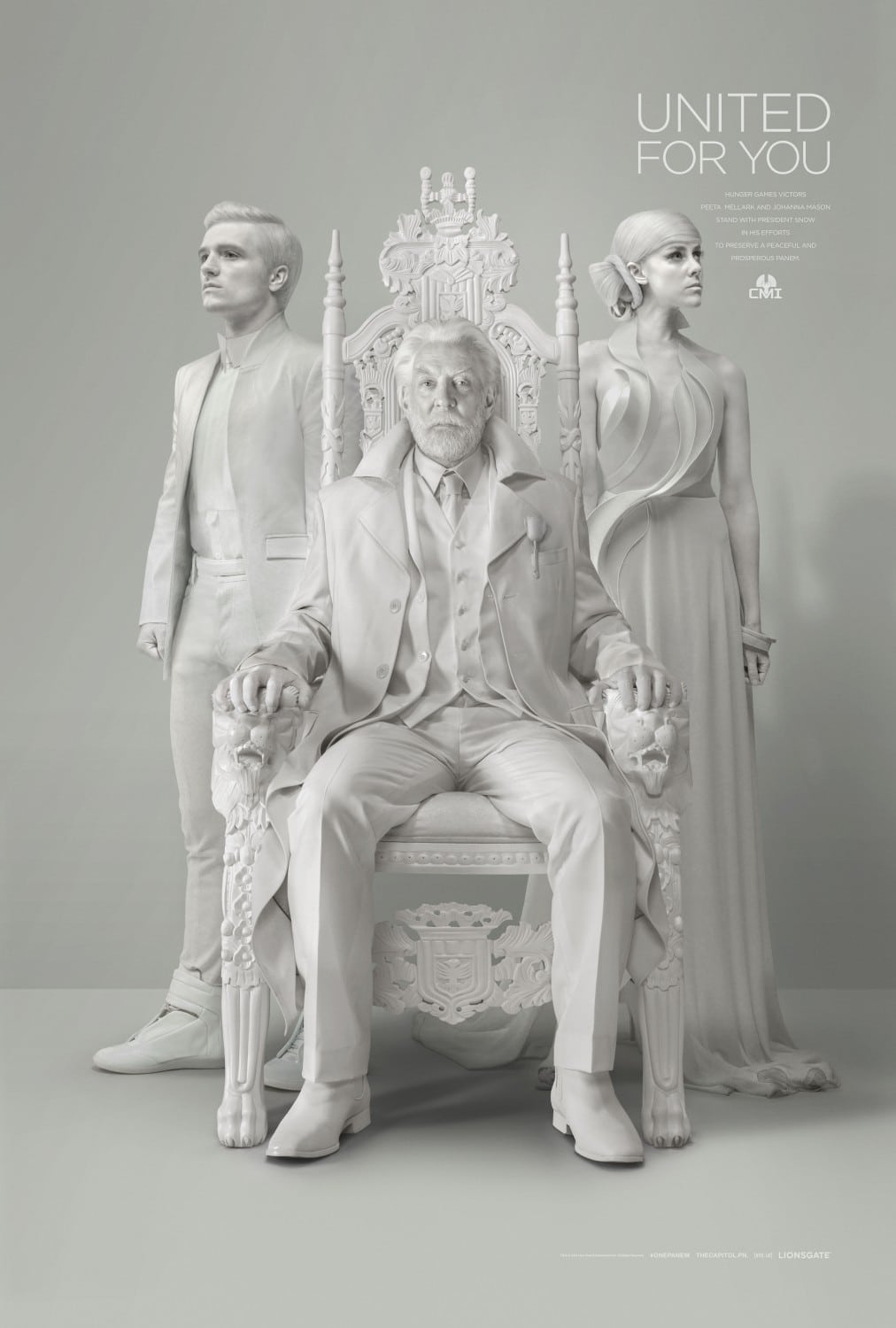
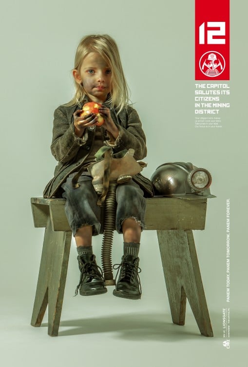
The marketing campaign for the Hunger Games sequel was extremely good and both of these posters show that. Each one would be amazing independent of the movie they are related to or promoting. The white image is a greatly executed piece of art on many levels. The image on the right looks like it could be a Rockwell painting.
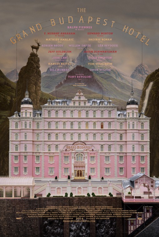
Is it a painting? Is it a miniature? Is it 3D? Is the background a backdrop? This is a poster you could look at for a long time. It’s very interesting and has almost no reason to be. The poster is a straight on photo of the exterior of a hotel… and yet it’s awesome.
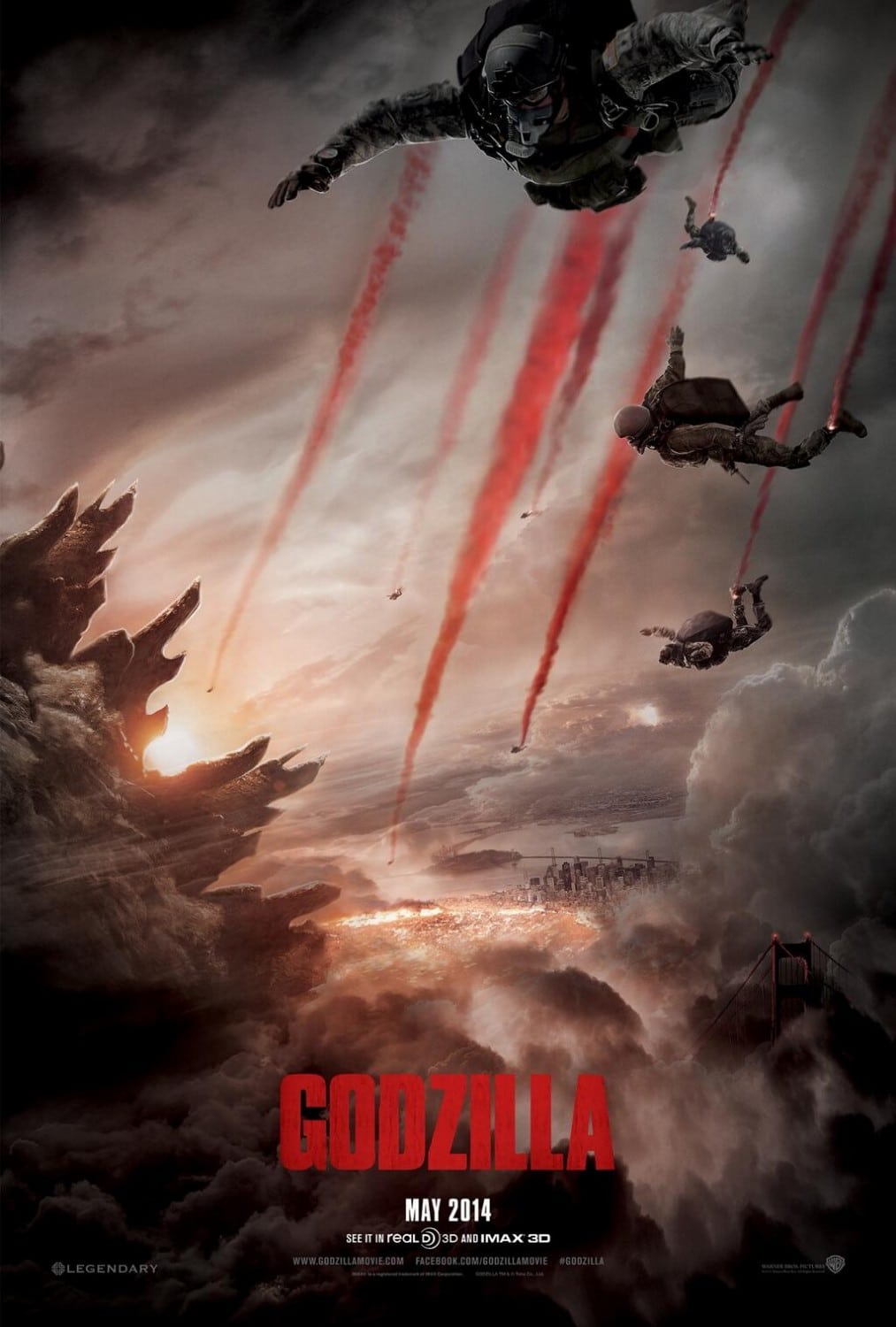
It was hard to choose which Godzilla poster I liked most. The campaign did great in showing scale. There is no question from the poster that this Godzilla is huge. Execution isn’t perfect, but overall it’s quite good and the image looks pretty amazing.
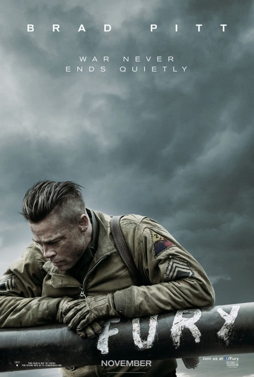
I really like this poster. It feels like it could be a Times photo of the year. The fact that the name of the film, which is also the name of the tank, is shown simply through the painted barrel is great. I really like the use of empty space at the top of the poster to convey a sense of dread and doom. I’m not a big fan of the tagline typography (there shouldn’t be more space between the words than between the lines of text), but otherwise it’s a near perfect poster.
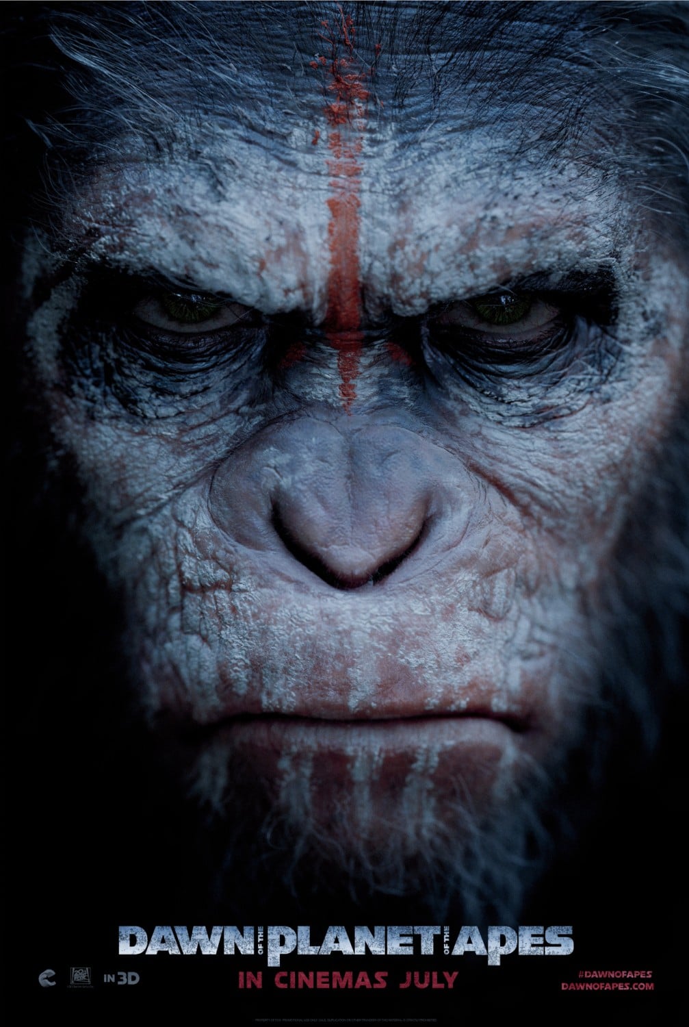
There’s nothing particularly innovative about this poster, however it works and it works well. Ceasar with war paint on and a scowl tells me a lot about the movie in a single image. Also, the quality of the image hints at the quality of CGI in this film.
I feel this could have been executed a bit better, but overall, I love it. It’s different, it’s interesting and it’s not a still from the film or a promotional photo. Someone spent some time to put together a good poster and they did a good job.
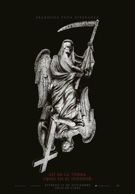
This is a foreign poster for the film “As Above, So Below.” And it’s a lot better than the English version. I like the fact that the image was created only for the poster. I like the juxtaposition of good and evil and an indication as to what the “above” and “below” of the title are referring to.
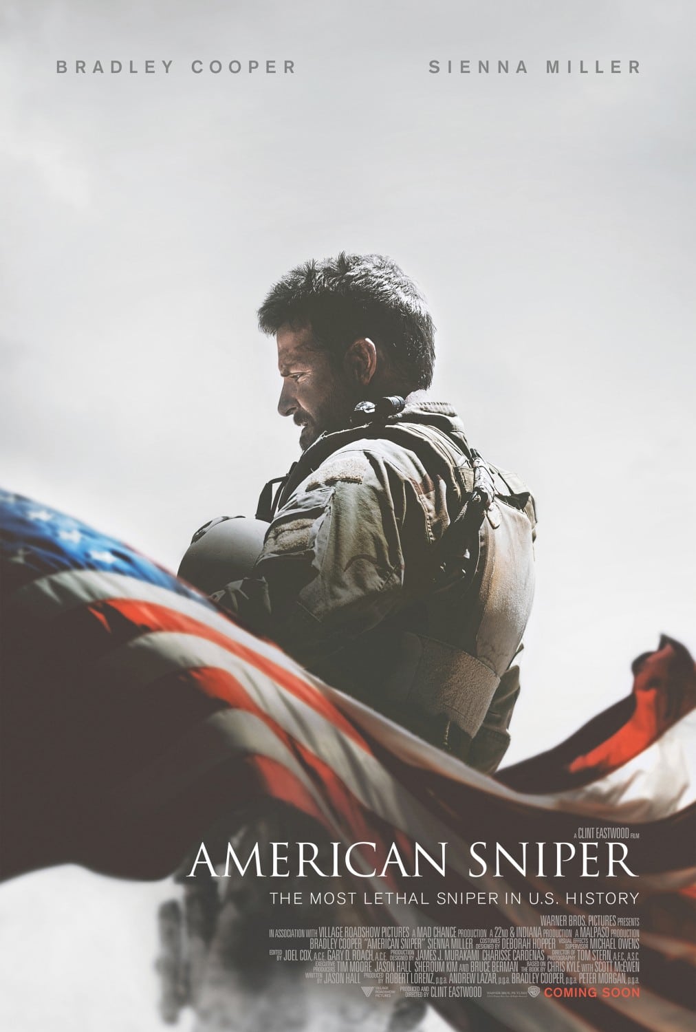
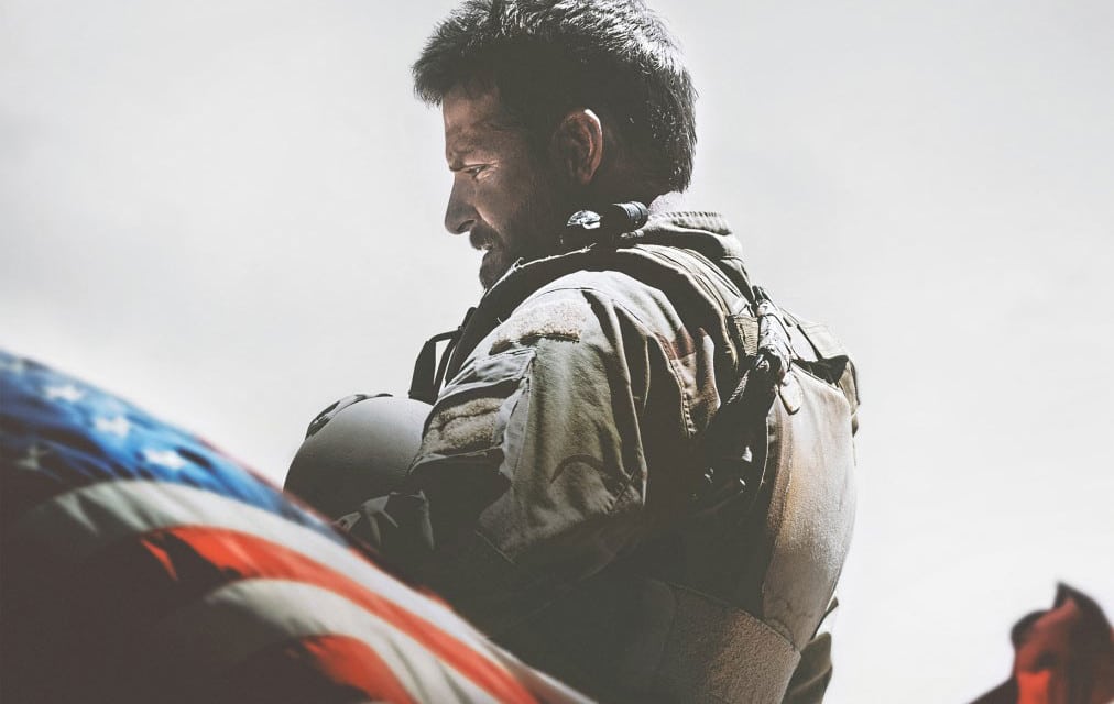
There isn’t anything particularly creative about this poster. But the execution is so good that it raises the poster to an entirely new level. The perfectly captured flag, the depth of field, the character in obvious mental turmoil. The typography shows us why Trajan is still the “movie font”—when used on a good poster, it’s beautiful. The black level was raised so that there is no pure black and the white’s were dirtied so that there are no pure whites in the image—intentional or not, to me this subtly hints at the fact that there is no black and white in modern war.
Runner ups, a few misses, etc.
Here are a few other posters. Some almost made the list. Otherwise I’m included because they were misses worth mentioning.
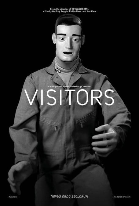
This one almost made the list. The image is super creepy and disturbing on many levels. The only reason it didn’t make the list is that there is too little context to get me interested in the film, which should be the primary purpose of any film poster.
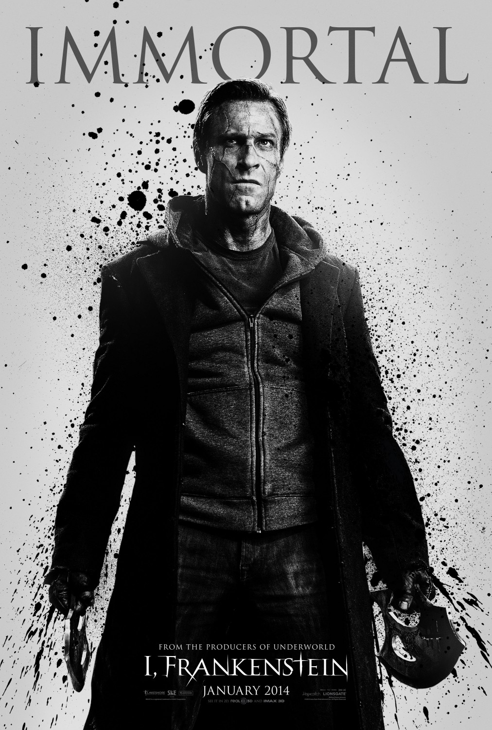
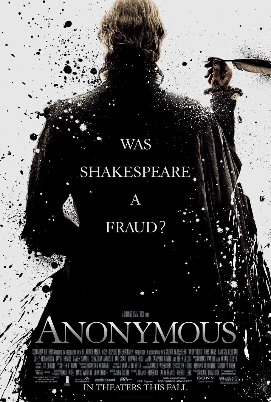
When I first saw the poster for I, Frankenstein I thought I was looking at the poster for Anonymous. The sad thing is that the poster was created by the same Creative Agency. So it wasn’t one designer getting inspiration from another designer and then copying it too closely. It was the same designer being too lazy to come up with a new idea.
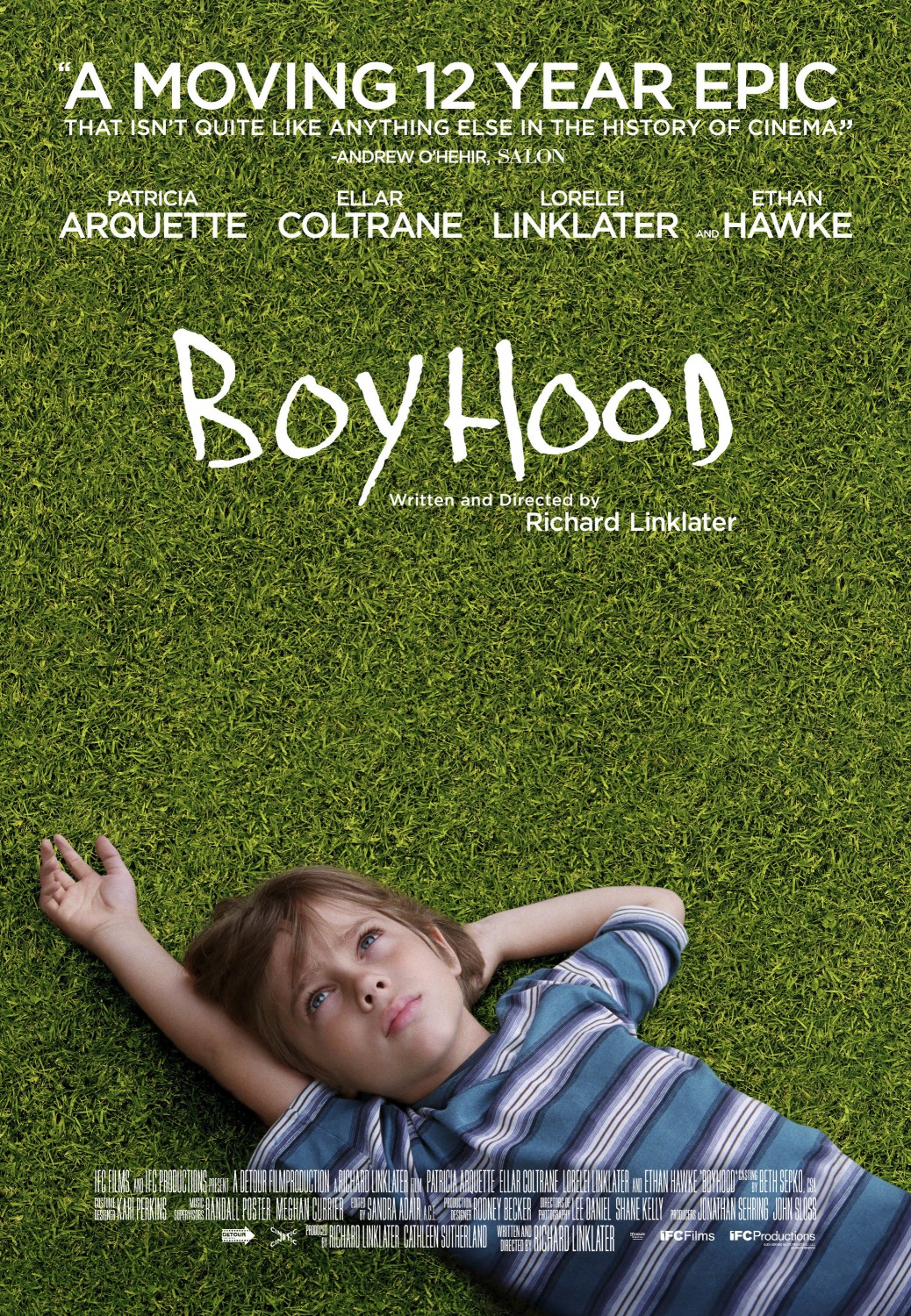
These two posters both use the same concept, even down to the hand-drawn lettering. Unfortunately, the Boyhood poster doesn’t work at all. The arm looks too short for the body and as soon as you see that, you can’t unsee it. Further, the grass was obviously cloned in photoshop. For a movie that took 12 years to make, they should have spent more than an hour on the poster.
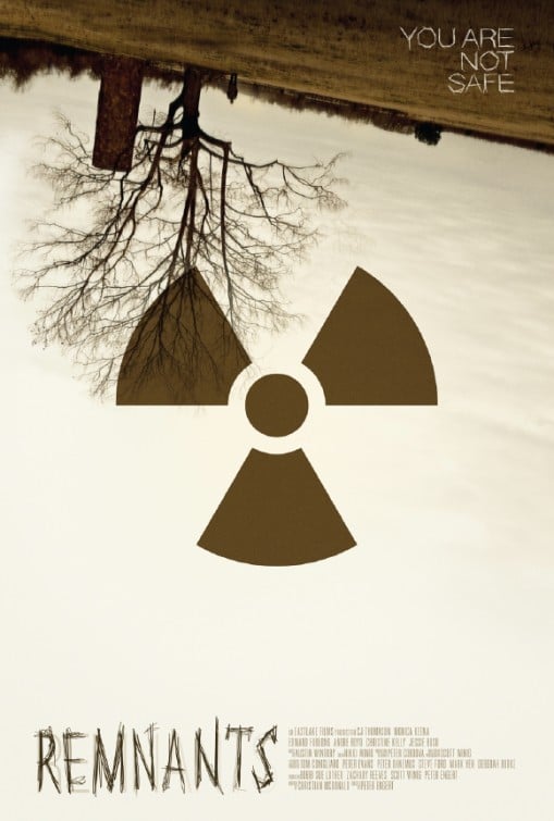
This is another poster that almost made my list. I love the uneasiness created by the slanted, upside down image. Unfortunately, the radioactive symbol should have been far more subtle. And the typography should have worked a bit more in telling me something about the film or what it is about.
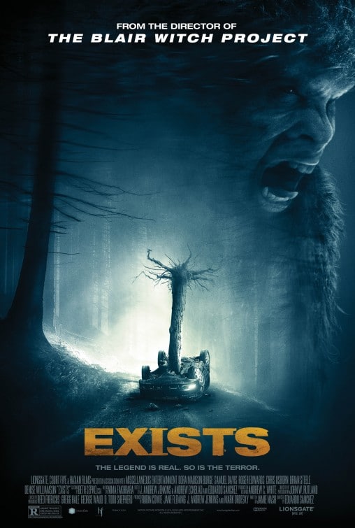
This poster unfortunately ruins the film. The best horror films don’t reveal their villain/monster until the end. The unknown is far scarier than the known. The image itself is quite cool—an overturned car impaled by a tree. But the monster shown on the top right, with it’s human top teeth simply makes the whole film less scary.
As a designer, the difference in perspective between the lettering and the shadow piss me off almost as much as the typography using two different-different-but-almost-the-same fonts.If you are going to do lettering in perspective, than it should match the perspective of the image. And if you’re going to use two fonts on the poster, than make them obviously different.
This image almost made my list, even though I do feel it’s a bit of a rip off of the Batman Begins poster. I still think it’s a really good poster. I feel it would have been better if the foreground and background matched up a bit better. They feel too different to make sense in the same poster. The background is obviously black and white while the foreground is in color.
That’s it! If there’s other posters you think should have made it on the list, let me know in the comments.

Hi there! I understand this is kind of off-topic however I had to ask. Does operating a well-established blog like yours take a large amount of work? I’m completely new to running a blog however I do write in my journal everyday. I’d like to start a blog so I can share my experience and thoughts online. Please let me know if you have any suggestions or tips for brand new aspiring bloggers. Thankyou!
Boy, I’d have to say I’m the wrong person to ask. I’ve been writing blog posts for about 5 years and only 1 out of 10 get any traction. And I have so little time I only get to write about 10 posts a year. I wish I could invest more time in it.
very neato.