My short answer is that I don’t like it. And if you’ve read my post on the Google logo, you can probably figure out why.
First, let’s start with a quick look at Medium itself. For all intents and purposes, it’s a blogging platform. But what made it different was it’s focus on written content over imagery. It was a platform intended for writers and readers.
When you came to Medium, you arrived at a place designed for optimum reading. The text was set in a serif face with ideal line length and good white space. There was no sidebar, no background color, no top bar, no footer, no ads.

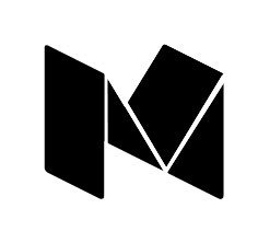
The previous logo fit this overall brand. A block serif M in black and white. It was a “no frills” logo, set in a face (Clarendon) that can trace its origin to the Oxford Press at Harvard. It’s a block serif face that had both a classic and authoritative look.
Against that backdrop, let’s look at the new logo.
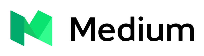
a) The new logo introduces a color that really doesn’t make any sense. Yes, it’s a fresh color, but it’s reminiscent of mint or foliage. Green has no association with knowledge or writing or reading. I don’t mind the introduction of color, but the color should have some meaning beyond just “looking good.”
b) The new logo uses a non-serif face. Why? Serif faces are easier to read and with a brand that’s built entirely around the reading experience, it would make more sense to retain a serif face.
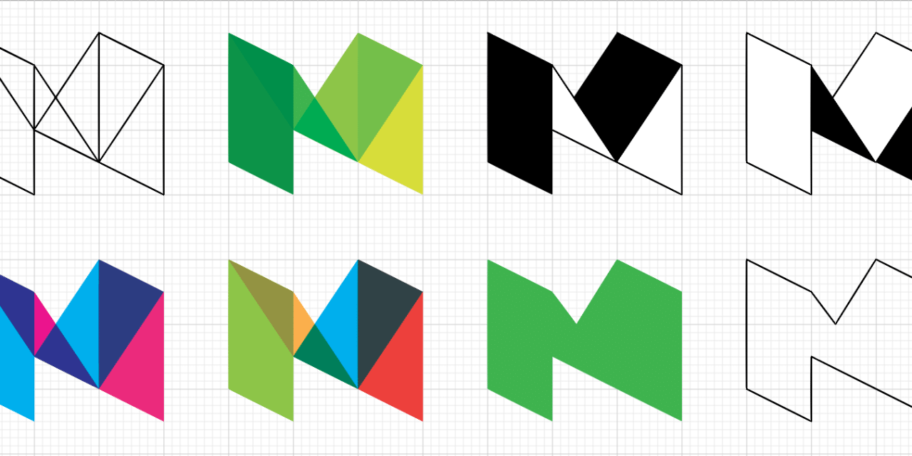
c) The folded M icon possibly hints at paper, which could be a clever metaphor for medium. But seeing that Medium is the opposite end of the spectrum—the anti-paper of writing and reading—it really doesn’t make much sense. Moreover, it comes awfully close to being a “low-poly” design, which is a very popular trend that won’t last more than a year or two before being very obviously dated—something a logo should avoid.
But the above are all opinions based on a possibly wrong idea of the Medium brand. It could be that Medium wants to come across as “fresh” in which case the color isn’t a bad choice. They may want to come across as “young and hip” and distance themselves from sophisticated, though-provoking writing, in which case the sans serif face is a good idea. And finally, they may want to compete against WordPress and Squarespace and other digital blogging platforms and thus the polygon inspired logo may serve them better than the previous M.
Now for the two things I consider technically wrong with the logo, regardless of opinion:
1) The logo should work in black and white (no, not greyscale—just black and white). If I want to take the logo and press it into a leather case, I don’t have the option of shades.
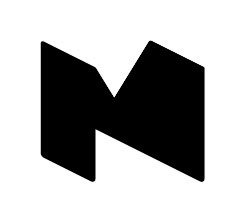
The logo no longer works. This isn’t to say it couldn’t be adjusted to work, as shown here:
But as designed, it only works in color or greyscale. And while we’re on the subject of color vs. greyscale, why is the official logo green and yet the logo in their menu and on their daily digest email greyscale? It’s very confusing.
2) The “Medium” feels like it’s been tracked out a tiny bit. Enough to be annoying. For a brand built around writing/reading, this should be dead-on accurate.
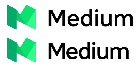
The top is the new logo. Below is a quick photoshop kerning of the letters.
At the end of the day, my biggest gripe with the logo is the shift of tone from the “no frills” blogging platform to the “me too” design.

