Here are the hits and misses for 2013 Movie Posters. This is based on my design review. I give my explanation on each. I will say ahead of time that I haven’t seen all of these movies. But a movie poster’s audience is people who haven’t seen it (except posters by Ollie Moss, which are done almost exclusively for fans of the film as collector items) so the poster should work regardless.
Okay, here we go. Let’s start with the posters that stand out above the crowd.
The Hits: Best Posters of 2013
These are the posters that, to me, stood out from the rest. They aren’t in any particular order.
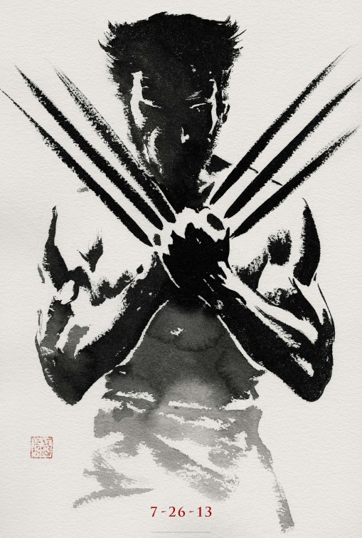
Although not the most impressive execution, it’s a great concept and suits the film quite well, immediately telling you it’s Wolverine (without even having a title on it) and telling you that it relates to Japan. The problem I have with the execution is that the black is too black, there should be a second color in it and some of the muscles (look at chess and biceps) are clearly derived from a photo rather than brush strokes. For comparison, check out this image of a Japanese Brush Painting.
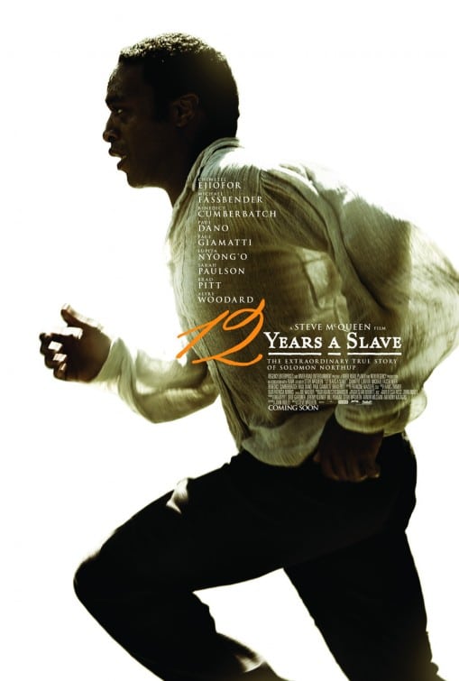
This is a great action capture. The stark white background works well. I love the fact that the back-lighting (with his arms showing through the thin shirt) is done in a fashion that looks realistic. The type is also nicely treated and the colored “12” works really well.
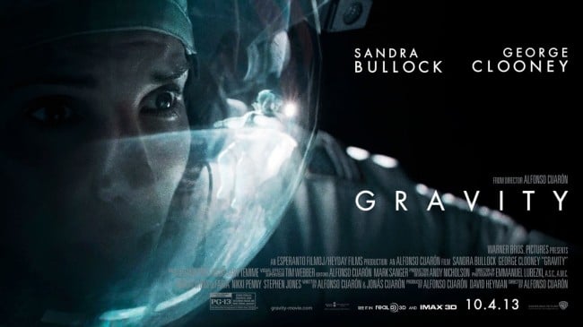
There were quite a few Gravity Posters done, including the more familiar image of an untethered astronaut. However, I prefer this one. It’s far more intriguing. I also like the very photographic nature, with the depth of field, the smudges in the glass of the helmet, the reflections, the light. The great thing about these is that they tell you visually that this movie will not look like CGI—that the film will look realistic.
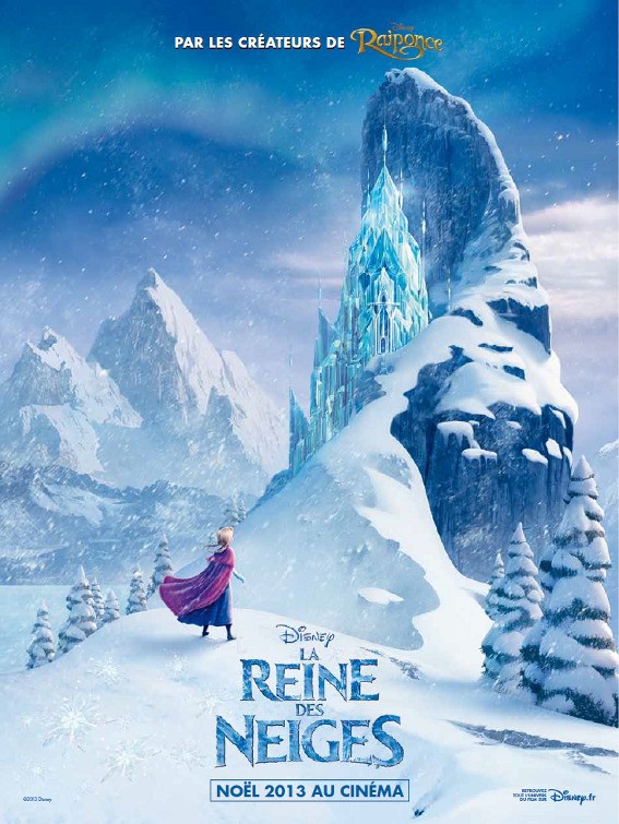
This is the French poster for Frozen and it is by far the best. The primary English poster is just a title in Frost. They had another poster with the character’s heads sticking out of the snow. None come close to the epic nature of this French poster.
Great use of space. Very simple. Limited color palette. One font. What’s not to like?
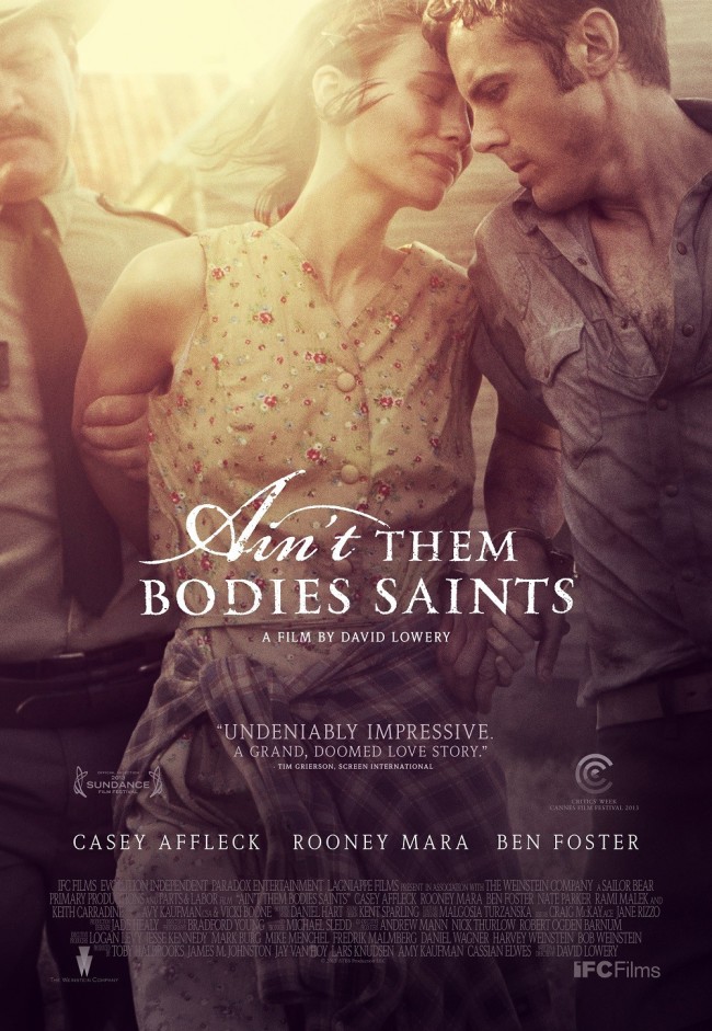
I’m not usually a fan of posters that are a super color toned photo. Primarily because most of them look amateur and are very uninteresting. And because this one is neither of those, it’s included in this line up. The photo is great, the treatment works well and the typography is really nice.
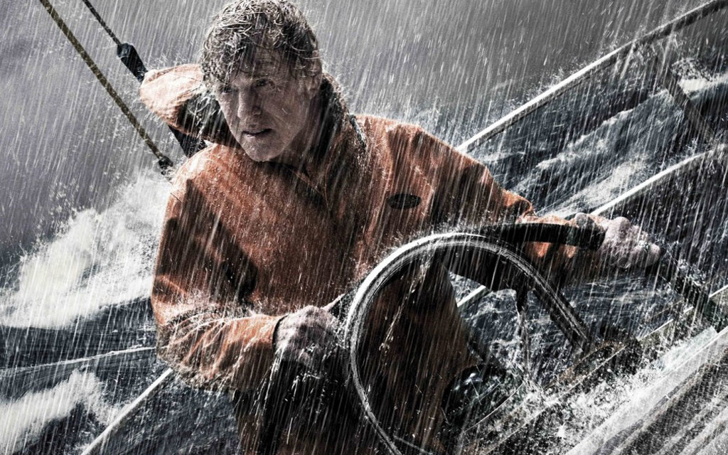
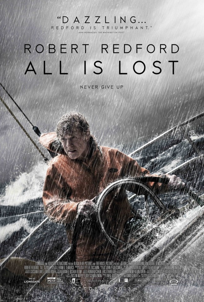
This is a great photo and I love the bleach bypass treatment that’s been done on it. Great use of mood lines. Great use of Triadic Color harmony. Great use of texture. My one gripe with the poster is the lettering. Robert Redford and “All is Lost” are not visually different enough. Thus it reads as one statement – “Robert Redford All is Lost.”
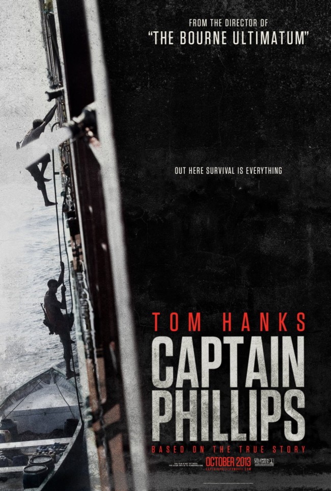
I like the use of negative space on this poster. I also like the use of an unstable mood line to create a sense of unease. The grunge and depth of field make the whole thing feel gritty and add to the sense that this was a true story. One almost gets the idea that this was a photo taken by chance during the real incident, rather than by a film crew shooting actors.
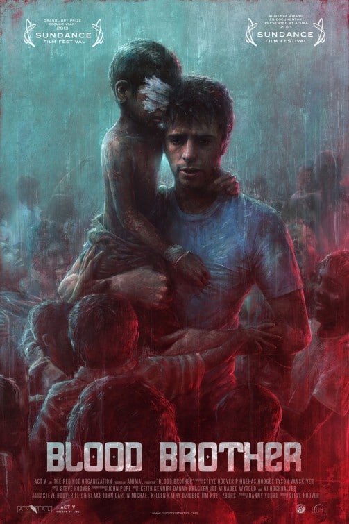
I have no idea what this movie is, but the poster is great. It’s an oil painting with amazing use of colors. It works as a piece of art in its own right.
This poster isn’t amazing, but the fact that it can stand on its own right, with no movie title on it tells a lot about the movie and its place in popular culture.
Horror Movie Posters
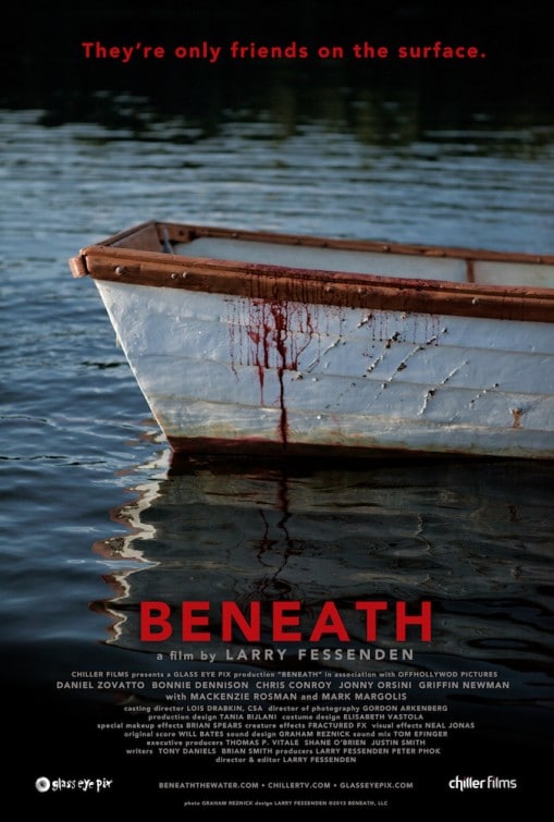
This poster, which is obviously for a B Movie, wins a place on this list not because of the execution, which is not great, but because of the concept and the tag line, which are both pretty excellent.
I’m a big Stephen King fan and this poster was a nice treat. The fact that the film title isn’t on the poster and yet most people will know immediately what movie it is for says a lot about the poster design.
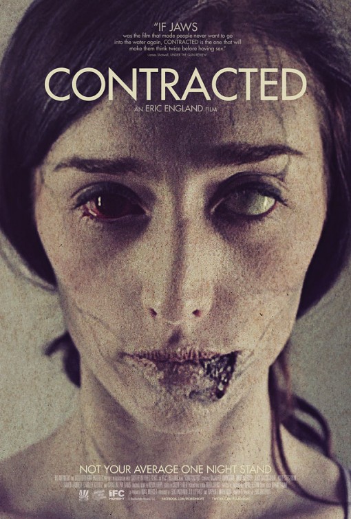
This is a super scary image that is disturbing on so many levels. It balances the line between realistic and horror so well that it makes you want to look away and yet at the same time, you can’t help but look.
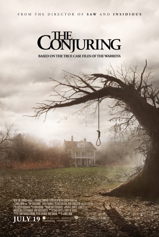
I love the composition of this poster. The creepy tree framing the house in the mist. The shadow of the hanging woman is a great concept, although not well executed. The problem I have with the shadow is that the cloudy day would not result in a strong, clean shadow. Also, the feet don’t look like a hanging person’s feet.
The Misses: The Not-so-great Posters of 2013
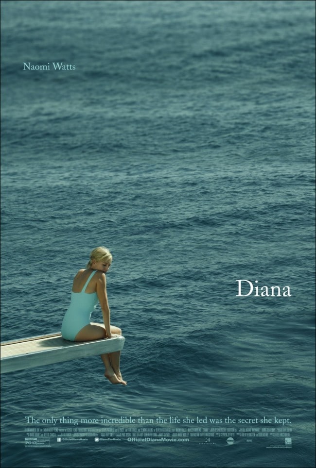
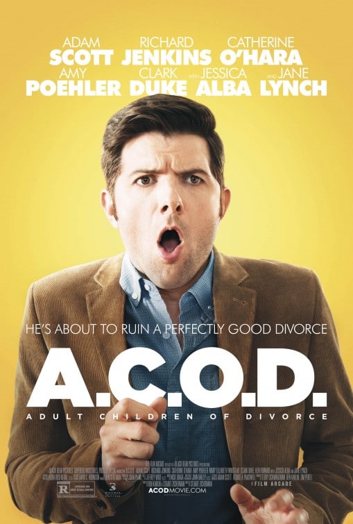
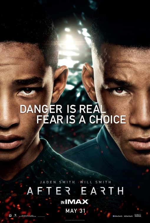
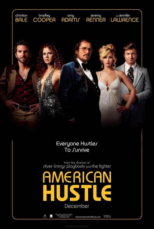
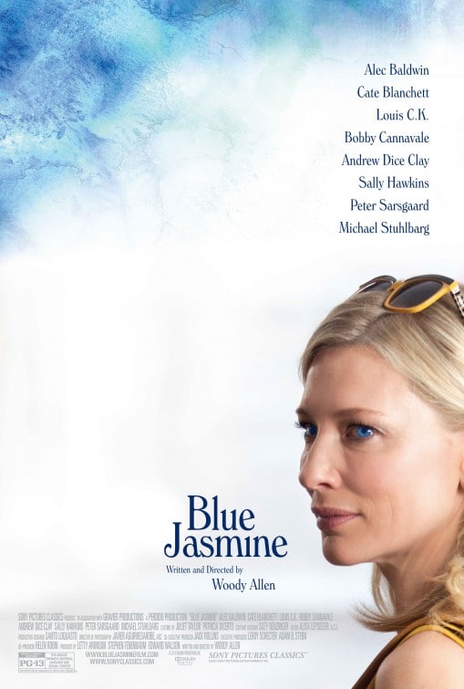
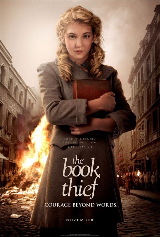
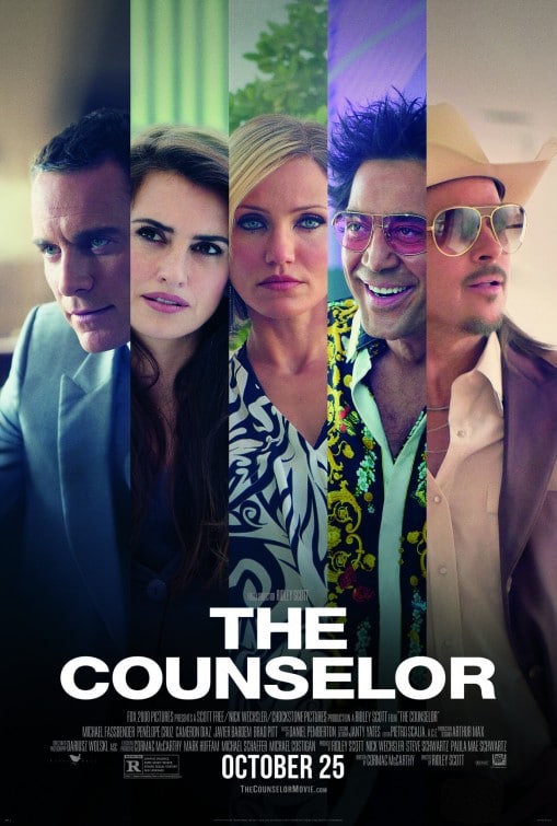
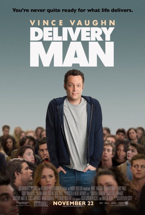
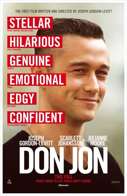
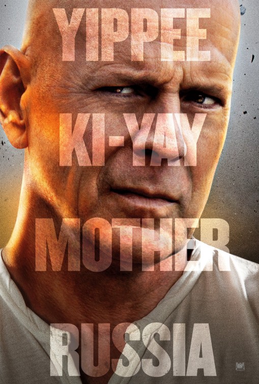
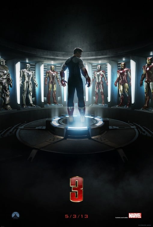
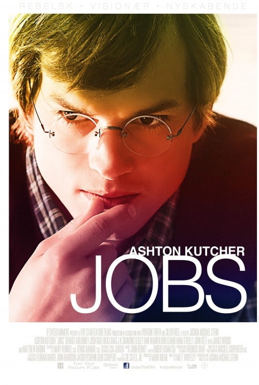
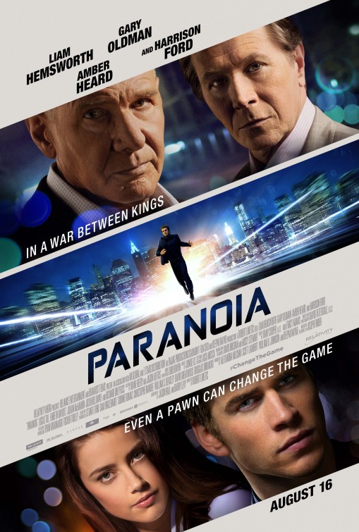
These aren’t by far the worst posters of 2013, however they are the most disappointing. I’ve avoided any posters for B Movies or Independent movies, as I don’t expect these to have good posters. Rather, these are movies that should have had good posters but didn’t. The biggest problem I had with these is that they either didn’t tell a story, were lazy or had some other fundamental flaw. Instead of doing through each one, you can hover over to see the few word review.

