“Why? Because it’s sometimes better than Times New Roman, that’s why.” — Vincent Connare
Comic sans is one of the most loathed fonts by professional graphic designers. And, more and more, it is becoming universally recognized as a terrible font—even though it’s use is still ubiquitous. Memes about Comic Sans are everywhere and there is more than one website dedicated to the font—not in a good way.
Thank God too—it’s about time this font falls into oblivion.
So, how did a simple font get such a terrible name? The reality is that there ARE fonts worse than Comic Sans. But few have created such a bad effect on design.
A Little Back Story
Comic Sans was designed by Vincent Connare while working at Microsoft. A comic software package had been developed by Microsoft that was using Times New Roman and so Connare decided that rather than Times New Roman, the software should instead use a comic-inspired font. He wasn’t wrong.
In a blog post he wrote regarding the font, he says:
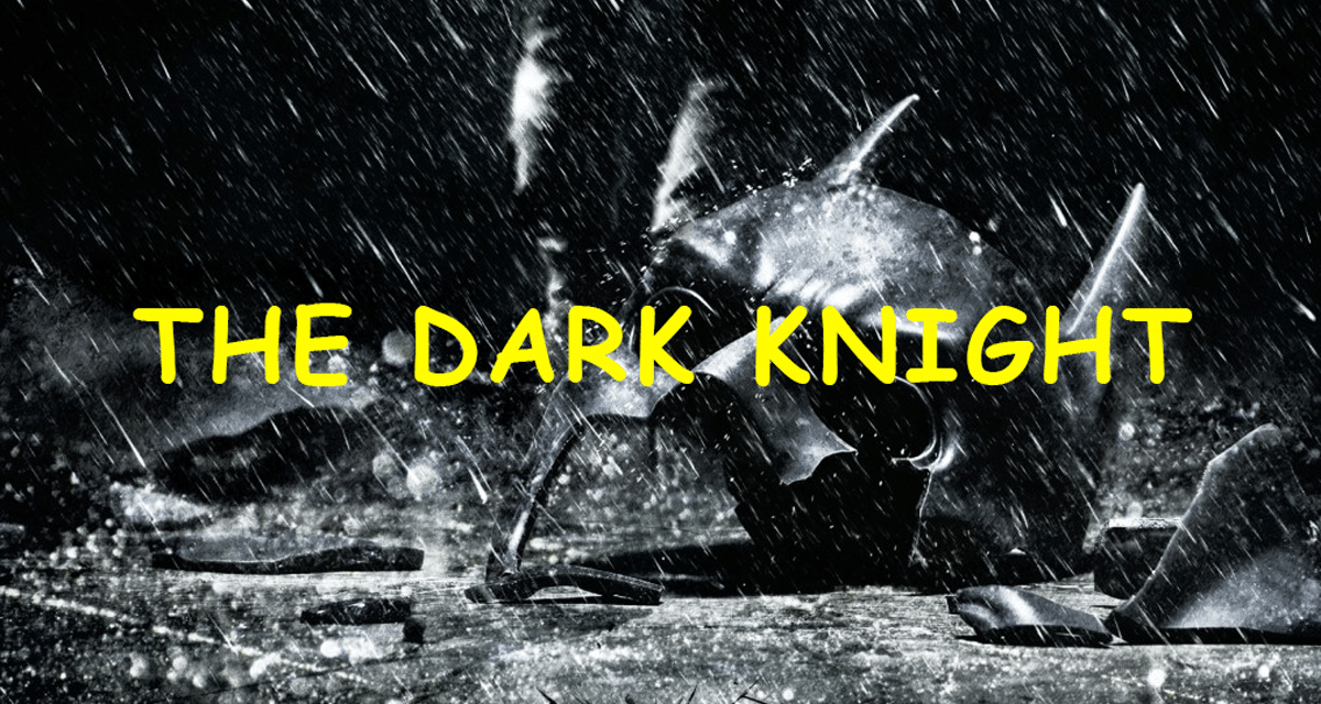
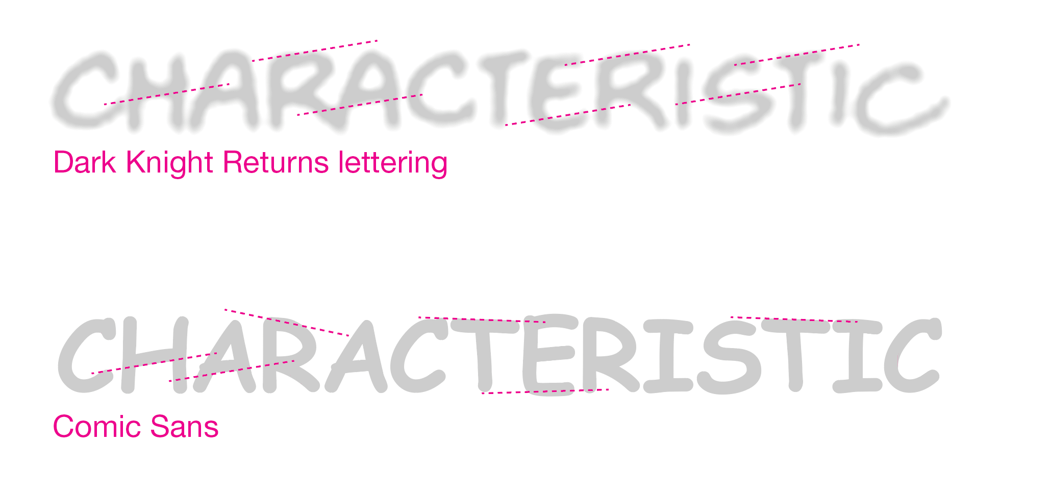
“I started with the font drawing software Macromedia Fontographer, trying to make the capitals in a similar form as the lettering used in DC, Marvel and all other company’s comic books. The Dark Knight Returns a Batman book was one of the books I referenced often. I took care not to copy the letters but looked at varying shapes in different styles. Also most samples only used capital letters so I had little reference for them. I printed it out so that the weight was about the weight of the Marvel and DC books. I looked at the varying letterforms that each book had since all the letters vary because they are manually written.”
To his credit, Connare never intended for the font to be used for anything but applications designed for children. Unfortunately, Microsoft included the font in Windows 95 and so began Comic San’s crusade to infiltrate everything from hospitals, offices, churches, restaurants, newsagents, police stations, doctor’s offices, supermarkets and a host of other locations that have NO NEED for a comical font.
Connare defends Comic Sans in the conclusion of his blog post—“Why? Because it’s sometimes better than Times New Roman, that’s why.”
While this statement is true, it doesn’t justify Comic Sans’ terrible design.
What Comic Sans and Arial have in Common
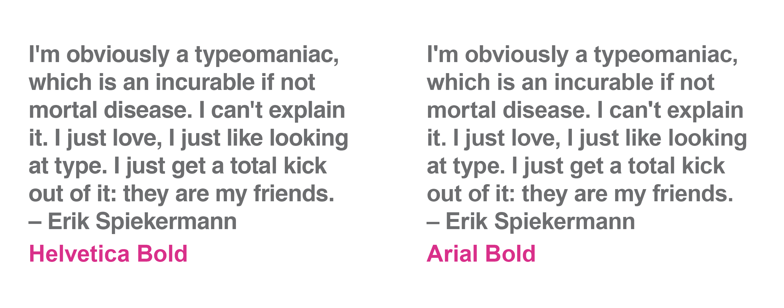
When Microsoft didn’t want to pay for a Helvetica license they had a 10-man team create Arial. Arial was designed to be metrically identical to Helvetica. The problem is that Helvetica, designed by Swiss typeface designer Max Miedinger, is a near perfect font. And so the Arial design team had only one direction to go—down. In essence, they degraded parts of Helvetica so that Arial wouldn’t be a “copy” of Helvetica and they could avoid having to pay a license.
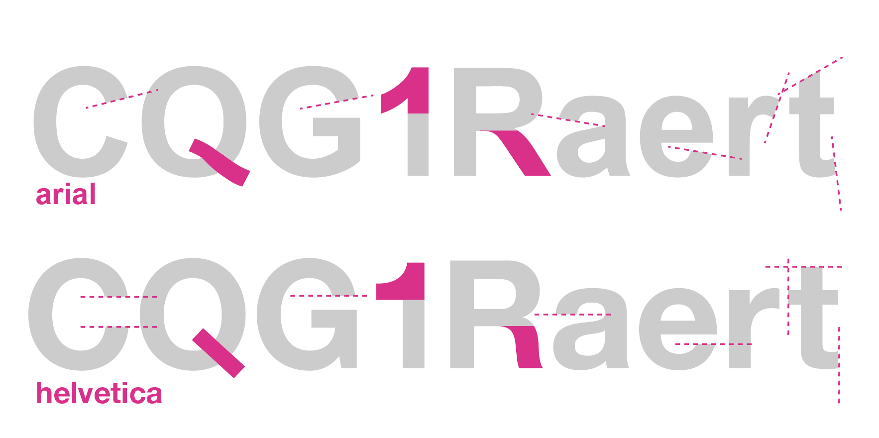
You can see from this comparison that Arial’s angles are all over the place, while Helvetica rarely deviates from 90 degree angles. Moreover, the clean top of the 1 and the slash through the Q have been changed for the sake of change and the result is not pretty. But the real difference is not so much in the fine details than it is in the sum of their parts. Text set in Helvetica looks more professional than Arial, even though their general design is similar.
This seems to be what happened with Comic Sans. Conner says he copied the letterforms in The Dark Knight Returns comic book, but a comparison of the two shows that they were modified to be worse. Unlike the lettering in comic books, Comic Sans doesn’t have a uniform angle and has a mix of serif and non-serif forms, creating a hodge podge font that, regardless of its use, is unattractive. I apologize ahead of time for the low-resolution of the hand lettering, but it serves to show the general angle of the letterforms as compared to the lack of uniformity in Comic Sans.
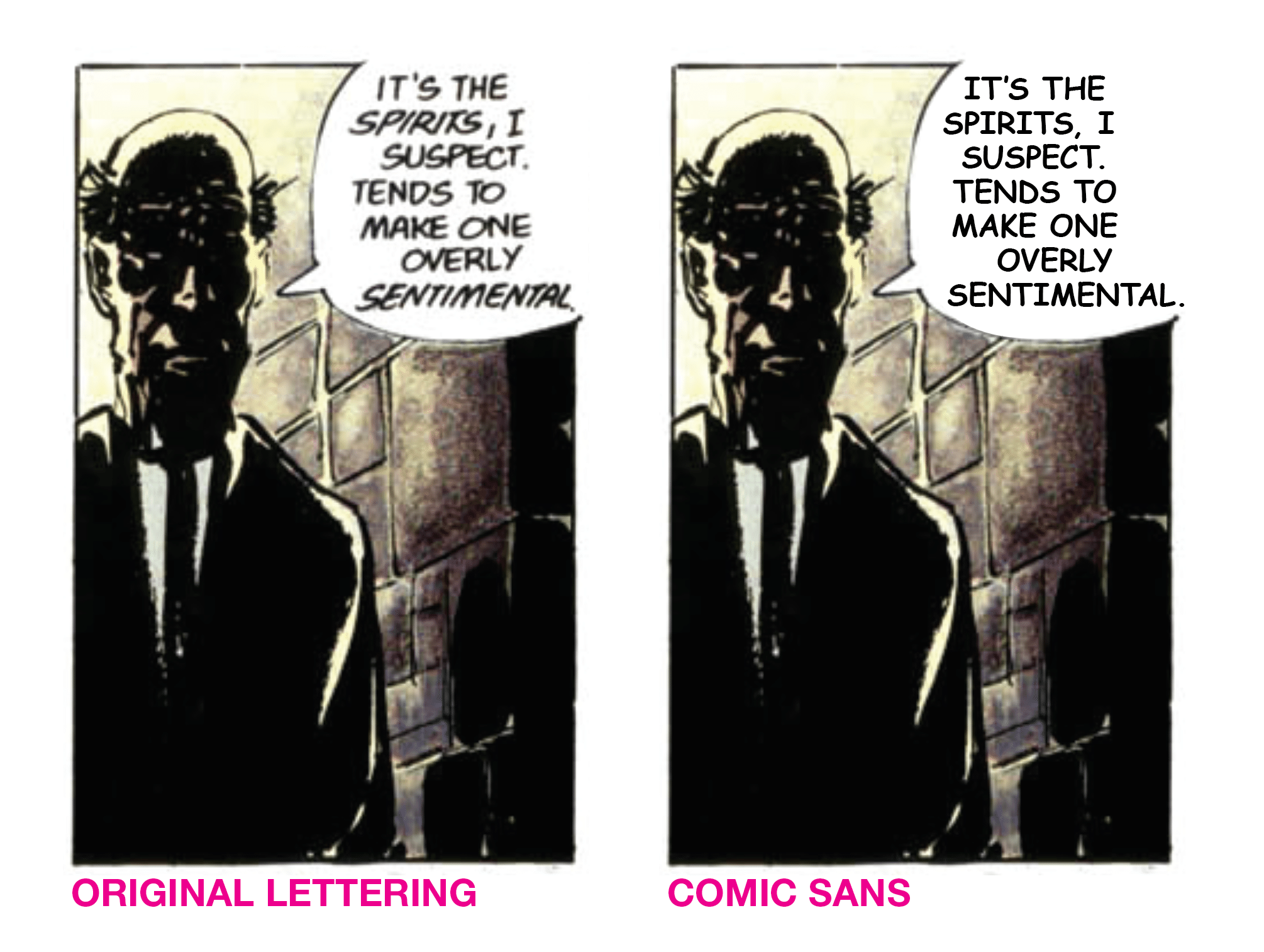
The difference in letterforms becomes even more apparent in a comic panel, as shown here:
This is compounded when the font is used for virtually anything except children’s books or comic panels.
Comic Sans and Designers
Comic Sans leaves a particularly bad taste in the mouth of most designers and for good reason. Comic Sans represents the devaluation of design as a skilled trade more than any other font. Because someone has a computer and a layout program, they think they can design. And this is most evident in virtually anything that uses Comic Sans.
People with no design savvy have reduced three of the basic font types—serif, sans serif and display—into three fonts: Times, Arial and Comic Sans. Consequently, everything they don’t want to set in serif or sans serif is set in Comic Sans.
In reality, unless it’s a sign for an Easter Egg hunt at a preschool, anything that uses Comic Sans loudly says that the person who produced it is NOT a designer and actually has no idea that the purpose of design is to complement and deliver a message appropriately to its intended audience.
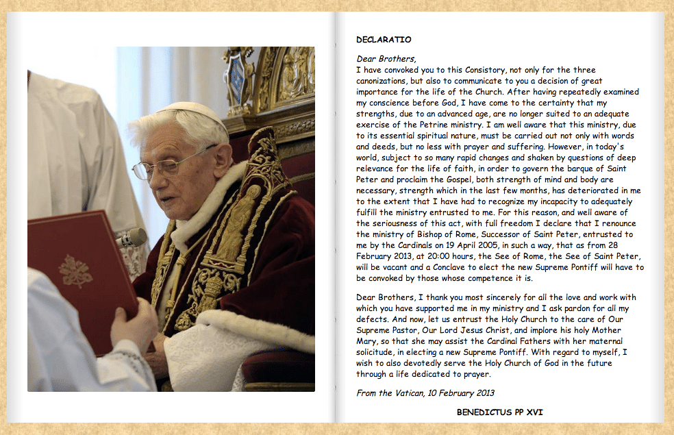
And when we’ve arrived at a time when an official publication from the Vatican (the origin point of such classic fonts as Trajan) is set in Comic Sans, we’ve truly hit rock bottom.
What You Should Use Instead of Comic Sans
Use literally anything else.
The first rule in Graphic Design Rules: 365 Essential Design Dos and Don’ts is “Though Shall Not Use Comic Sans.” And as a general rule for professional graphic designers, it’s a good rule.
If you’re confronted with something using Comic Sans, first identify what the Comic Sans was being used for. This will generally fall into one of these categories:
- in place of a display font. As mentioned above, this is about the amount of “thought” put into 80% of items set in Comic Sans.
- to show something being “handwritten.”
- to show something isn’t serious.
- to appeal to children.
- to show a caption or dialogue in a comic strip.
From there, you’ll have a good idea of what to do. If it’s (1), simply find a good alternative display font that contrasts well with the body font.
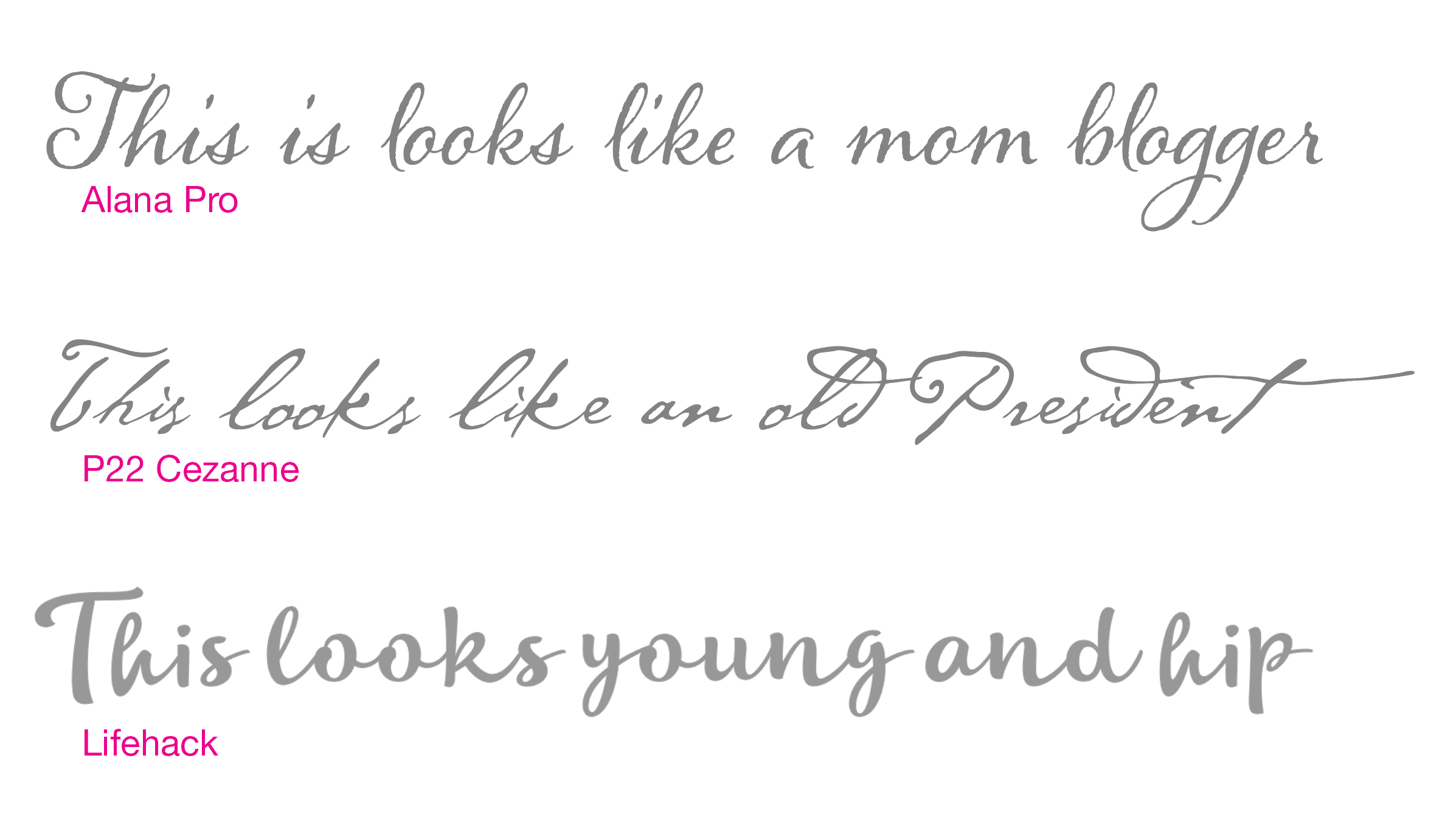
If it’s (2), use a nice handwritten font—here’s a good selection. The font you choose will go a long way in giving the content’s voice a character. If you want the “voice” to be young, use a font like Lifehack. If you want it to have a female voice, use something more scripty and twirly, like Alana Pro. If you want it to be old, use P22 Cezanne. And so forth.
If it’s (3) above, use instead a font that has a less mechanical feel to it. While Helvetica is a great font, it is so accurately formed that it can feel important or “non-formal” feel to it. Humanist fonts are a good alternative—look at fonts like Myriad Pro or Frutiger as a starting point.
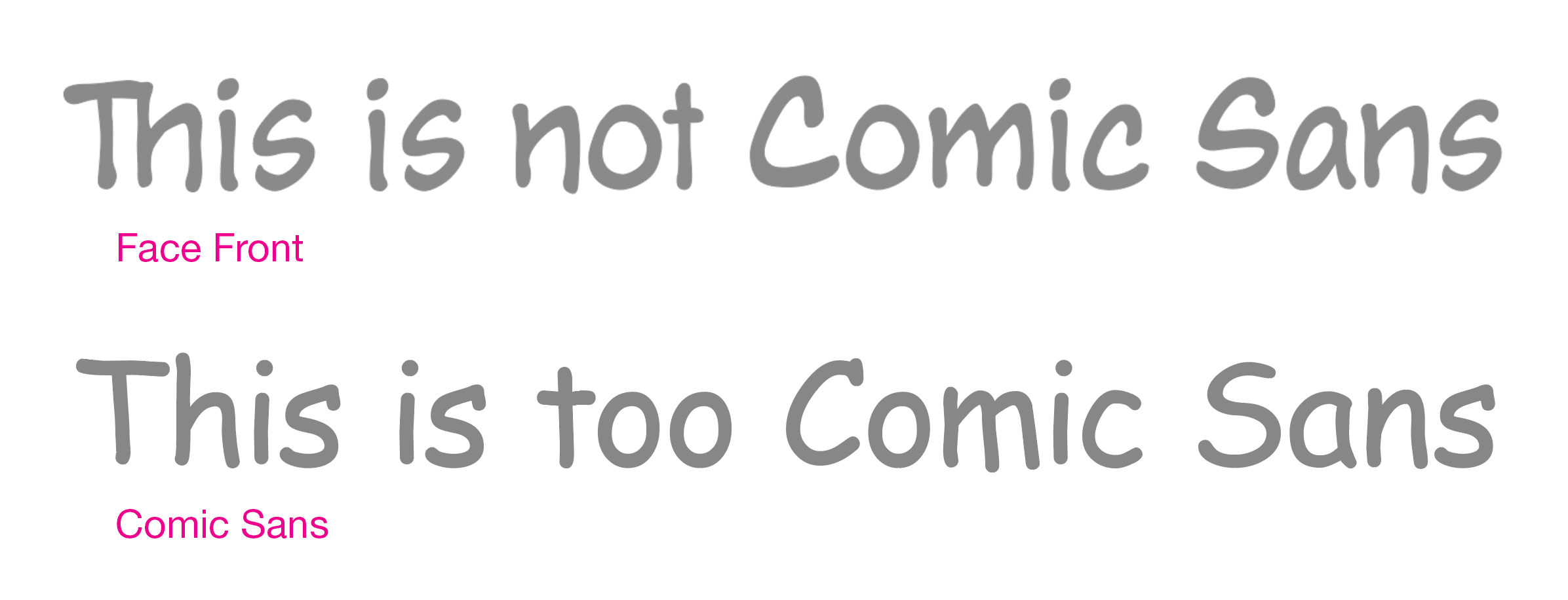
Finally, for (4) and (5) Comic Sans is an appropriate font, but not a great font. There are far better fonts to use in both scenarios. Lafayette Comic Pro is much closer to the actual hand lettering in original comics, but doesn’t come with lowercase letters. Another good option, with a slightly more childish feel is Samaritan. But for a font that has the same qualities as Comic Sans, but is better crafted, I would recommend Face Front. You can see the two next to each other here. The quality of the fonts is immediately apparent.
You’re probably wondering why you should pay $50 for a font when Comic Sans comes free with Mac and Windows computers.
Why? Because it’s always better than Comic Sans, that’s why.
