How do you design a logo? What’s important when designing a logo? What are the fundamentals to keep in mind? Here we look at the 7 most basic “rules” or principles of logo design. Each of these could fill a book, so I’ve kept this somewhat short and only covered the highlights of each point.
- A logo must communicate
- A logo must be relevant
- A logo should be memorable
- A logo should be timeless
- A logo should not have superfluous elements
- A logo should be technically well crafted
- A logo must be versatile
1) A Logo must communicate
“To design is to communicate clearly by whatever means
you can control or master.” — Milton Glaser
![]()
Like any design, a logo must communicate a message. By communicate, we simply mean share or impart. And a message can be a story, an idea, an emotion or mood.
A logo can communicate its message through the symbol itself representing a core value, product or service of the brand. Or it can communicate a message through the execution of the design—simplicity, luxury, high-tech, low-tech, vintage are all easily communicated through the execution of a design. Or the logo can communicate a larger story that is either understood implicitly or only understood after some explanation, such as Amazon’s A-Z logo or Twitter’s bird logo.
Whatever the case may be, the logo must communicate SOMETHING.
Let’s take a closer look at the ways in which a logo can communicate:
a) A logo can tell you the name of the brand
The term Logo is short for logotype, design-speak for a trademark made from a custom-lettered word (Logos is Greek for Word). The term logo has now become synonymous with trademark, regardless of whether the trademark is a logotype, symbol, monogram or other graphic device.
But this certainly gives us a clue as to the most basic duty of a logo—to tell us what the brand is. Coca-Cola, IBM, Ford—all these logos are simply an execution of the brand name. Logos that stand alone, independent of any logotype, such as Apple, Twitter and Nike, all started with a logo that incorporated their name. Only through a lot of repeated use and almost universal symbol recognition were they able to drop their name from their logo (a concept referred to as debranding).
![]()
b) A logo can visually represent the brand name
This is one of the more common uses of a logo. The apple logo means nothing more than “Apple.” It’s literally an icon of an apple. The Windows logo shows you a window. The Taco Bell logo is a bell. The Nautica logo is a sailboat—which makes sense when you consider that nautic means “of or concerning sailors.”
![]()
c) A logo can give you a clue as to what the brand is about
Good examples are PetCo, Nvidia, DirecTV, Burger King and Sprite. In each case, the logo shows you something about the brand. PetCo is quite literal in showing a cat and a dog. Nvidia shows an eye, which has a direct relation to graphics cards. Burger King’s logo is sandwiched inside a hamburger and Sprite features a lemon and a lime.
![]()
While the above are quite literal examples, a logo can also tell you something about a brand in a slightly more roundabout fashion.
d) A logo can relay a sense, mood or feeling
Certain names have little to do with the product itself and in this case, the execution of the logo gives a sense of the brand ethos. The LEGO logo for example, is written in a very playful font, using primary colors red and yellow. The logo immediately conveys a sense of fun, youth and play despite the fact that in English, LEGO doesn’t mean any of those things.
![]()
e) A logo can tell a story, or at least hint at one.
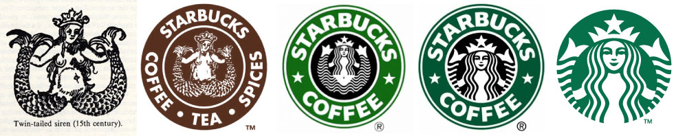
The argument can easily be made that this is the best kind of logo. These are the logos that leave a lasting impression. The Starbucks logo has a back story that involves a Norse woodcut siren. The story of the Bluetooth logo involves a Danish King. Ferrari’s famous logo has it’s origin in a famed Italian World War I fighter pilot. Even the Domino’s logo has some significance to the three dots—this was the original number of franchises at the time the logo was designed. And did you know the Unilever logo includes 23 different illustrations—one for each of the industries and fields in which it’s products land?
![]()
The great thing about these logos is that people who learn the story and who are interested in them will likely share that story, creating instant brand ambassadors. There are thousands of blog posts and articles on the story of the Siren in the Starbucks logo. Each one is reinforcing the brand and the logo for the company, something many smaller companies would pay good money for.
While there’s been a lot said about the revised Pepsi logo, I would argue that most people prefer the old logo over the new one. Why? My theory is that the old logo communicated something—the blue color said it was different from Coke. And the wave indicated it was a drink. The circle actually started as a bottle cap and the logo had a history that naturally resulted in their simplified logo. The new logo didn’t communicate to it’s audience. No one understood the new shape. Was it a smile? A different wave shape? A gap? A beer belly? I believe Pepsi will recognize this at some point and return to their previous logo. (Note that you can see a hint of the old logo in the “e” of the logotype.)
![]()
2) A logo must be relevant
“I do not regard advertising as entertainment or an art form,
but as a medium of information.”
—David Ogilvy
This is an obvious point and virtually guaranteed if the first principle above is applied. However, it is a point often missed with beginning designers who start the logo design process with “let’s make something that looks cool” rather than, “let’s make something that communicates the brand message.”
Here are a few logos from 99Designs that make the point:
![]()
None of these logos are relevant to the brand. Would you guess, by looking at the logo, that Mane is a hair salon? There’s already a metaphor in the name—Mane is the hair of a lion. And yet instead we get the brand written in a boring font with a few parts of the A and E knocked out so that we can pretend it’s a logo. Or how about the “curentt” logo? Would you guess this is supposed to be for a dating app? Bilt Nano and AdUp use the same design element yet are totally unrelated fields.
The problem with most designs done on a site like 99Designs.com is that the design process—which is usually 90% research and 10% design—is improperly balanced to 5% research (whatever “brief” is posted on the site) and 95% “designing.” In reality, most designs are just writing the name of the company and adding a stock vector element to the logo.
As a final point on the relevance of designs, I’ve seen other articles which state this as “a logo should be appropriate.” While this is true to some degree, the negative would be the better rule—a logo should not be inappropriate. A bird isn’t particularly “appropriate” for a social networking site, but it isn’t inappropriate. On the other hand, here are some inappropriate logos:
![]()
3) A logo should be memorable
“An arrow, in and of itself, is one of the most mundane
graphic devices in visual communications.” — Lindon Leader, Designer of the FedEx Logo
Is it unique? Has it been done before? Is it a visual cliche? These are questions that must be asked of any logo design.
What makes a logo memorable is a mix of luck, repetition and creativity.
Beyond that, there are certainly things you can avoid in creating a logo. First and foremost, skip your first idea. 9 out of 10 times, your first idea is also every other designer’s first idea. If you’re doing a logo for a coffee company, showing a coffee bean is not going to be memorable. If you’re doing a water filter logo, don’t do a drop. And if you’re doing an organic based logo, don’t use a leaf!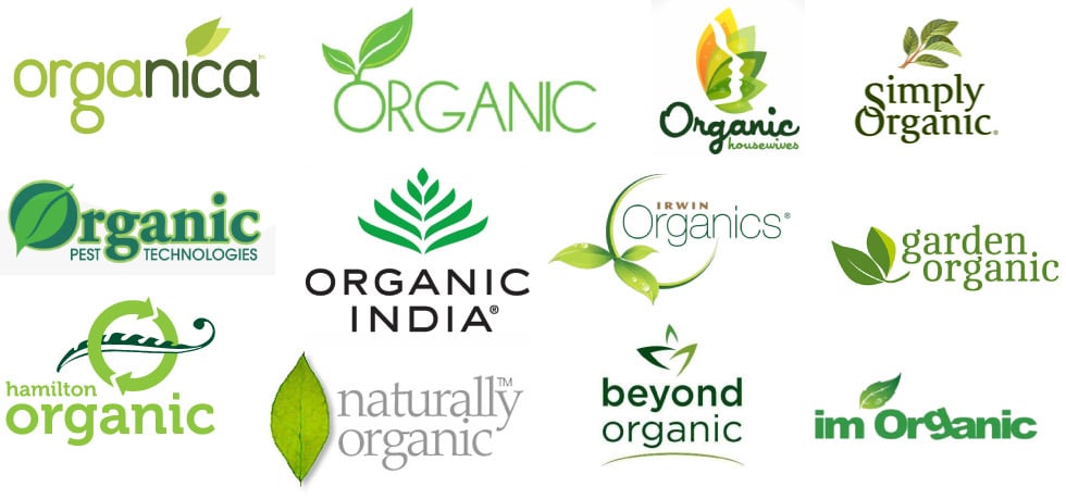
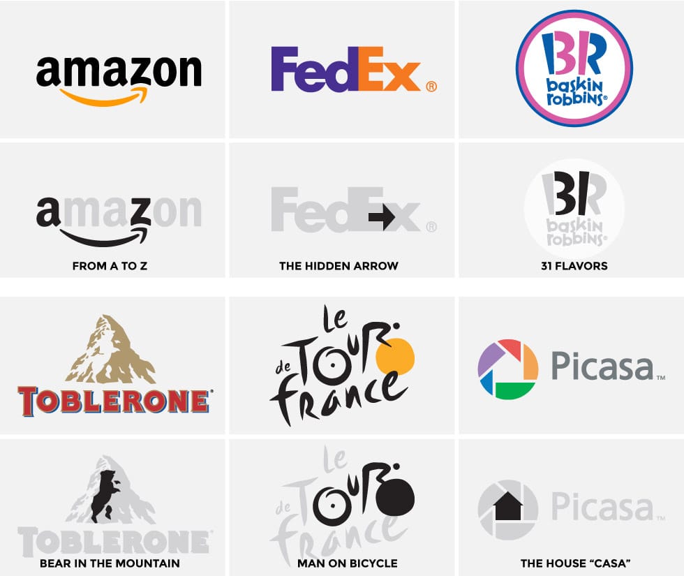
The Hidden Surprise
Another element that works very well in creating a memorable logo is to build into it something which gives it an “aha moment.” In other words, something that is not immediately obvious but when found, gives one a small surprise. This small surprise will do a lot in making people remember the logo. Probably the first logo that comes to mind in this regard is the FedEx logo with its hidden arrow. There’s a great interview with the designer of the logo that you should read. The crux of it, in regards to the arrow, is that it only works because it is hidden.
4) A logo should be timeless
“To create a memorable design you need to start with a thought
that’s worth remembering.” — Thomas Manss
Another key point in designing a logo is making sure it will be timeless. If something hasn’t existed for at least 50 years, it’s likely not a good idea to design a logo around it. Good logos are based on elements that will be around for a long, long time. The Apple logo, shown earlier, is a fruit that’s synonymous with the beginning of mankind. Had the logo been designed around the shape and form of the first apple computer, the logo would have lasted 2 years. The twitter logo is a bird. The Starbucks logo is a sea creature. The Ferrari logo is a horse.
None of these logos will become irrelevant with time. On the other hand, logos designed based on contemporary items will quickly date. Here are a few examples.

The key for cars is already dated—most modern cars don’t have keys. The clothes worn by the lumberjack, along with his hard hat, also already look dated. Sunglasses styles are far too transient to base a logo on. And the luggage in the last design will likely only last a few years.
Design Trends
Another example of logos that aren’t timeless are those based on current design trends. A good example is the current trend of “polygon art” which originally started as a photo manipulation effect and has now crept its way into logo designs. Aside from other inherent problems with this as a design style for logos, this trend will be gone in a year or two and the designs will instantly be dated.
![]()
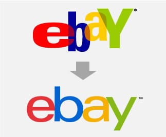 This problem of timeless design is manifested in a few recent logo “updates.” Small logo changes to stay contemporary and relevant are not the issue here. Creating a logo to be dependent on a contemporary design trend is. The simplification of the Starbucks logo makes sense and is a logo update that works well. Even the updates to the Google logo makes sense—removing the bevel effects and drops shadow actually enhances the integrity of the logo (see point 6 below for more on this). eBay’s logo update, on the other hand, essentially throws away their previous logo in favor of their name typed in one of the most common fonts in the world and can only be called a logo because of some color changes between letters. Even the Microsoft logo, in my opinion, has the same problem. Oversimplification has eliminated any element that made the logo unique in favor of something that looks more “modern.”
5) A logo should not have needless elements
“It seems that perfection is attained not when there is nothing more to add,
but when there is nothing more to remove.” — Antoine de Saint Exupéry
Originally, I was going to have this point be that a logo should be simple. And for most scenarios and situations, this is correct.
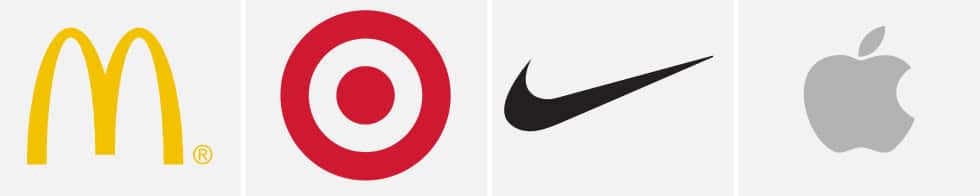
The more simple a logo is, the easier it is to remember and also the easier it is to explain. If I want you to go to McDonald’s I can tell you to go to the fast food joint with the big yellow arches. Target is the store with a red target on it. Nike is the swoosh. Apple is the apple with a bite out of it.
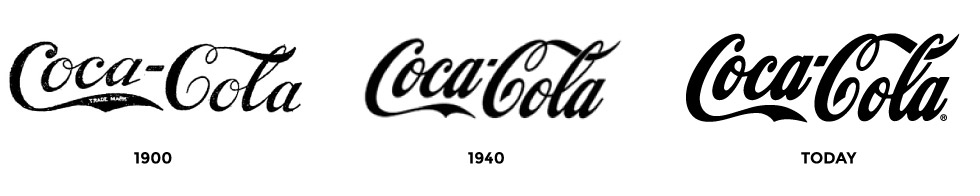
But there are logos which are not so simple that still work. The Coca-Cola logo is a good example. The logo has remained virtually unchanged since it was first created in 1887. It is not simple in any sense of the word but through repetition and distinctiveness it is one of the most recognized logos in the world.
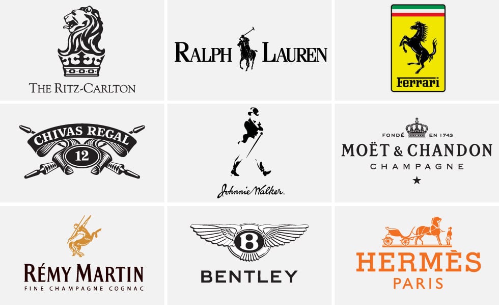
Another example is the Ritz-Carlton, which has a complex logo of a lion’s head on top of a crown. The reality is that the logo’s complexity is actually part of the message. It says that the brand is exclusive and luxurious. It can’t be easily replicated and there’s even a subtle indication that it can’t be easily attained or reached. This same design messaging can be seen in the logo for Ralph Lauren and Ferrari. High-end beverages also use this strategy.
A good rule of thumb to use, regardless of whether you are designing a simple logo or a more detailed logo is to never include anything which doesn’t have a reason for being there. Once you’ve put together your logo, ask yourself if there is anything that can be removed without the design losing it’s meaning. It’s interesting to note that as a brand becomes more and more recognized, the simpler the logo can be while still retaining its meaning. When Apple first introduced its logo, the Apple was multi-colored and “Apple Computer” was part of the logo. Now, only the silhouette symbol of the apple remains. The same has happened with Nike and the swoosh. And even Starbucks is following this same trend.
But all of these actually did need to have more “complex” logos to begin with. And whether by luck or by design, in each case the logo was designed with future simplification being pretty obvious.
6) A logo should be technically well crafted
“The details are not the details. They make the design.” — Charles Eames
Regardless of how original, clever or brilliant your idea is, it will fall short unless it is well executed. I have a rule of thumb that I apply to poster and cover designs—the brighter your idea, the more you can get away with in execution; conversely, the weaker your idea, the better your execution has to be.
This can easily be applied to logo design. The Google logo was a weak idea to begin with coupled with not so great an execution. But the logo caught on and became universally recognized. Now that the company can afford the top designers in the world, the logo has been perfected in execution while still retaining the original, weak idea.
The same can be seen in other logo upgrades. Where the logo has broad recognition, the idea is usually not changed. Instead, the execution is perfected.
Let’s break this down further.
Consistency of scale
Consistency of scale is the uniformity of sizing and proportional scale between all the elements of a design. For example, if you look at the Starbucks logo, you will see that the level of detail in the face is similar to the level of detail in the crown and in the two fins. Proportionally, the logo works. Similarly, if you look at the logo for Ralph Lauren, you will see a similar level of detail in the man and the horse. On the opposite end of the spectrum, you have the Apple logo. There is a similar level of detail between the apple and the leaf. Both are the most simplistic shapes that are still recognizable for what they are.
Consistency of scale is relevant at any level of detail or complexity. If your logo is a highly detailed illustration, then the entire logo needs to be highly detailed. If your logo is a simplified icon, then the whole thing needs to have a very low level of detail. Here are a few examples of logos with inconsistent levels of detail and you can see right away that they will present problems.

Color harmony
The basics of color harmony should be applied to logo design. While a logo should work in black and white (covered further below), colors are important to branding. Some brands’ colors are so recognizable they can almost stand on their own. Tiffany’s turquoise color is a great example. The reality is that most memorable brand colors are a single color, however there are also brands that employ two colors and in that case it’s important to use colors that work well together. McDonald’s red and yellow are analogous colors on the color wheel as are the Subway green and yellow colors. The FedEx orange and purple are harmonious colors.
Accuracy of shapes
If your logo has a circle, then it had better be a perfect circle. If your logo has a square, then please make sure it is in fact a square. Arcs should be a segment of a circle. Compare the old and new Twitter bird and you can see how much of a difference it makes to have accuracy in shapes.

Typography
As mentioned above, logo is derived from logotype—the way in which the name of a product or company is written. While logo has since come to represent the name or symbol of a product or company, it originally was entirely in reference to the text itself. And this points out the importance of typography in creating a logo.
Common mistakes:
- Incorrect capitalization
- Inconsistent capitalization
- Too many fonts (more than two in a logo is too many)
- Stressed font (either horizontally or vertically scaled)
- Bad kerning
- Bad letter spacing
- Inappropriate fonts
7) A logo must be versatile
“Making good design is easy. It’s polishing the half-assed stuff
that takes time.” — Stefan G. Bucher
A good logo can be used in any setting. Whether it be a 16 x 16px favicon, a website header, a business card or a building sign. Let’s break this down a bit further:
Black and white
A logo should work in black and white. Whenever I see a logo that uses gradients, tones and colors to create distinction, I see a failed design. I’ve heard the argument that this is an outdated design rule as we no longer use fax machines, but guess what we do still use:
- Foiling and embossing
- Engraving
- Metal badges
- Embroidery
- Icons
A good logo should be equally distinctive in any of these applications. I mentioned the upgrade of the ebay logo earlier. There’s a few other companies that have fallen into this same trap of “modernizing” their logo by getting rid of what made it distinctive. Look at these logos in color and in black and white:
![]()
All of the logos work and are distinctive in black and white, even though their color counterparts are obviously superior. But in the case of PayPal, you could take the double P and turn it into an icon and people would know it’s PayPal. Moreover, you could take the Microsoft waving window and, without color, people would know it’s Microsoft Windows. Even the notch in the “o” of Microsoft is color independent.
Now take a look at the modernized versions of these logos:
![]()
The PayPal double P becomes a blob. eBay no longer looks like a logo. And the Microsoft Windows is not recognizable as a logo without color. Even the Microsoft name lost any distinction and simply became a name, typed out in a font that looks an awful lot like Frutiger.
As a general rule of thumb, my first iteration of a logo is black on a white background. Once I have a design that works well in that setting, I can add color or tones or even gradients, although I avoid the latter.
Vector
Logos should be designed in a vector based program. Adobe Illustrator and Corel Draw are examples of vector-based design programs. The obvious reason for this is that vector graphics are resolution independent—meaning the logo can be scaled to any size without a loss of definition and crispness.
Beyond that, however, there are certain applications where ONLY a vector version of the logo can be used. These include:
- Any 3D rendering program and consequently any 3D printing application.
- Any kind of etched foiling or embossing dies.
- Vinyl cutting, for window displays.
- Embroidery machines.
I’m probably missing others. At the end of the day a vector image can be saved to a raster image with a few clicks. The same can’t be done from raster to vector.
Long and short of it—design your logo in a vector program.
Scalability
A logo should be designed to allow for scalability. One could argue that a “perfect” logo would be designed as a square or circle, allowing it to be used horizontally and vertically equally well. But in a lot of scenarios, designing a square logo isn’t feasible. Moreover, sometimes a horizontal logo is needed for one usage while a vertical logo is needed for another.
This should be considered when designing a logo. How will it work in a horizontal format? How will it work when placed vertically? If the logo won’t shrink down to the size of a small icon, is there a visually distinctive element that will be usable as an icon (the “f” for facebook, the Q for Quora, the bottle outline for Coke, etc). This is an example of a logo Tethos recently designed with this in mind.
![]()
You can see here that the primary logo was designed in a horizontal format. Because there would be instances where a less wide version was needed, the logo was also re-purposed in a stacked version, and finally as just an icon. All three versions would still be distinctive in black and white.
Epilogue
“Learn the rules like a pro, so you can break them like an artist.” — Picasso
Rules are made to be broken. This is as apropos to logo design as it is to any creative field. These rules can be broken, but do so with caution as they aren’t incidental rules. They are the most basic rules of logo design that you will see repeated in almost any article on the subject.
While logos might be simple and at times seemingly obvious, they usually took a lot of thought and effort to put together. I’ve seen professional logo designers go through 50 ideas before finally arriving at a design. There have been entire font families created just so that a logo of a few letters would work.
Most graphic design has a life span of a month to a couple years—brochures, fliers, magazine ads, websites. Great logo designs, on the other hand, will last decades.

Great article!
I am a graphic designer and I gain so much useful information.
Awesome article about Logo Designing. Wating for more articles about logo designing and branding. Looking for more in the future.
Truly great article and tips on logo design.
Thanks for sharing this helpful info, Rikard!
Nice post! I think concept is a core element when looking to design a logo for a business which has to make a connection with its consumer and that is why custom logo design. I manage a film production business, and my work sometimes goes toward graphic design and visual assets, rather than just the moving image. Since we are working on our business branding images with the best logo design Sunshine Coast, here I got valuable tips to implement in our business logos.
Can i give you a hug . i am a freelancer from india kerala your article guider helped me so much . thank you very much for great write up . keep come up with a great articles .
GREAT ARTICLE
Really really great post! Saved to my favorites right now!
I really enjoyed this article, along with the other ones on this site as well. Thank you, and keep up the great work!