Growing up in the early 80’s, I was a Star Wars fanboy. I had most of the characters and watched the films numerous times. I even had fond memories of The Ewok Adventures.
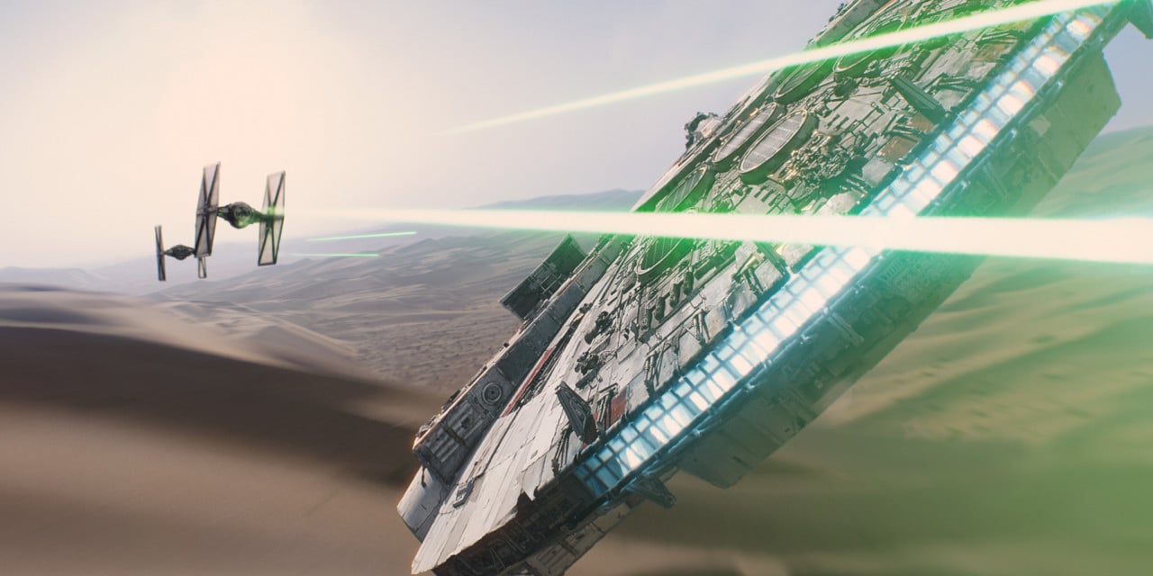
That said, I am very excited about the new Star Wars. I’m a big fan of J.J. Abrams and thoroughly enjoyed his reboot of the Star Trek series. A couple days ago the second teaser trailer was released and it was awesome to behold. Watching the last scene with Hans Solo and Chewie, I felt like a kid seeing my father return from a long business trip. It flooded me with happiness and reminded me of how much I missed them.
But…
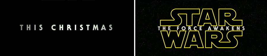
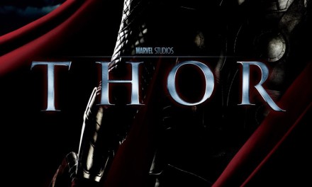
Who the hell chose the font for “The Force Awakens” and how did it get through the Art Department?! Does that screen on the left seem like it belongs to what will likely be the most important sci-fi film of the year?
The font is a bold weight ITC Serif Gothic. Serif Gothic was designed by Herb Lubalin and Tony Di Spigna and released by the ITC in 1972, now part of Monotype. It’s currently available through MyFonts.
Now, as to why it’s a terrible choice.
The font looks dated. It looks old. It looks ugly. And most importantly, it looks like it’s from the ’70s!
The Star Wars saga takes place in a time long, long ago—NOT in the 70’s! And while the Star Wars primary logotype is part of the Star Wars brand, this font is not. It’s only connection to Star Wars is that it appeared as the tagline font on the 1977 poster for Star Wars.
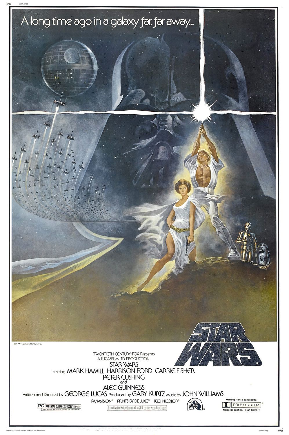
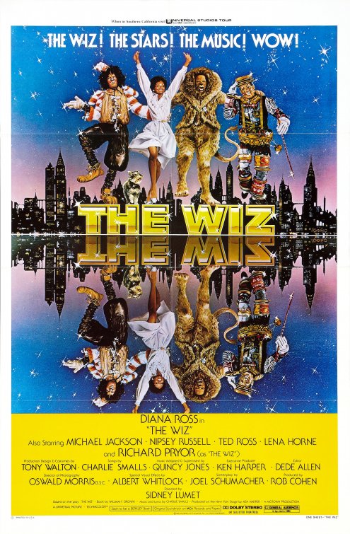
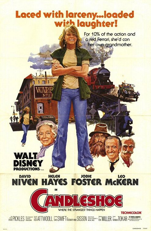
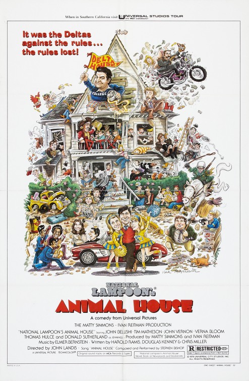
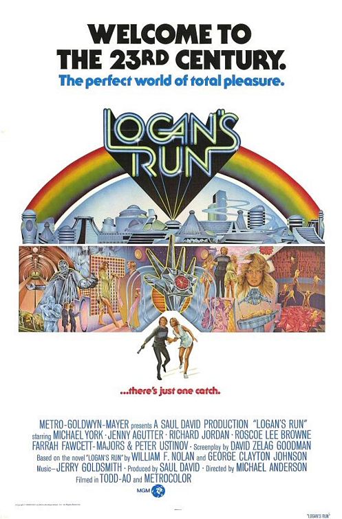
It’s the 70’s equivalent of Helvetica or Univers Condensed being used as the tagline and credits font on most posters put out today. Here are a few other posters of the time that used this font as it’s tagline and credits font:
By the time the second film (Empire Strikes Back) came out in 1980, the font had changed to the more recent (for the time) released Avante Garde typeface.

There’s a big difference between retro and old. Contax Pro, for example, is a retro 1970’s font—it has a lot of the same look and feel, but still modernized to feel in place within today’s design language.
There’s my rant. I love the new teaser trailer; I just couldn’t help but notice the bad choice of font. It reminds me of Avatar using Papyrus. What’s with movies that have multi-hundred million dollar budgets not being able to afford a type designer?

Cool article – I found it because I googled “bad typography” The Force Awakens.
My issue is not with the font choice though – it’s with the violation of any legitimate logo standards by sandwiching in type between the two halves of the word mark—and squeezing it in so tightly it almost touches the work mark! That is just appalling to me!! I cringe every time I see it.
Anyone else feel this way?
BTW, the original Star Wars word mark is one of my first typographic inspirations – I used to love it as a kid and draw it all the time. Nothing should have ever been added inside the mark.
I don’t love the alignment of The Force Awakens either, but it does seem to imply motion, as though those words are coming out from the background through the words Star Wars, which does makes sense.
Man! Thanks for writing this. We have been discussing this at the office for months now and I totally agree with your thoughts on the font. I am a huge JJ fan and love the use of Futura throughout Lost and Star Trek. WHY DID WE USE ITC Serif FOR STAR WARS!? It is truly awful. I would love to find out which production company made that decision. Marvel Comics has had horrible typography decisions over the last 10 years. Some Disney projects are very suspect, as well.
I love the idea of a throw-back font, but the trailers, tone and style of all of the imagery for this NEW film DO NOT feel retro. They honor what has gone before, but it is not a replication. We needed something professional and strong – not clipart from MS Word.
Maybe they should have hired James Cameron’s font guy – we could have had Papyrus.
Couldn’t agree with you more.
I didn’t love the font when I saw it in the trailer. I really enjoyed this article and all your points but somehow I’m coming away appreciating the font choice. I guess I was focusing on the practical look and the original-trilogy-appropriate design of the sets, costumes, props and vehicles and didn’t notice the typography.
I definitely appreciate the use of ITC more conceptually than in final execution but it makes me all the more excited for the new films that even the trailer typography is in line with an attempt to ground the aesthetic in the world of the original films. While they were set “long ago and far away” those films still have an inherent stamp of the late-70s and 80s despite the best efforts of the original design team. That’s the world we left and that’s the world fans like me have wanted to come back to.
Thanks for prodding me to think about what the new team is doing on this film in a more fundamental way. I wish they would have gone with Contax Pro, though.
I’ll agree to disagree. I loved it.
“The font looks dated. It looks old. It looks ugly. And most importantly, it looks like it’s from the ’70s! – See more at: https://zevendesign.com/star-wars-force-awakens-terrible-font-choice/#sthash.j778v3Lt.dpuf”
Star Wars is from the 70’s.
The first film was from the 70’s, but the story was not set in the 70’s. I think that’s an important distinction.
Nail on the head. This font is cringeworthy. It is distracting, and it pays homage to an obscure star wars reference. You want to pay homage, use green helvetica for the original Lucas Film card. This is just distracting and cheapens the feel. It’s worth noting however, most trailers and posters are made by third party vendors. they are approved by marketing execs, not the filmmakers.
Congrats on so horribly missing the point it prompted you to write this. Its supposed to feel retro. Have you not seen Rebels? The push by Disney/Lucasfilm to reference an older age? Constantly referencing the term practical effects in nearly every interview with anyone involved in it? All to make people think of the old trilogy and what the court of public option ruled as reasons for its greatness?
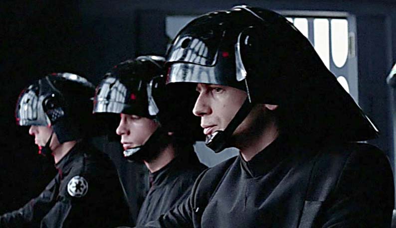
We’ll have to agree to disagree. The original film didn’t include this font. The credits on the poster did. And even so, there is a difference between retro and regressive. The design of the storm troopers in the new trailer is retro–it feels like the original trilogy but the design is upgraded. The trailer doesn’t show Death Star Troopers, but if they are in the new film, I doubt they will have Spaceball size helmets. To me, this font is the typographic equivalent to the Death Star Trooper helmet.
I think the font works for Star Wars. It was used in a few other original posters, most relevant on the tagline “May the force be with you.” It also stands out in an era of overuse of basic san-serif fonts with their weight the only thing unique about them. I’m a millennial, so I have no bias towards the 70’s look one bit, but I think here, and here alone, it works.