Category: Typography
A Graphic Designer’s Guide to Visual Hierarchy
Posted by Rikard Rodin | Sep 22, 2016 | Blog, Design, Designer's Guide, Tutorials, Typography | 3 |
Star Wars: The Force Awakens’ Terrible Font ...
Posted by Rikard Rodin | Apr 19, 2015 | Blog, Design, Poster Reviews, Reviews, Typography | 11 |
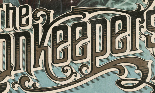
5 Basic Rules of Designing Titles
Posted by Rikard Rodin | Jul 8, 2011 | Blog, Design, Tutorials, Typography | 10 |
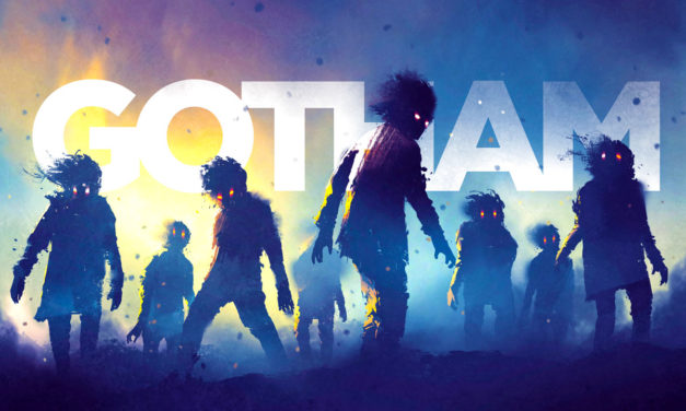
The Rise of Grotesque
by Rikard Rodin | Feb 25, 2018 | Blog, Design, Typography | 1 |
It may come as a surprise to many modern designers that the ubiquitous font Gotham was released in...
Read MoreA Graphic Designer’s Guide to Visual Hierarchy
by Rikard Rodin | Sep 22, 2016 | Blog, Design, Designer's Guide, Tutorials, Typography | 3 |
One of the most important tasks of a designer is to create a hierarchy—to create an order of...
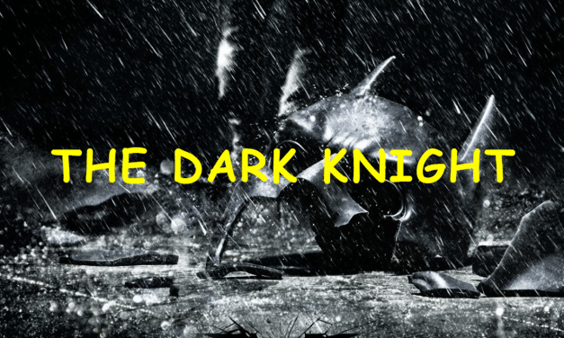
Read MoreComic Sans and the Dark Knight
by Rikard Rodin | Feb 4, 2016 | Blog, Design, Typography | 0 |
“Why? Because it’s sometimes better than Times New Roman, that’s why.” —...
Read MoreStar Wars: The Force Awakens’ Terrible Font Choice
by Rikard Rodin | Apr 19, 2015 | Blog, Design, Poster Reviews, Reviews, Typography | 11 |
Growing up in the early 80’s, I was a Star Wars fanboy. I had most of the characters and...
Read More5 Basic Rules of Designing Titles
by Rikard Rodin | Jul 8, 2011 | Blog, Design, Tutorials, Typography | 10 |
Title Design is an art form in itself. Whether designing a book title, an album title or a movie...
Read MoreThe Logo Design Process
by Rikard Rodin | Jun 25, 2011 | Blog, Design, Logos, Tutorials, Typography | 6 |
For a while I’ve wanted to do an article on the design of logos. There’s a lot to be...
Read More
Search
Recent Posts
Newsletter
Join our mailing list to receive the latest news and updates from our team.

