It may come as a surprise to many modern designers that the ubiquitous font Gotham was released in 2002. In other words, the movie Matrix existed in a world where the Gotham font did not. Originally commissioned by GQ magazine, the Gotham font was designed in 2000 by type designer Tobias Frere-Jones, inspired by the letterforms of architectural signage throughout New York City. The intent of the design was to create a font which was both fresh and modern, but also felt familiar and credible.
To this day, Gotham holds a special place in my heart as a graphic designer. And I share this sentiment with many of my design colleagues.
I remember when Gotham was released. I had just recently entered the world of graphic design and only in an auxiliary role—more a sideline observer rather than an actual player. But even then, I distinctly remember seeing the release of the font as something important. For starters, the release of the font came with a video announcing it. How many videos do you see about the release of a font? And 2 years before YouTube? You can see a segment of that video here:
Gotham wasn’t just a new font. It wasn’t just an alternative to Century Gothic. It was the harbinger of the grotesque era.
GOTHAM THE GROTESQUE
Gotham is a grotesque typeface. But what is Grotesque?
Grotesque (or gothic) typefaces were developed in the early nineteenth century following the introduction of William Caslon’s Egyptian type. Caslon’s typeface was not well received and was described as “grotesque” or “gothic”—comments influenced by a style of architecture experiencing a revival at the time.
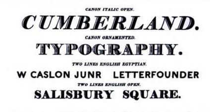
Sample of Caslon’s letterbook, showing a sans-serif “Grotesque” font
Grotesque is now considered to be synonymous with sans-serif, however this loses some of the nuance in the term. Originally, grotesque fonts were intended primarily for headline use. The fonts did away with variable line thickness and had shorter ascenders and descenders, making for an x-height that was more similar to the full font height. This allowed for tighter linespacing in headlines. Also, letterforms were more geometric in design, with circular letters such as O, G and D being perfect or near perfect circles.
THE RISE OF GOTHAM
Since it’s release in 2002, Gotham has, almost single-handedly, brought about a revival in grotesque typefaces.
While Gotham became popular with graphic designers almost immediately, it did have some significant milestones that placed it at the forefront of popular culture and helped in creating its ubiquity in our modern world:
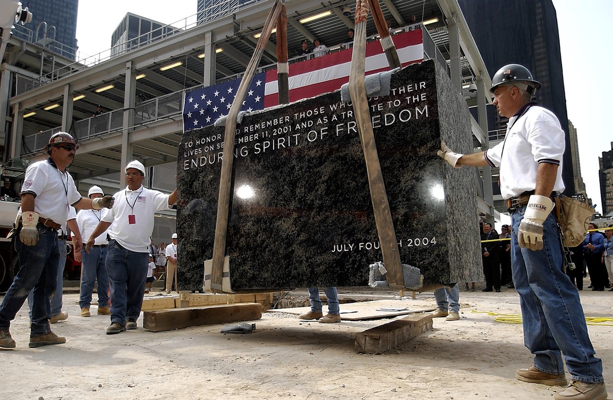
a) In 2004, Gotham was used as the typeface for the Freedom Tower cornerstone. While monuments like this would usually use established and old typefaces (think Trajan), it instead used a font that had only been released 2 years prior.
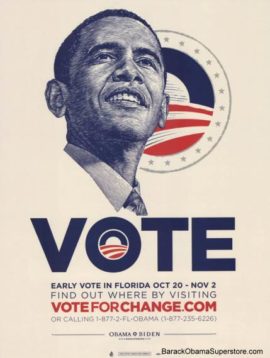
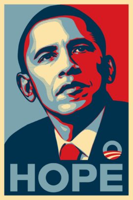
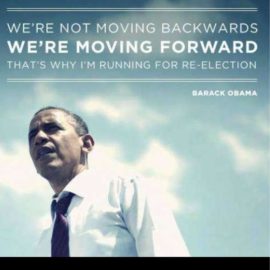
b) Starting in 2007 and carrying into 2008, the Obama presidential campaign used the Gotham font in its famous HOPE and CHANGE posters as well as other campaign materials.
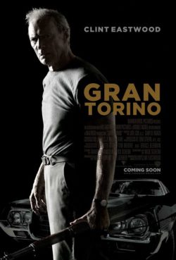
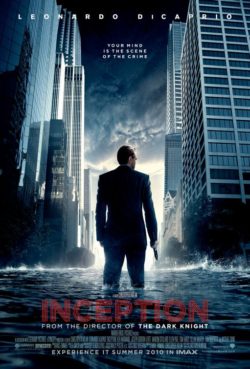
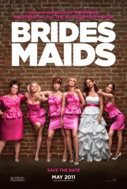
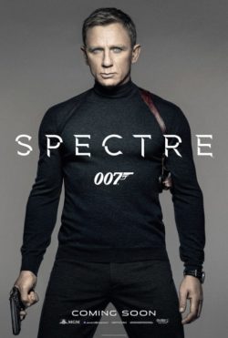
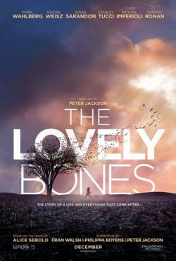
c) Starting in 2008, Gotham started to feature more and more on movie posters and especially tentpole Oscar films. Gran Torino (2008), The Lovely Bones (2009) and Inception (2010) are some good examples. But the use of Gotham on posters didn’t end there. Spectre, Moneyball, Bridesmaids and Moonlight are just a handful of the movies that used the font.

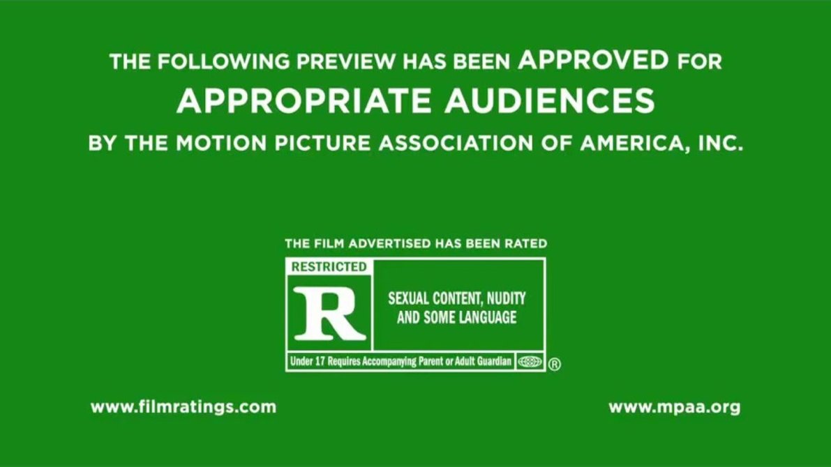
d) In June of 2013, the green MPAA trailer tag changed its font from Helvetica to Gotham. This means that every person who has seen a film in the last 5 years has seen the font Gotham in use!
GOTHAM AND THE WEB
No article on Gotham would be complete without mention of it’s web step-sister Montserrat—now one of the most widely used Google fonts for headlines across the net. If you’ve browsed themeforest or the templates of Squarespace, you’ve seen Montserrat.
Montserrat began as a kickstarter campaign in October of 2011. The purpose was to create a free Google web font, ostensibly inspired by the signage of Beauos Aires, although also clearly inspired by Gotham.
Gotham started as a print font for GQ but was later made available for web use. But it is not free. Moreover, it’s not a font you can buy. Instead you can rent the font for web use with limitations on page views. While this is fine for businesses with budgets and marketing departments, your freelance web designer and developer are going to look for a free solution.
Montserrat was that solution.

Montserrat is featured in more than 4.7 million websites. In the last week, the google fonts API served Montserrat 4.26 billion times!
Amongst headline fonts, Montserrat is definitely a leader in the pack. Raleway (another Gotham inspired font) was served 2.68b times. Playfair (a popular serif display font) was served 0.9b times.
THE GOTHAM ERA
Montserrat is not the only font we’ve seen come out of the post-Gotham era. And while it’s unfair to attribute all grotesque fonts released since 2002 to Gotham, it would also be unfair to not acknowledge Gotham’s influence in popularizing the grotesque font and carrying it into the 21st century.
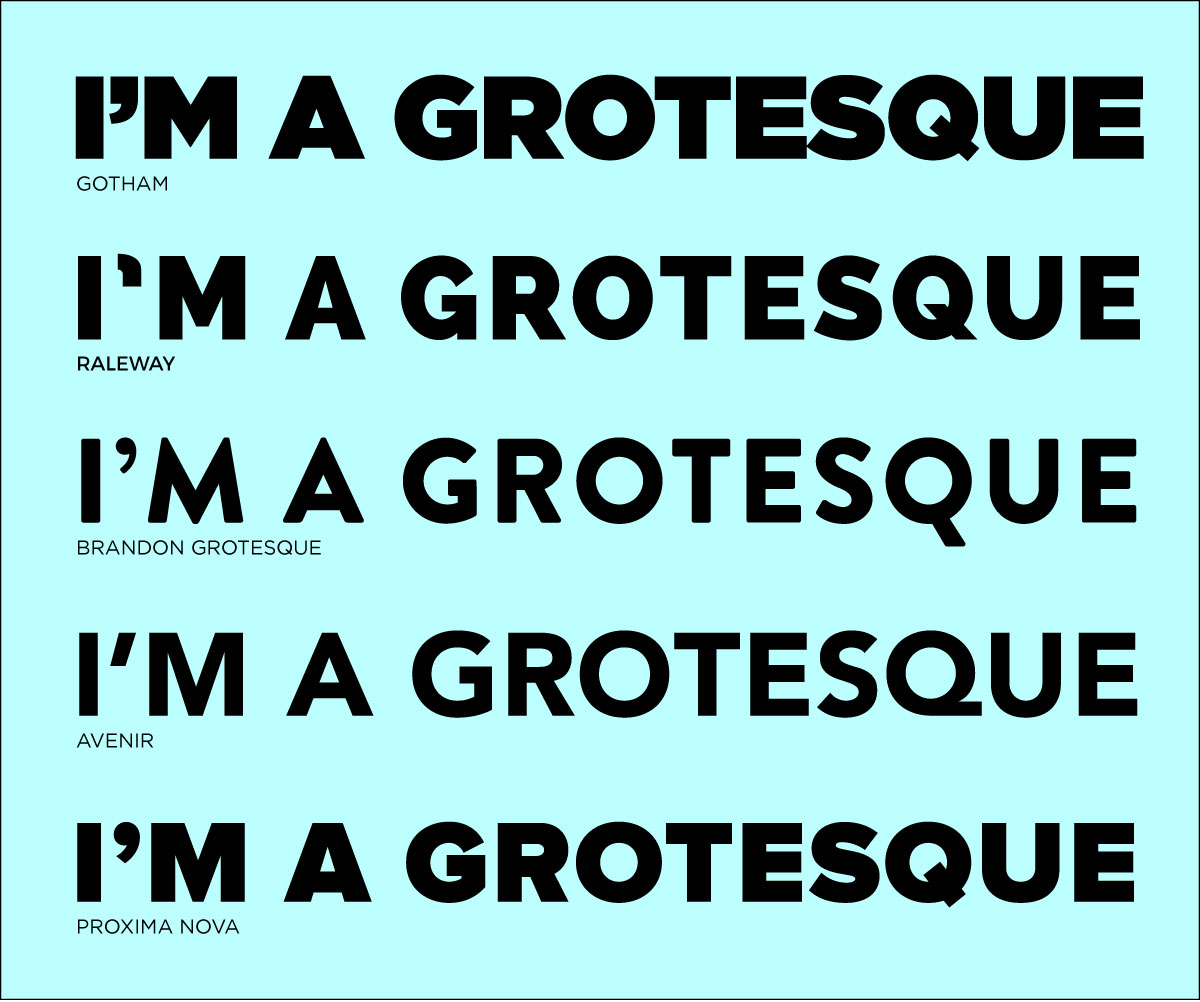
Raleway released in 2012 and Brandon Grotesque released in 2010 are popular fonts which both draw some inspiration by Gotham.
And two older fonts which have seen a renaissance in the post Gotham era are Avenir and Proxima—both grotesque fonts that are better suited for body copy than Gotham.
But really, you don’t have to look further than the 2018 Winter Olympics to see the enduring influence of Gotham. NBC created a custom font for the olympics called Nexa—which looks a lot like Gotham with tight letter-spacing and different number glyphs. The first image here is Nexa, the second is Gotham. Not a whole lot of difference…
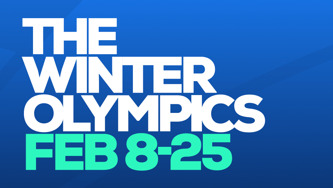
This is the newly designed Nexa font, created specifically for the 2018 Winter Olympics
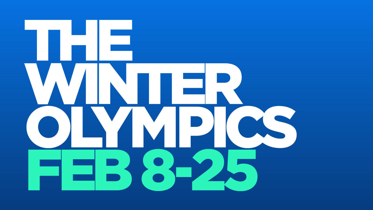
This is the same lettering, set in Gotham Bold for comparison to the Nexa font above.
LOGOS
If there’s one place where the ubiquity and influence of Gotham truly stands out, it’s in the design trend of logos. And more specifically, the homogenizing of logos into the “Gotham-esque” look. Here’s some logos—all clearly on the path to making Gotham the only acceptable font for use in logo design.
SUMMARY
Let’s all take a few seconds to appreciate the Gotham font. It’s pretty clear that Gotham signaled the era of the grotesque, which has lasted nearly 2 decades and doesn’t seem to be losing steam anytime soon.

Love this! Gotham is easily a favorite of mine and I use it in many of my projects.