In the first part of this series, I reviewed the posters for the 8 films nominated for Best Picture. Now it’s time to review the posters for the films that were nominated for an Oscar, but not in the best picture category. Some of these were nominated in the Acting category, some in film, in visual effects, music or script. It’s a total of 21 posters—and that’s already eliminating animated films, foreign language films, short films and documentaries. So to keep this article a reasonable length, my review on each poster will be short and to the point.
For starters, here’s the list of films in the first category for which they were nominated (some films were nominated in more than one category as is pretty common with the Oscars):
- Foxcatcher
- Gone Girl
- Wild
- Still Alice
- The Judge
- Into the Woods
Cinematography
- Mr. Turner
- Unbroken
Costume Design
- Inherent Vice
- Maleficent
Makeup/Visual Effects
- Guardians of the Galaxy
- Captain America: Winter Soldier
- Dawn of the Planet of the Apes
- X-Men: Days of Future Past
Music/Sound Editing
- Interstellar
- Beyond the Lights
- Begin Again
- The Hobbit: Battle of Five Armies
Writing
- Nightcrawler
The Poster Reviews
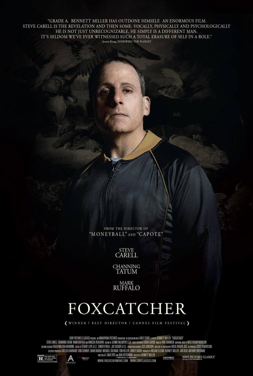
Foxcatcher
While this poster doesn’t say much about the film itself, it is still intriguing and—for lack of a better word—honest. This is not a sports film. It isn’t a film about Channing Tatum as a wrestler. It’s a story about a troubled man, played by Steve Carell. And in that regard, it’s an excellent poster. The make-up on Steve transforms him into an entirely different person. And the expression on his face is extremely hard to read. The lighting is dramatic and the costume hints at some of the plot points while the background artwork also hints at the name. Overall, a good poster.
 Gone Girl
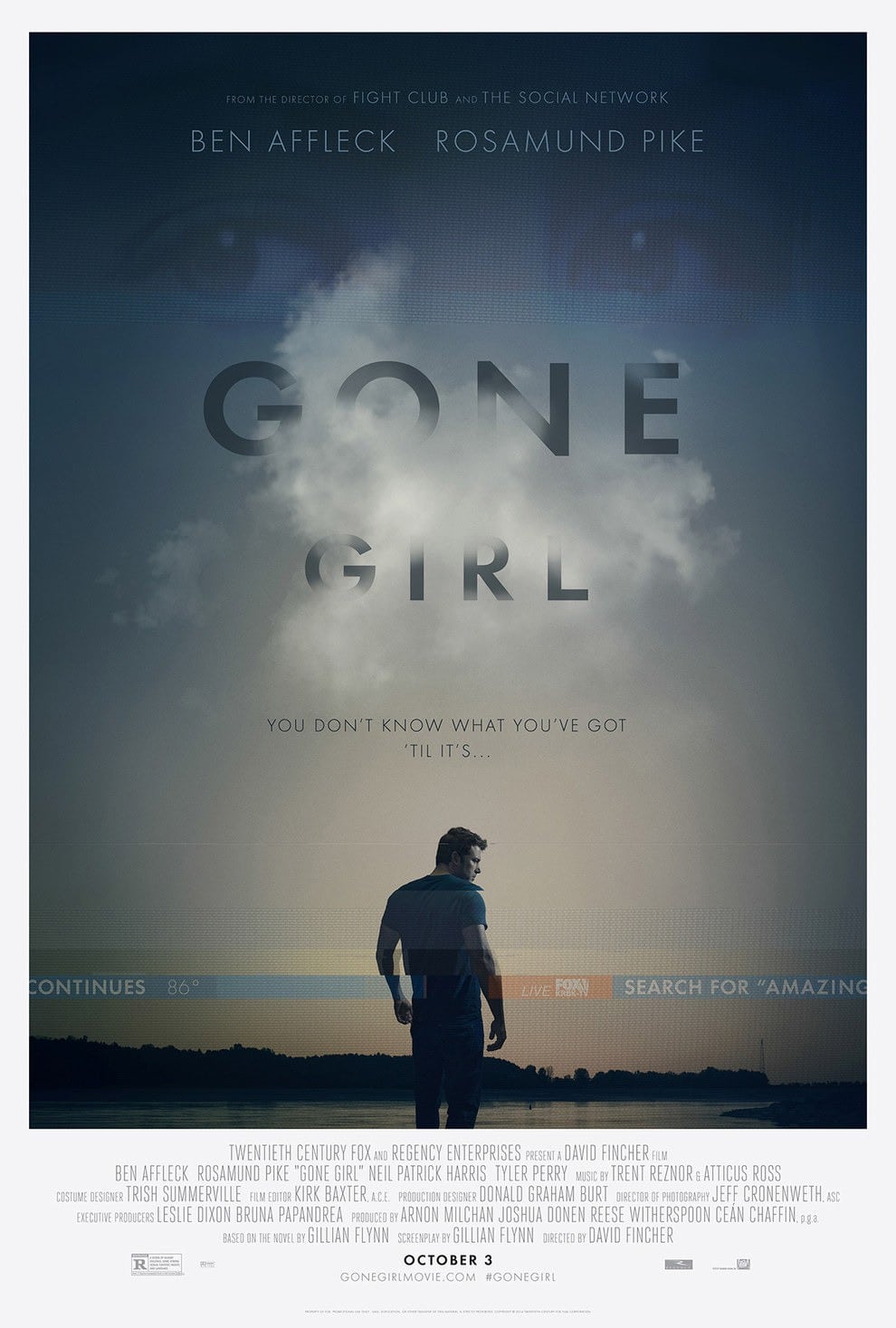
This poster is well-composed and simple but has numerous layers of brilliance. First off, the image itself is appealing and hints at the fact that events are making this man feel small and alone. The type disappearing behind a cloud is another well-executed visual metaphor. Then we come to the more subtle design elements—the TV Screen overlay of eyes at the top, the “news bar” cutting across the bottom of the image, the white frame that hints at a newspaper full-page ad or op-ed piece. All in all, this is a great design and one of my favorite in this article.
 Wild
Wild
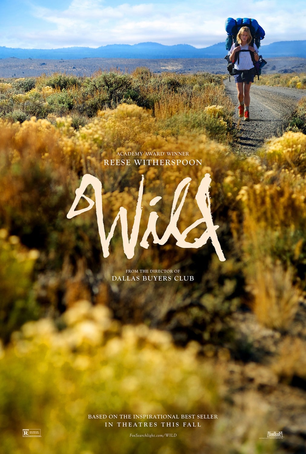
Unfortunately, nothing stands out about this poster. It’s a photo with some typography put on top of it. While simplicity is a virtue in design, there is the opposite end of the spectrum—this poster. The colors are all primary—red, green, yellow, blue. The composition demands attention rather than directing it. The typography is “interesting” for the sake of being interesting. And as for the message, I feel like I’ll be watching a GoPro documentary about a girl’s cross country hike.
 Still Alice
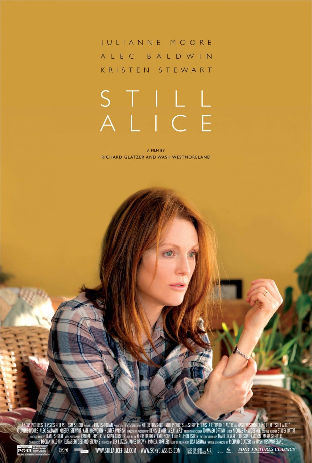
This poster shares a lot of faults with the Wild poster. It’s simply a photo with some type on it. There are a few things it does better—the composition is not distracting (although it is a bit boring). The typography is nice. The look on the woman’s face hints at the plot line of the film. Beyond that, it is a very boring poster with little indication as to what the film is about or why I should want to see it. While some posters scream “Indie film” (see poster for Whiplash in Part 1 of this series), this one screams “Oscar-bait.”
 The Judge
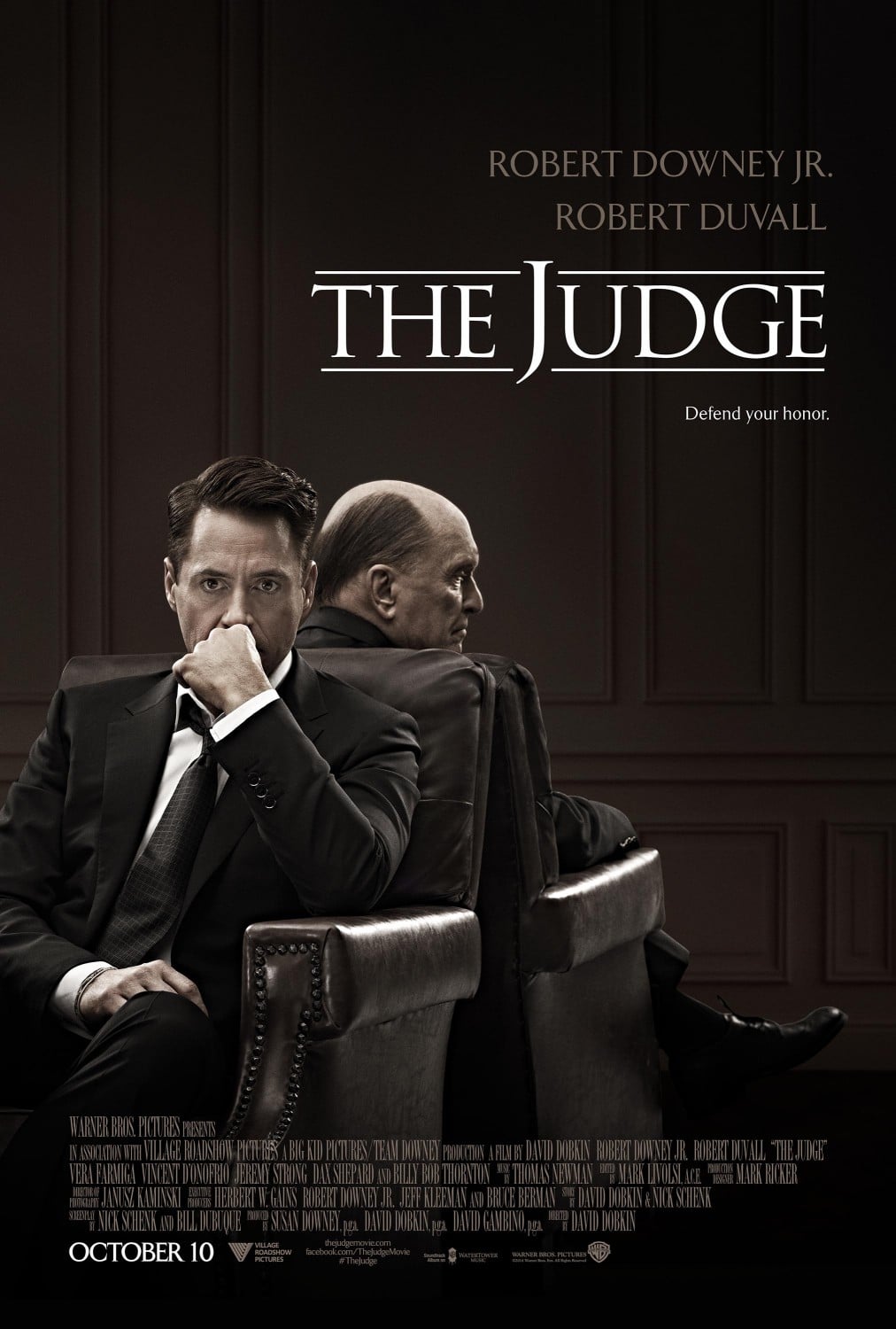
And speaking of Oscar-bait… This poster is mediocre. Not bad but not great. It’s tough to do a great poster for a courtroom drama but it can be done—two memorable ones that come to mind are Jagged Edge and The People vs. Larry Flynt. As this film’s primary draw is the two actors involved in the film, and as the film centers around their relationship more than the case itself, this poster does it’s job. Unfortunately, it doesn’t do much else.
Into the Woods
This poster is a study on gross design errors:
- Never photograph a woman to be unattractive (yes, I know she’s a witch, but see the poster for Maleficent or for a more drastic example, the poster for Misery here…)
- Don’t condense or scale a font (see the entire list of characters at the top of the page)
- Stick to 2 or 3 fonts. This poster has about 6.
What happens to the rest of Meryl’s body? The difference in scale between the top of the poster and the bottom is visually disturbing. Also, the typography for “Into the Woods” doesn’t make sense—a sans-serif font is used despite the fact that branches are coming off the bottom, which would naturally lend itself to serifs. And why have the visual metaphor of the branching letters when the entire lettering is intertwined in branches? You now have gold branches from the bottom of the “S” mingling with branches from the image. It makes no sense.
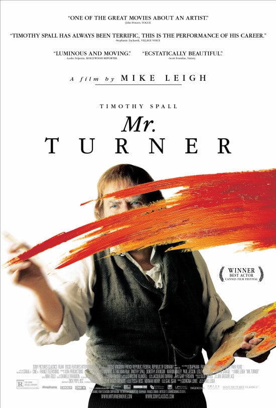
Mr. Turner
After a few not-so-great posters, this one stands out as being quite creative. The isolated-on-white has a certain “12 years a slave” vibe to it, but it works well for the poster and especially for the “visual trick” of the paint in front of the artist. My one complaint would be the typography at the top—the accolades for the film push the whole poster away from it’s visual center. And there doesn’t appear to be any rhyme or reason to the typographical treatment of the title—why is “Mr.” italicized? And why is it on a different line? But these are relatively small points to an otherwise great design.
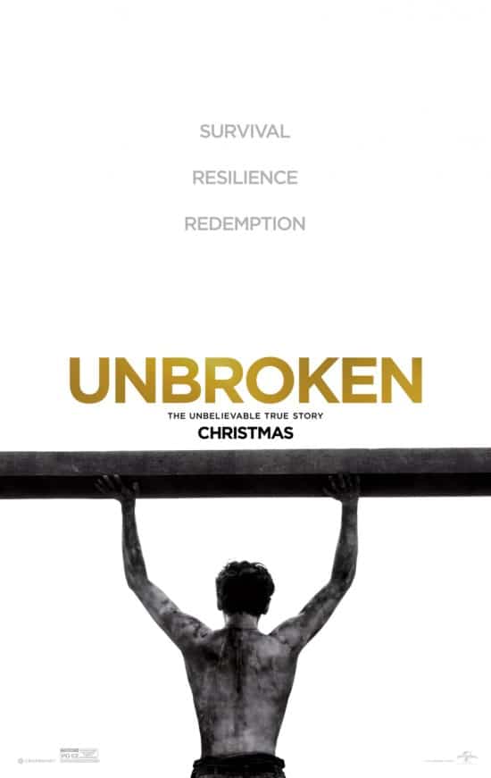 Unbroken
This is a poster that could have been great with three changes:
- Recrop the image so that we can see he is lifting something heavy as opposed to just putting his hands on a cross beam.
- Change the color of the type—gold and white are a very Christmas combination. And the color shift running through the text simply makes it worse.
- Change the font. The font used here—which is either Houshka Pro or Alright Sans—is a contemporary sans serif font (designed in the last 10 years) along the lines of the ubiquitous Gotham. For a story set in World War II, it makes no sense and adds a child-like and friendly quality to a poster that should have neither of those things.
Unfortunately, without these changes, the poster looks like a Disney film that would sit really well along side McFarland, USA, Million Dollar Arm or Alexander.
Inherent Vice
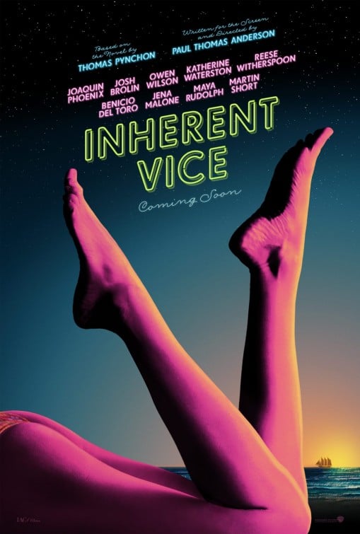
This is one of the better posters in this list. The colors indicate both an era (1970’s) and hint at the noir-esque nature of the film. The legs forming the shape of a “V” is an obvious hint as to what the “vice” might be. As is the case with most Paul Thomas Anderson films, it appears to have the makings of a cult film and this poster is certainly contributing to that.
Maleficent
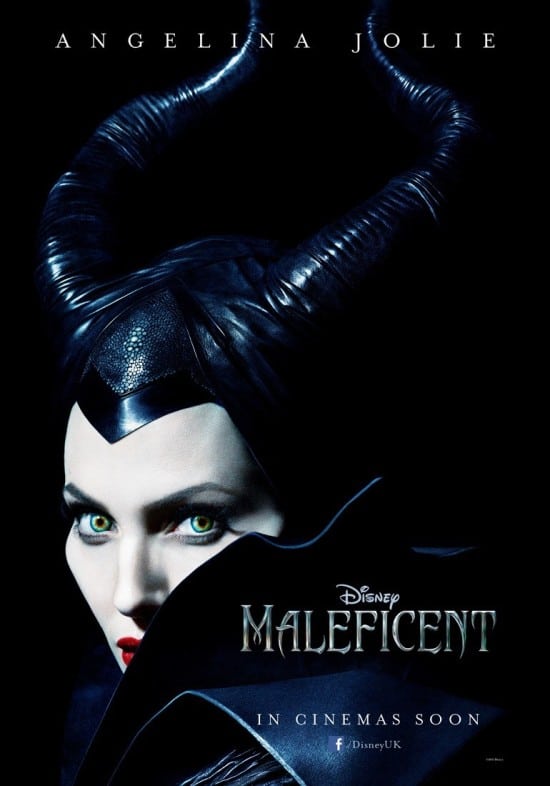
As one of the first recent “live action” remakes of a classic Disney story (Cinderalla and Beauty and the Beast are now in the works), this poster did a brilliant job of showing what the famous Disney Maleficent would look like in real life and for that, it gets a lot of props. It strikes the right balance of evil and magic. And the font selection is very fitting, although could have done without the 1990-esque Photoshop effects.
Guardians of the Galaxy
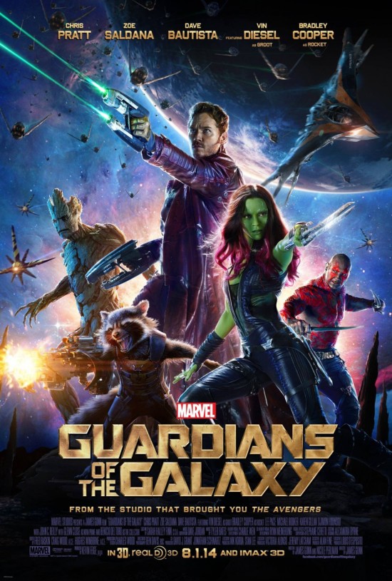
This poster is nicely composited, even if a bit too busy. The colors are great, the typography is nice and photo editing is top quality. The only real issue I have with this poster is the fact that it had the potential of being more iconic, like the original Star Wars poster and instead feels quite generic. Great execution but a weak idea.
Interstellar
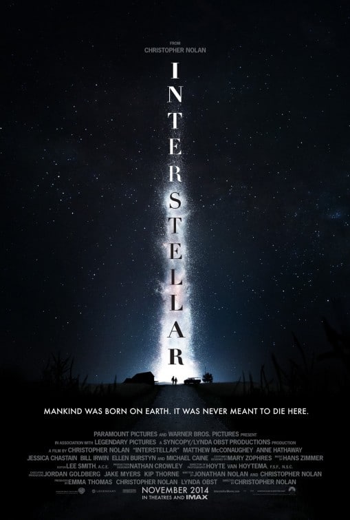
I’ve seen the posters for Interstellar appear on more than one list of “great movie posters.” But to me, the poster is mediocre if not outright boring. Let’s start with the image—two tiny ant-sized people at the bottom of a star cloud? Or is it supposed to be a rocket burst? Or maybe the light from an alien craft? It doesn’t really communicate much.
As for the typography, I like Didot. It’s a great font. It was created in the late 1700’s—so it’s been around for almost 300 years. And this is a film about the future. I’m not saying it doesn’t work—but it’s certainly not the most coherent font choice. However, going from Bold at “I”, to not bold by “S” and then bold again by the bottom “R” is simply distracting.
Then we come to the tagline, which is set in Futura, a font designed for the Bauhaus movement of the 1930’s. The font is starting to age and there are a lot of more contemporary sans serif faces that would work better on a film about the future.
Finally, the credit block at the bottom of the poster uses a non-condensed font, making it much larger than it needs to be.
Beyond the Lights
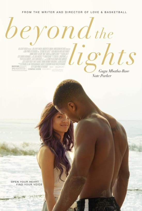
Overall, not a bad poster for what it is. The fact that the woman is looking into the camera seems like a mistake and is distracting. And letterspacing an italic lowercase font is a violation of typography 101 (although, to the designer’s credit, it doesn’t look terrible here). Beyond that, there’s not much to comment on. The poster does it’s job for a romance film whose draw is probably the actors, their hot bodies and good looks.
Begin Again
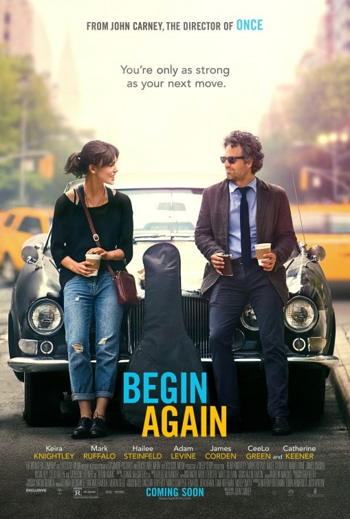
Too many colors! Beyond that, a decent if boring poster. For a much more iconic and memorable music movie poster, see Crazy Heart. Or better yet, the poster for Walk the Line.
The Hobbit: The Battle of Five Armies
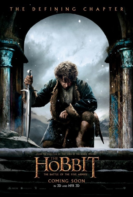
I appreciate the restraint in this poster. Rather than showing a bunch of CGI generated armies, we instead have Bilbo with his sword, bowing down, appearing to dread what may be coming. Were I doing the design, I’d add more depth between Bilbo and the background and also better utilize the snow to “unflatten” the image. As it is now, the image appears to have two layers—the front and the landscape in the back. Ideally, the steps, Bilbo, the archway and the landscape would all be different layers visually.
Captain America: The Winter Soldier
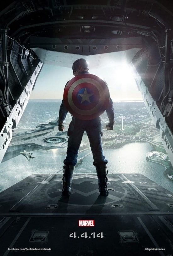
As someone who hasn’t read the Captain America comics, I feel this poster had one important task—decode the title of the film. While I realize this was the teaser poster, it could easily be a poster for the first Captain America film or even a character poster for The Avengers. For this reason, the poster didn’t do anything for me. For some contrast, the poster that came out for The Dark Knight Rises—depicting Bane with Batman’s cracked mask at his feet—did an excellent job of introducing the villain and showing he was a worthy adversary—which is a requisite to any good superhero film.
Dawn of the Planet of the Apes
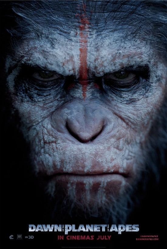
I already mentioned this poster in my review of 2014 Movie Posters. I love the simplicity of the poster. In the first film (of the remake), we were introduced to Caesar as a character. In this poster, we see his face with a scowl. But more importantly, we see he has war paint on. And we see some grey in his hair. These subtle and not so subtle visual cues are enough to tell us a lot about the film: Ceasar has aged and matured, he is now at war and he is not happy.
How much is said with a single image is what makes the poster work so well.
X-Men: Days of Future Past
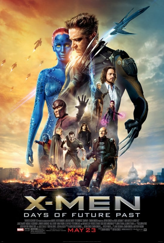
The problem with this poster is that it has far too much going on. Rather than showing us what makes this movie worth watching, we are instead shown every character as if the poster is a visual billing sheet. There is no integrated color palette and there is no rhyme or reason to the scale of the various characters shown. If Guardians of the Galaxy is an example of how to properly do a character-based poster, this is an example of how not to do it.
Nightcrawler
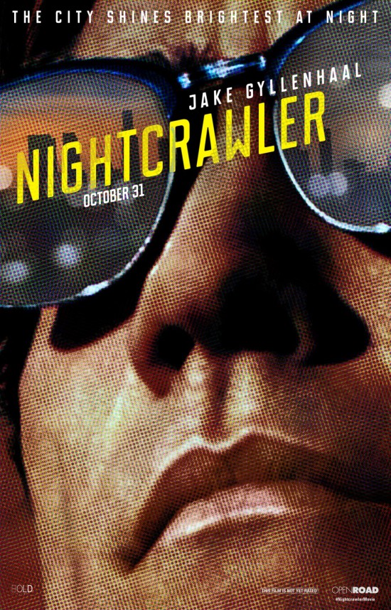
Ah, the best for last! This movie poster is a piece of art in and of itself. The extreme close-up of the character’s face indicates the ego of the main character and his persistence in being in-your-face. The halftone dot pattern tells us that the film has to do with journalism. The sunglasses with the skyline tell us the film is in Los Angeles and also hint at the neo-noire aspect of the film. This is probably the best poster in the article and the one most likely to become a piece of pop culture.
Summary
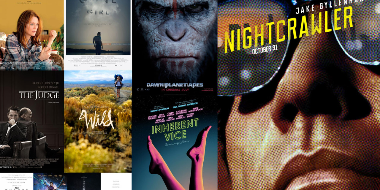
There are too many posters here to sequence all of them into a “best to worst” list. Instead, I’ve rated my top three and bottom three. Please join the conversation in the comments—I’d be happy to hear your view on which you like (or hate) and why.
Top three:
- Nightcrawler
- Gone Girl
- Inherent Vice
Bottom three:
- Into the Woods
- Unbroken
- X-Men: Days of Future Past




Great post!!!! i like it so much your web 😀