Traditionally, I do a post reviewing all movie posters for the year and select my top picks and highlight some real misses. However, with the Oscars coming up, I decided I should do a review of all the posters for the Oscar nominated films. For the purpose of this series, I’ve left out the foreign language films, documentaries and short films. I feel these are competing on a different playing field—and with them, the list would simply be too long (it’s probably too long already).
The first category of posters I’m reviewing here are those for the films nominated for Best Picture.
Best Picture
- American Sniper
- Birdman
- Boyhood
- Grand Budapest Hotel
- The Imitation Game
- Selma
- The Theory of Everything
- Whiplash
The Best Picture Posters
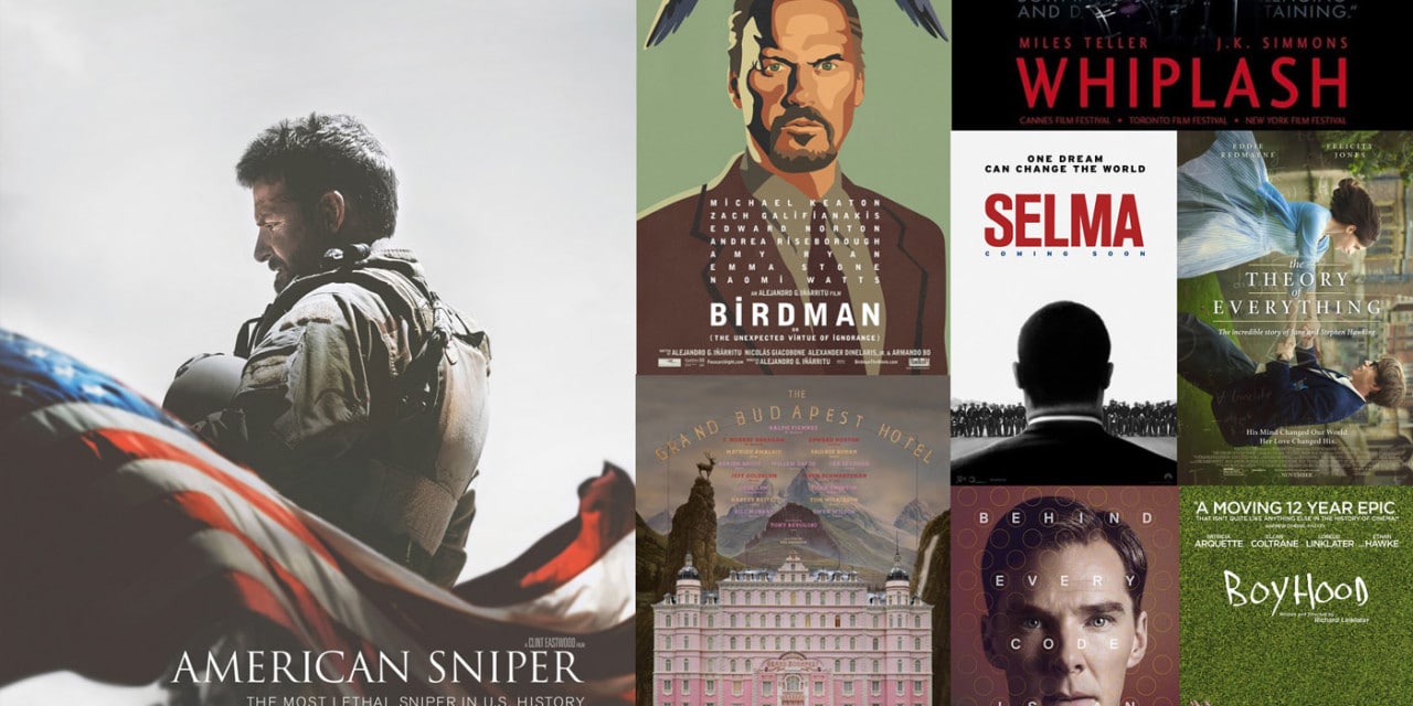
It shouldn’t come as a big surprise that quite a few of these posters are already made a debut on my list of top posters for the year (and a couple even made the “miss list.”) As is common with almost any big movie marketing campaign, many of these films have more than one poster. For the purpose of this review, I am only looking at one poster. I’ve tried to select the poster which is most prominent in the public eye or the poster which came out first.
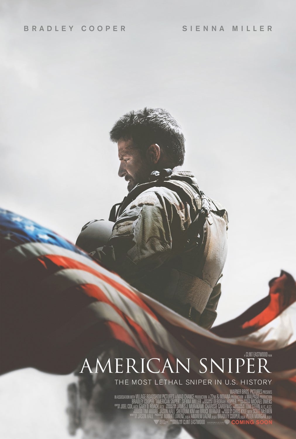
American Sniper
I’ve already covered in my 2014 Movie Poster review that this was one of my favorite posters of 2014. The reason is that it is a simple concept very well executed. It is indeed a good example of less is more but also communicates a lot through very careful selection of design elements. Things I can gleam from this poster—having not seen the film but simply using context and a bit of conjecture:
- It’s a patriotic film (the flag) but acknowledges the weight and internal toll that war can have (the somber look and stance of the character)
- It’s a film I should take seriously—a drama, not an action film. This is clear from the color palette, the choice of a somber stance over an action pose, the selection of an overcast background and the cleanness and simplicity of the titling.
- The film is a look back on a life rather than a story that has a future—as indicated by the direction the character is facing.
Possibly some of this was accidental or coincidental, but I’m more happy to believe that the designer was calculated in his/her decisions.
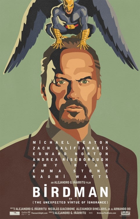
Birdman (The Unexpected Virtue of Ignorance)
Another poster that made it on my top posters of 2014 list, Birdman! I really appreciate the fact that this illustrated design was the promotional poster for the film—and not done after the fact. I do feel the illustration could have been done a bit better (see some of Tom Haugomat’s work or even Brian Miller’s work). The visual metaphor it’s attempting to emulate is a traditional, screen printed poster/art print. And if you’re familiar with the process, you know that you want to reduce you’re number of colors to as few as possible as each color is a separate printing pass. This image has more than 30 different colors. It could have been done with a third of that, if not a fifth. Also, small imperfections—edges overlapping slightly, areas where the ink isn’t as thick—would have added to the overall impression.
While I initially didn’t like the dotted “i” in an otherwise uppercase typography layout, I’m starting to warm up to it. It’s a subtle hint to the bird on top of the main character on the poster and is also a visual link between all the typography. I believe the kerning of the actors’ names could have been better handled, but that’s a nit pick.
Overall, I love the poster. But details, details, details could have made it better.
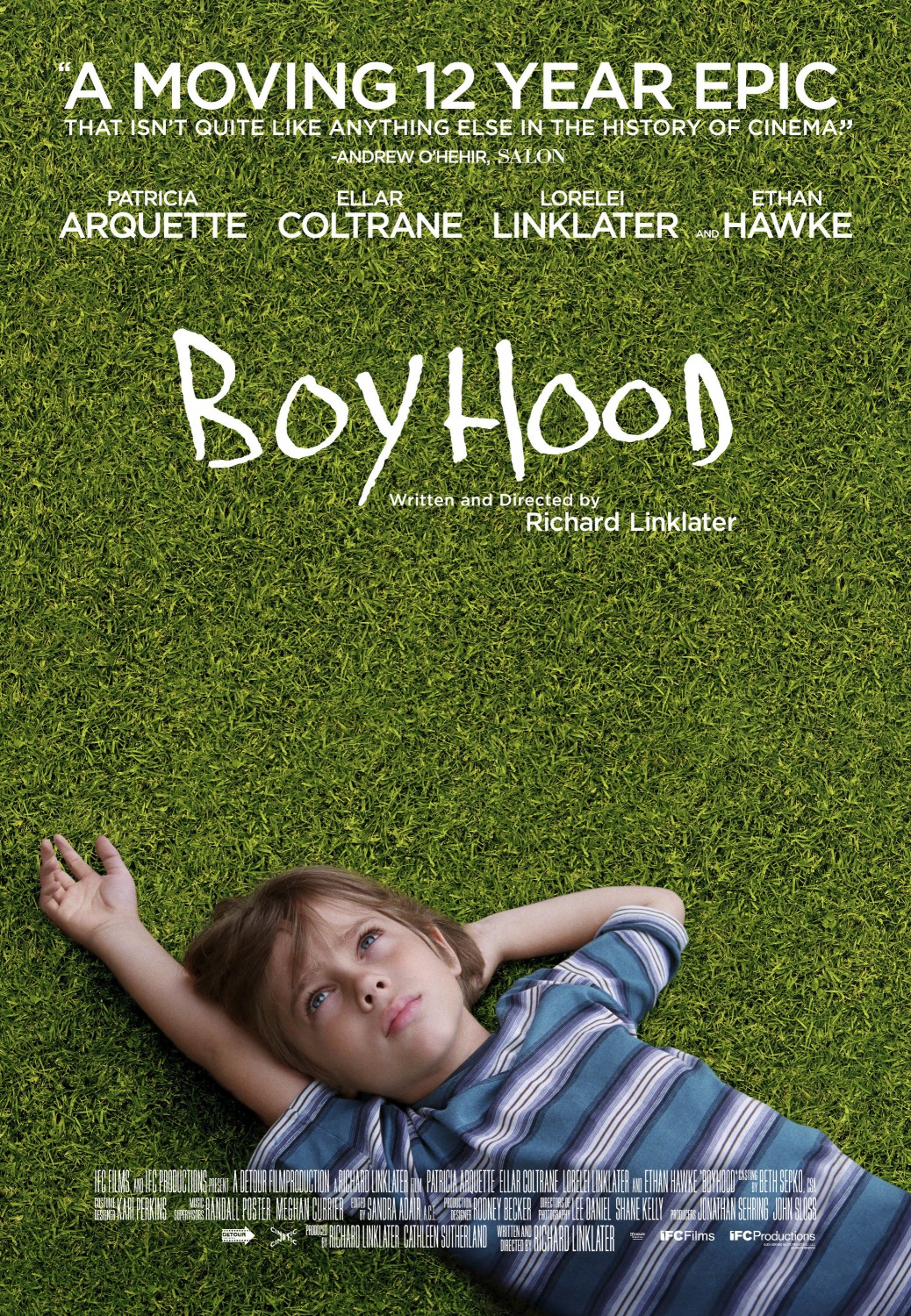
Boyhood
This poster has a few problems, the first and most obvious being the odd perspective on the boy. The arm simply looks too short and oddly proportioned to the rest of his body. In the film, this is a moving shot that appears within the first minute of the film. Because the camera is moving, it isn’t a problem. But as a still image, it doesn’t work at all. Further, the grass, which was replaced in the poster, looks extremely fake and if you look closely, has been cloned around to make it large enough for the whole poster. The result is grass that has no perspective at all, which throws the perspective of the boy off even more than it already is! The child-like font used for “Boyhood” coupled with the obviously pubescent child on the poster doesn’t at all hint at the fact that the majority of the movie has the “boy” as a teenager. Nor does it make any indication as to the single thing that makes the film interesting—it was filmed over 12 years with the same cast.
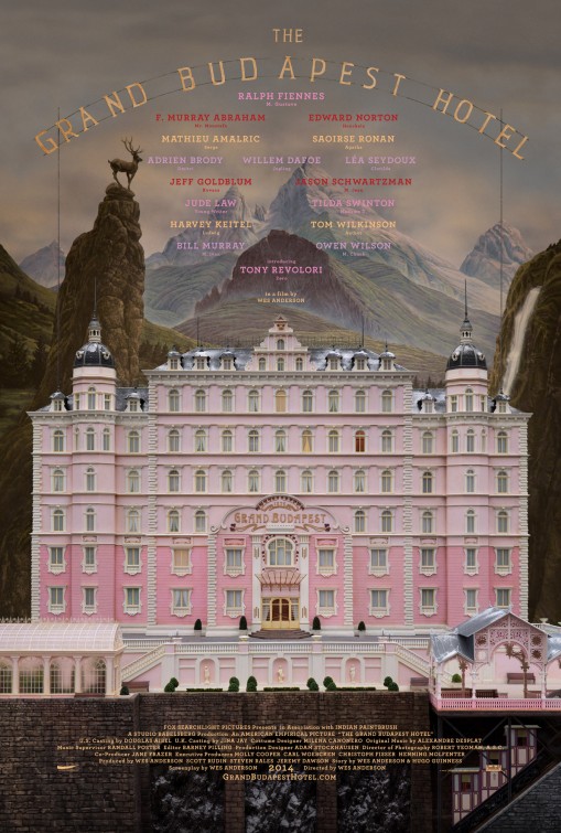
The Grand Budapest Hotel
Here again is a poster that made my top list for 2014. This is a great poster—it is one of the most intriguing of all those in this article. Is it a painting? Is it a miniature? Is it 3D? Is the background a backdrop? This is a poster you could look at for a long time. Some windows have different colored curtains—why? There is a single window that seems to have no curtains. What’s the relevance of that? It’s very appealing—through excellent symmetry, color selection and attention to detail. The poster is a straight-on photo of the exterior of a hotel… and yet it’s awesome.
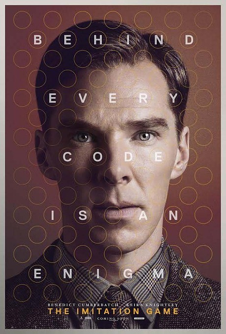
The Imitation Game
This poster is lackluster at best. While I appreciate the circular pattern and the fact that this has a connection to the code-breaking technology figured out in the film, trying to read the copy is itself an exercise in code breaking. Beyond that, the poster is too “actor focused.” The terrible box office numbers for The Fifth Estate should have been indication enough that Benedict Cumberbatch (who I consider an excellent actor) is not a box office drawn in and of himself. The pros: Good photo, nice color grading. The cons: Bad information hierarchy (title is smaller than the tag line), hard to read tagline, doesn’t say anything about the film itself or make me want to see it.
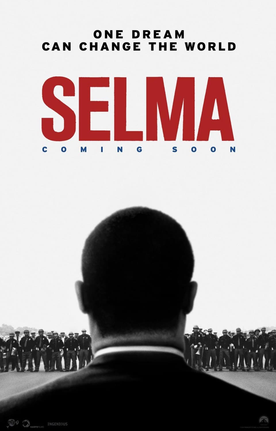
Selma
I’m on the fence about this poster. I want to like it, but there are numerous things that simply don’t work for me.
- The fact that the main character is out of focus doesn’t seem to be contributing to the message of the poster and is instead simply distracting.
- The fact that the bottom of the poster doesn’t include the “billing block” throws some confusion into the mix—is it a documentary or a film based on MLK?
- For those of us who haven’t studied the history of MLK—Selma doesn’t mean much. Certainly the tagline could have shed some light on it rather than repeating an overused cliche…
- The “Coming Soon” in blue is entirely unnecessary and unless the blue was intended to create the colors of the American flag, has no place on this poster.
In the grand scheme of things, these points are all relatively small and would take but a few minutes to fix. But the collective of all these points detract from the overall design.
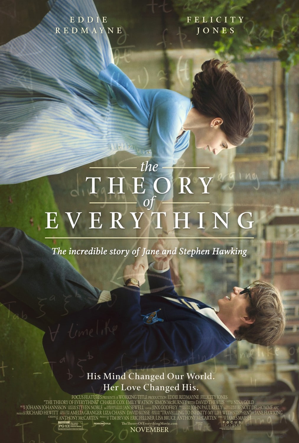
The Theory of Everything
Overall, I think this is a good poster. Not great, but good. The image turned on its side is a clever visual metaphor and the biggest plus of the poster—they fell in love as equals, then their world was flipped on its side and now Jane is holding Stephen up so he doesn’t fall (at least that’s the subliminal message I get from it). Although I understand the “science writing” hints at the subject matter of the film, it feels a bit like an afterthought. As for the typography, I like the title in the middle, but have a few gripes on the lack of consistency:
- “The” in the title should be capitalized.
- The subhead to the title uses standard capitalization yet…
- the tagline at the bottom (His Mind…) has every word capitalized.
Make up your mind! Either use capitalization correctly, or don’t. Changing it up on every element of typography looks amateur and unprofessional. And knocks the poster down a few rungs on the list.
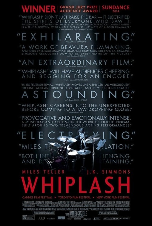
Whiplash
Nothing screams “indie film” more than a bunch of accolades on a movie poster. This would have, could have, should have been a great and iconic poster. Instead, it looks like a full-page Oscar campaign ad in Variety magazine. Take away all the type and the rest of the poster is quite good. I like the small character encroached in darkness with a single light shining on him. It tells me what to expect from the movie and the red title indicates that this isn’t an ordinary music film. Unfortunately, it’s ruined by all the text.
Summary
Rounding out the posters for the films nominated for Best Picture, here’s how I would rate them:
- American Sniper
- Grand Budapest Hotel
- Birdman
- The Theory of Everything
- Selma
- The Imitation Game
- Whiplash
- Boyhood
The top three were the biggest debate for me. Grand Budapest Hotel is probably the most interesting but American Sniper serves its purpose better—which is to tell me what the film is about and get me interested in seeing it. And finally, Birdman is the only poster on the list that dared to use an illustration on the cover despite a super impressive cast. And for that, it gets a lot of kudos from me. In terms of the worst, Boyhood was an easy choice. Had a designer working under me submitted all these, Boyhood is the one I would have sent back to the drawing board.
Let me know what your order of best to worst is in the comments.
Coming Next: Part II – Secondary Nominated films

