Category: Reviews
Star Wars: The Force Awakens’ Terrible Font ...
Posted by Rikard Rodin | Apr 19, 2015 | Blog, Design, Poster Reviews, Reviews, Typography | 11 |
Optics by Boris FX: Comprehensive Review and Tutorial
by Rikard Rodin | Feb 8, 2022 | Photoshop, Reviews, Tutorials, Video Tutorials | 0 |
Walk through the entire Optics plugin by Boris FX and learn the basics and tips & tricks to integrate the plugin into your Photoshop compositing workflow.
Read MoreLogos that Look Lazy
by Rikard Rodin | Oct 3, 2017 | Blog, Logo Review, Logos | 1 |
Regardless of the final result, logo design is hardly ever easy and there’s always a lot...
Read MoreEpisode 1: Movie Poster Reviews
by Rikard Rodin | May 2, 2016 | Blog, Reviews, Video Reviews | 0 |
Here’s a review of some recently released movie posters, including: Night Moves (Jesse Eisenberg, Dakota Fanning, Peter Sarsgaard) Son of a Gun (Ewan McGregor) Teenage Mutant Ninja Turtles 1000 Times Good Night Who is John...
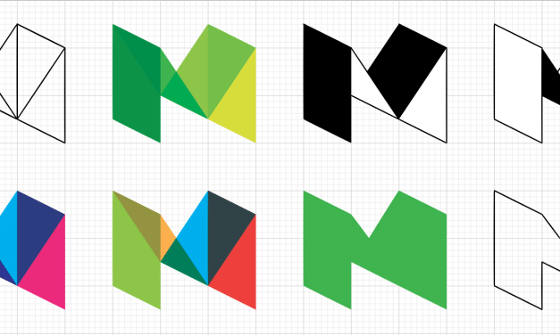
Read MoreWhat I think of Medium’s New Logo
by Rikard Rodin | Oct 24, 2015 | Blog, Logo Review | 0 |
My review of the new Medium logo.
Read MoreThe new Google Logo
by Rikard Rodin | Oct 24, 2015 | Blog, Logo Review, Reviews | 0 |
My review and thoughts on the new Google logo.
Read MoreStar Wars: The Force Awakens’ Terrible Font Choice
by Rikard Rodin | Apr 19, 2015 | Blog, Design, Poster Reviews, Reviews, Typography | 11 |
Growing up in the early 80’s, I was a Star Wars fanboy. I had most of the characters and...
Read MoreOscar Nominees: The Poster Review (Part II)
by Rikard Rodin | Feb 20, 2015 | Blog, Design, Reviews | 1 |
In the first part of this series, I reviewed the posters for the 8 films nominated for Best...
Read MoreOscar Nominees: The Poster Review (Part I)
by Rikard Rodin | Feb 18, 2015 | Blog, Design, Poster Reviews, Reviews | 0 |
Traditionally, I do a post reviewing all movie posters for the year and select my top picks and highlight some real misses. However, with the Oscars coming up, I decided I should do a review of all the posters for the Oscar nominated films. For the purpose of this series, I’ve left out the foreign language films, documentaries and short films. I feel these are competing on a different playing field—and with them, the list would simply be too long (it’s probably too long already).
The first category of posters I’m reviewing here are those for the films nominated for Best Picture.
Read MoreMovie Posters of 2014, Hits and Misses
by Rikard Rodin | Jan 3, 2015 | Blog, Poster Reviews, Reviews | 3 |
Here’s my annual top picks for movie posters of the year. I’ve also included a few...
Read MoreMovie Posters of 2013, Hits and Misses
by Rikard Rodin | Dec 6, 2014 | Blog, Design, Reviews | 0 |
Here are the hits and misses for 2013 Movie Posters. This is based on my design review. I give my...
Read MoreEpisode 3: Magazine Ads
by Rikard Rodin | Dec 4, 2014 | Reviews, Video Reviews | 0 |
This is a review of the ads in the latest issue of People’s magazine. In this review I look...
Read MoreEpisode 2: Book Covers
by Rikard Rodin | Dec 4, 2014 | Reviews, Video Reviews | 0 |
In this video, I review the book covers for the 10 books currently at the top of the New York...
Read More
Search
Recent Posts
Newsletter
Join our mailing list to receive the latest news and updates from our team.


